
Serene Breeze
Serene Breeze is a Green paint color from Benjamin Moore, but its character reaches beyond a single label. It appears in Benjamin Moore Classics® Color Collection, placing it within several distinct decorating stories rather than a single fixed look. The manufacturer's description below offers one reading; the room imagery leaves space for your own.
Hex
#CDDED3LRV
68.55
Serene Breeze in Rooms
Follow Serene Breeze from one space to another and watch how light, scale and surrounding materials reshape its character. 4 sourced room photos offer a closer look at the color in lived-in settings.
1 Living Room Photo
Serene Breeze (449) brings its green character into a space shaped by conversation, quiet evenings and changing daylight. Its cool classification can bring a composed, clean tension to warmer finishes.

Living room walls embrace the peaceful palette of Serene Breeze.
@manymustardseedsinteriors
2 Dining Room Photos
Serene Breeze (449) can change noticeably under natural light, candles and pendant lighting. Sample it beside the finishes that will remain in the room.

Dining room walls create a cozy atmosphere in Serene Breeze.
@manymustardseedsinteriors

Dining room walls in Serene Breeze create a calm backdrop for gathering.
@manymustardseedsinteriors
1 Misc Photo
In an assortment of spaces that reveals the color outside a single design formula, the most interesting quality of Serene Breeze (449) may be the way it responds to a changing mix of architectural details and personal finishes. Its green undertone may become clearest at the boundary between paint and a contrasting finish.

Painted furniture in Serene Breeze brings soft elegance to any bedroom.
@22interiors
Coordinating Colors


White Heron reflects far more light (LRV 87 vs 69), opening up a space where Serene Breeze encloses it.


At LRV 69 vs 26, Serene Breeze is decisively the brighter choice.


Serene Breeze reflects far more light (LRV 69 vs 39), opening up a space where Cotswold encloses it.


Snowfall White reflects far more light (LRV 90 vs 69), opening up a space where Serene Breeze encloses it.
Similar Colors


A 7-point LRV gap (75 vs 69) makes Taffeta Green the marginally brighter of the two.


Serene Breeze reads slightly lighter (LRV 69 vs 65), a gap that shows most in low-lit rooms.


A 6-point LRV gap (69 vs 63) makes Serene Breeze the marginally brighter of the two.


With LRVs of 69 and 66, the two reflect almost the same amount of light.
Complementary Colors

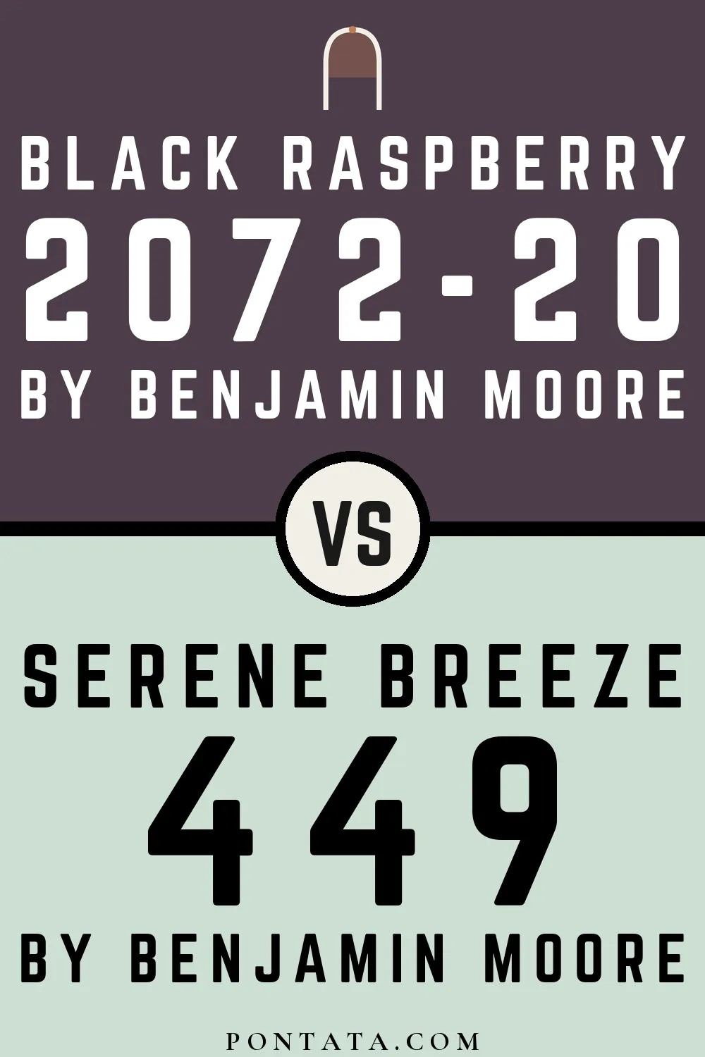
At LRV 69 vs 7, Serene Breeze is decisively the brighter choice.


At LRV 69 vs 21, Serene Breeze is decisively the brighter choice.


At LRV 69 vs 5, Serene Breeze is decisively the brighter choice.


At LRV 69 vs 18, Serene Breeze is decisively the brighter choice.


Serene Breeze reflects far more light (LRV 69 vs 11), opening up a space where Kalamata encloses it.

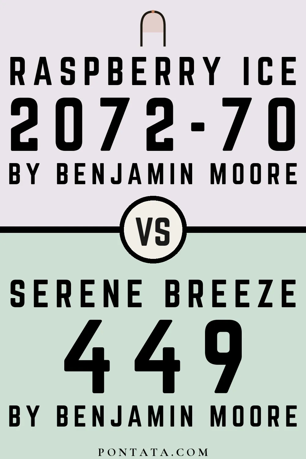
Raspberry Ice reads slightly lighter (LRV 76 vs 69), a gap that shows most in low-lit rooms.


Serene Breeze reflects far more light (LRV 69 vs 6), opening up a space where Dark Purple encloses it.
Lighter Colors


Green Cast reads slightly lighter (LRV 77 vs 69), a gap that shows most in low-lit rooms.


Opal Essence reads slightly lighter (LRV 75 vs 69), a gap that shows most in low-lit rooms.


At LRV 82 vs 69, Emerald Vapor is decisively the brighter choice.
Darker Colors

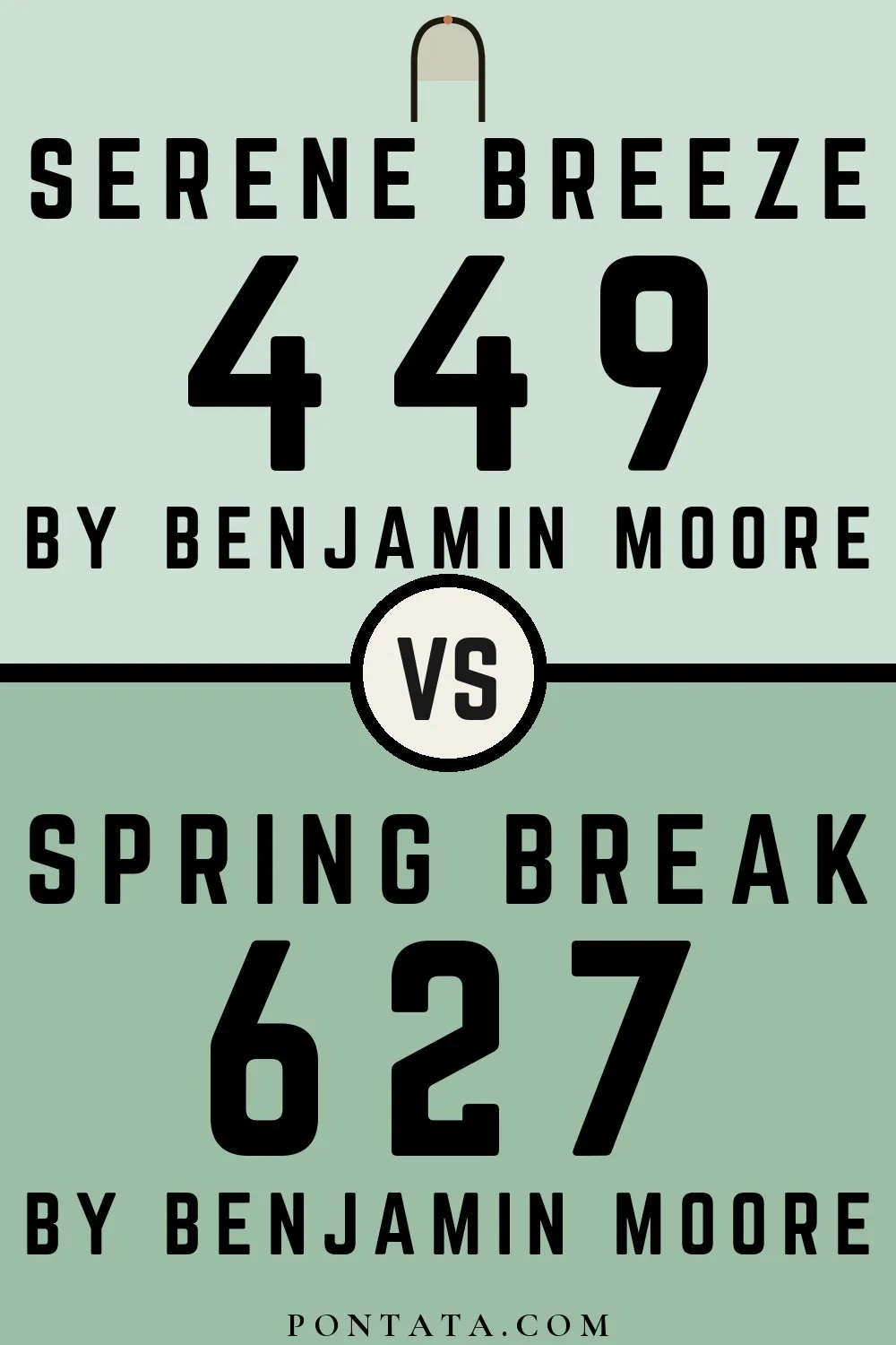
At LRV 69 vs 46, Serene Breeze is decisively the brighter choice.


A 5-point LRV gap (69 vs 64) makes Serene Breeze the marginally brighter of the two.


At LRV 69 vs 56, Serene Breeze is decisively the brighter choice.


Their light reflectance is nearly identical (LRV 69 vs 67), so neither reads brighter in a room.


A 11-point LRV gap (69 vs 58) makes Serene Breeze the marginally brighter of the two.
Color Codes
Manufacturer description
A touch of blue-gray brings buoyancy and calm to this pale green.