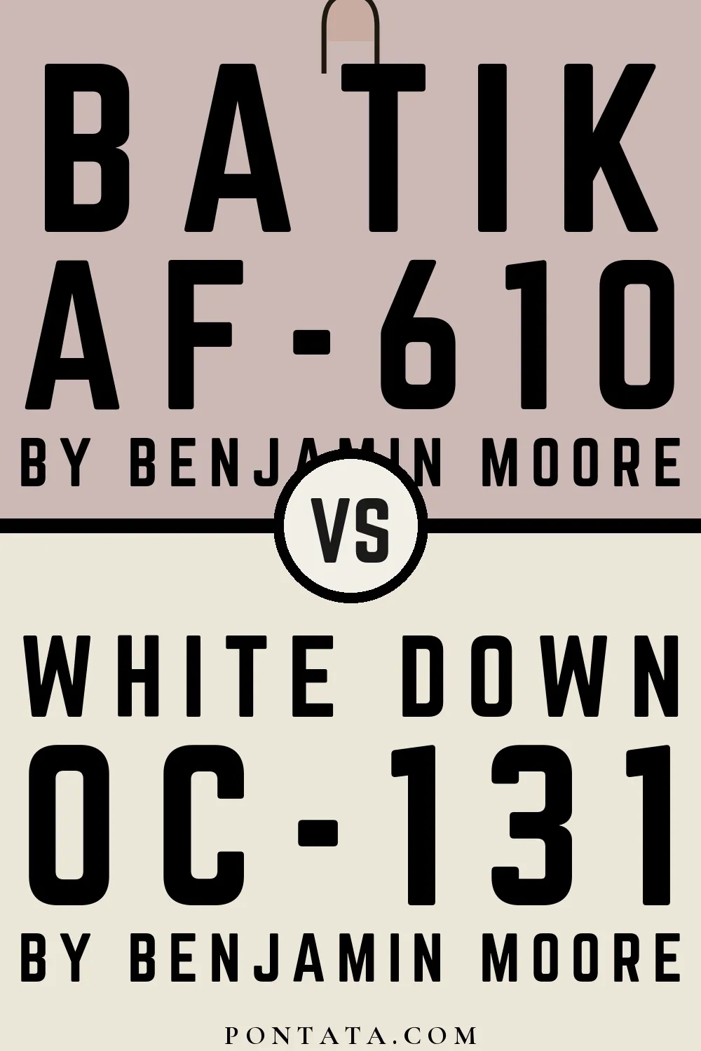
Batik vs White Down
Both are Benjamin Moore colors. Batik reads as pink, while White Down reads as beige-white — two distinct hue families, not close cousins. At LRV 77 vs 50, White Down will read as the brighter of the two — a 26-point gap that matters most in north-facing or low-light rooms. The tonal difference — Batik's red character against White Down's yellow — becomes most visible against white trim or in morning light. At ΔE 16.6, these are genuinely distinct colors — a strong contrast if used together, or a meaningful choice between two different directions. Below, 5 simulated room previews show how each color reads at scale — real-room photos will be added as they become available.
Color Details
Batik vs White Down Simulated Comparison
5 simulated room previews — drag the slider on each to see Batik on one side and White Down on the other.


Digital color is approximate. These simulations are generated from the manufacturer's hex values and overlaid on grayscale room photos — your screen's calibration, brightness, and viewing angle all affect how they render. Before committing to either color, test physical samples in your own space under the light you actually live with.