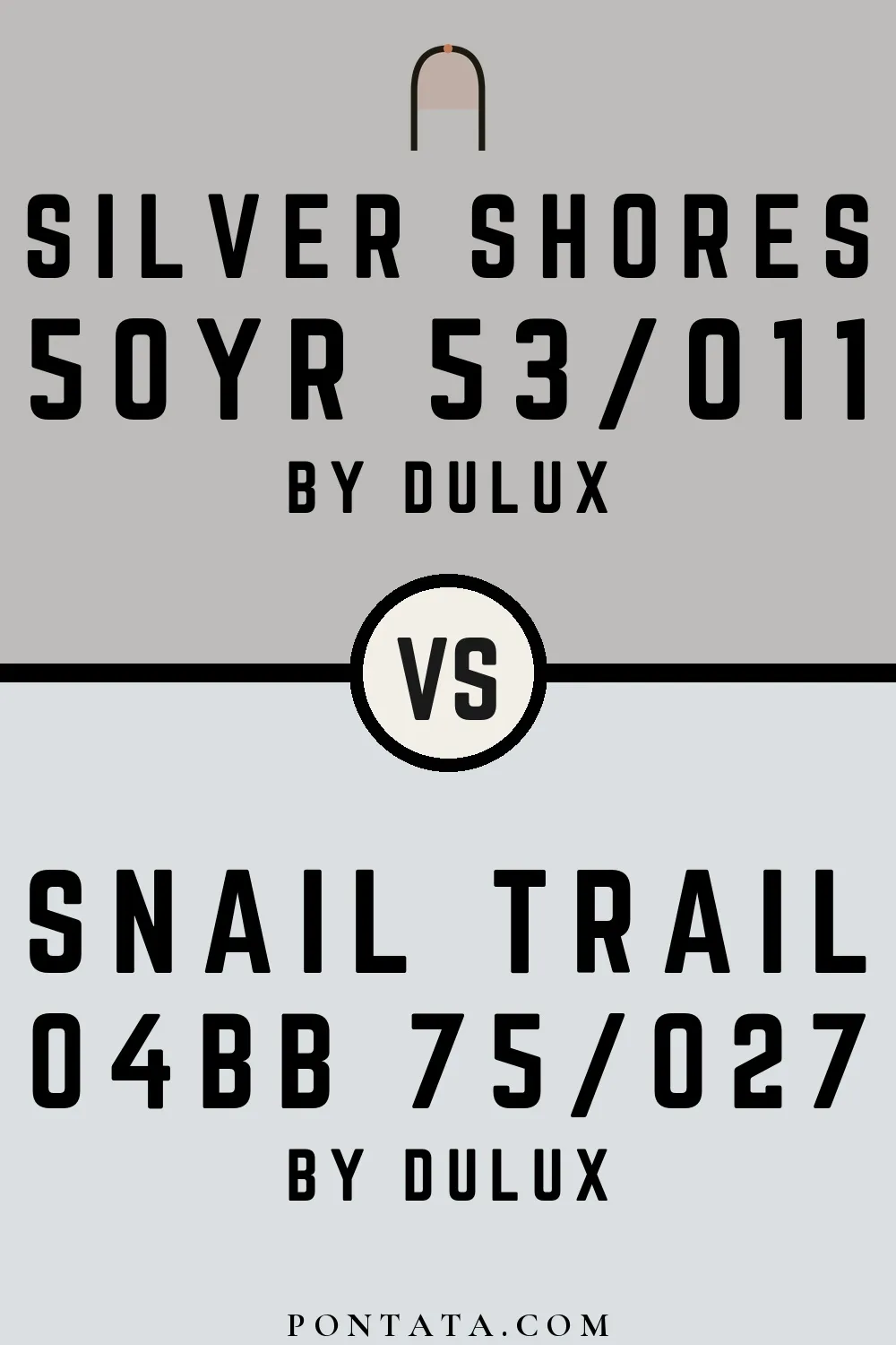
Silver Shores vs Snail Trail
Both are Dulux colors. Hue-wise, Silver Shores belongs to the grey family and Snail Trail to the blue-white family. At LRV 75 vs 53, Snail Trail will read as the brighter of the two — a 22-point gap that matters most in north-facing or low-light rooms. The tonal difference — Silver Shores's neutral character against Snail Trail's cool — becomes most visible against white trim or in morning light. At ΔE 12.9, these are genuinely distinct colors — a strong contrast if used together, or a meaningful choice between two different directions. Below you'll find 1 real-room photo comparison where both colors appear side by side, plus 5 simulated room previews.
Silver Shores vs Snail Trail in Real Spaces
1 real room side by side. Seeing Silver Shores and Snail Trail in actual rooms makes the difference concrete; browse the spaces below to get a feel for how each color lives on a wall.
Living Room
Living rooms test a color across a full range of conditions — morning sun, afternoon shade, and evening lamp light all shift how both of these read. Snail Trail returns significantly more light to the room — in a smaller or darker space, that difference in perceived brightness is hard to miss.


Color Details
Silver Shores vs Snail Trail Simulated Comparison
5 simulated room previews — drag the slider on each to see Silver Shores on one side and Snail Trail on the other.


Digital color is approximate. These simulations are generated from the manufacturer's hex values and overlaid on grayscale room photos — your screen's calibration, brightness, and viewing angle all affect how they render. Before committing to either color, test physical samples in your own space under the light you actually live with.