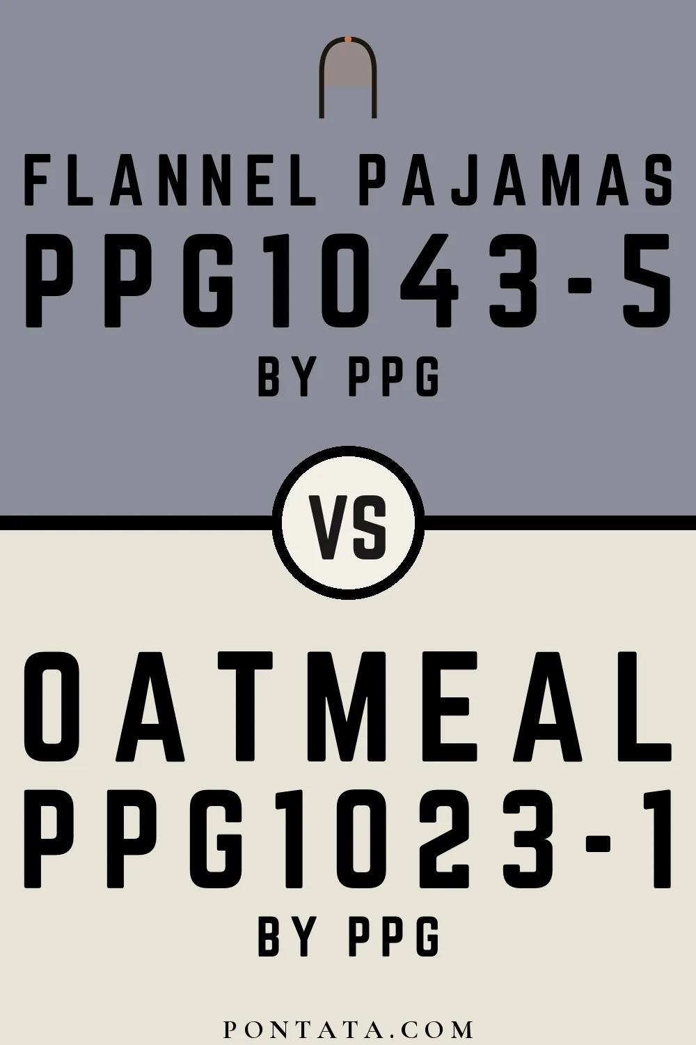
Flannel Pajamas vs Oatmeal
Both are PPG colors. Flannel Pajamas reads as blue-grey, while Oatmeal reads as beige-greige — two distinct hue families, not close cousins. At LRV 76 vs 27, Oatmeal will read as the brighter of the two — a 49-point gap that matters most in north-facing or low-light rooms. At ΔE 34.1, these are genuinely distinct colors — a strong contrast if used together, or a meaningful choice between two different directions. Below you'll find 10 real-room photo comparisons where both colors appear side by side, plus 5 simulated room previews.
Flannel Pajamas vs Oatmeal in Real Spaces
10 real rooms side by side. Seeing Flannel Pajamas and Oatmeal in actual rooms makes the difference concrete; browse the spaces below to get a feel for how each color lives on a wall.
Living Room
Living rooms test a color across a full range of conditions — morning sun, afternoon shade, and evening lamp light all shift how both of these read. Oatmeal returns significantly more light to the room — in a smaller or darker space, that difference in perceived brightness is hard to miss.


Bedroom
Bedroom walls are often seen under warm artificial light, a context that shifts both colors from how they look on a chip. The LRV gap is large enough that Oatmeal will make the room feel meaningfully brighter than Flannel Pajamas would.


Kitchen
Kitchen lighting tends to be bright and directional, which sharpens contrast and makes undertone differences more apparent. The LRV gap is large enough that Oatmeal will make the room feel meaningfully brighter than Flannel Pajamas would.


Dining Room
Dining room light is typically the warmest in the house, which shifts both colors toward the red end of the spectrum compared to daylight. Oatmeal reflects noticeably more light off the walls, making the space read more open than Flannel Pajamas.


Bathroom
Bathrooms amplify color — the enclosed space and reflective surfaces make what reads subtle elsewhere feel more present here. The LRV gap is large enough that Oatmeal will make the room feel meaningfully brighter than Flannel Pajamas would.


Home Office
In a home office, wall color sits in your peripheral vision for hours at a time, so temperature and undertone matter more than you might expect. The LRV gap is large enough that Oatmeal will make the room feel meaningfully brighter than Flannel Pajamas would.


Mudroom
A mudroom color needs to hold up under the most casual scrutiny: a glance as you're coming and going, often in mixed or artificial light. Oatmeal reflects noticeably more light off the walls, making the space read more open than Flannel Pajamas.


Patio
Patio colors are seen under changing outdoor light throughout the day — morning, midday, and golden hour each reveal different qualities. Oatmeal reflects noticeably more light off the walls, making the space read more open than Flannel Pajamas.


House
At full exterior scale, the difference between these two colors becomes much easier to judge than from a small chip. The LRV gap is large enough that Oatmeal will make the room feel meaningfully brighter than Flannel Pajamas would.


Front Door
Front doors are seen in isolation against the rest of the facade, which makes them a high-stakes surface where even subtle differences matter. Oatmeal returns significantly more light to the room — in a smaller or darker space, that difference in perceived brightness is hard to miss.


Color Details
Flannel Pajamas vs Oatmeal Simulated Comparison
5 simulated room previews — drag the slider on each to see Flannel Pajamas on one side and Oatmeal on the other.


Digital color is approximate. These simulations are generated from the manufacturer's hex values and overlaid on grayscale room photos — your screen's calibration, brightness, and viewing angle all affect how they render. Before committing to either color, test physical samples in your own space under the light you actually live with.