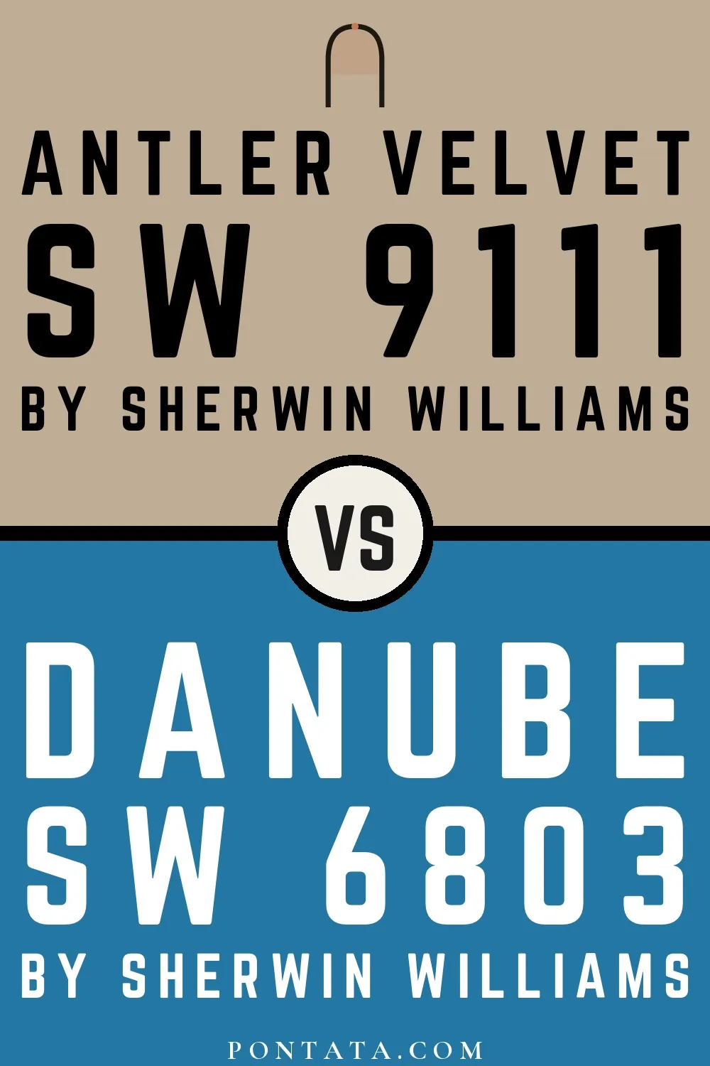
Antler Velvet vs Danube
Both from Sherwin-Williams's palette. Hue-wise, Antler Velvet belongs to the beige-greige family and Danube to the blue family. Antler Velvet (LRV 43) reflects noticeably more light than Danube (LRV 16), a difference of 27 points that becomes especially apparent in rooms with limited natural light. Antler Velvet runs warm while Danube is decidedly cool, which means they'll respond very differently to warm vs cool light sources. With a ΔE of 52.3, the contrast is hard to miss. These aren't variations on a theme — they're two different answers to the same question. Below you'll find 1 real-room photo comparison where both colors appear side by side, plus 5 simulated room previews.
Antler Velvet vs Danube in Real Spaces
1 real room side by side. Seeing Antler Velvet and Danube in actual rooms makes the difference concrete; browse the spaces below to get a feel for how each color lives on a wall.
Living Room
In a living room, color works across both daylight and evening light — the same wall can read very differently at noon and at 8pm. The LRV gap is large enough that Antler Velvet will make the room feel meaningfully brighter than Danube would.


Color Details
Antler Velvet vs Danube Simulated Comparison
5 simulated room previews — drag the slider on each to see Antler Velvet on one side and Danube on the other.


Digital color is approximate. These simulations are generated from the manufacturer's hex values and overlaid on grayscale room photos — your screen's calibration, brightness, and viewing angle all affect how they render. Before committing to either color, test physical samples in your own space under the light you actually live with.