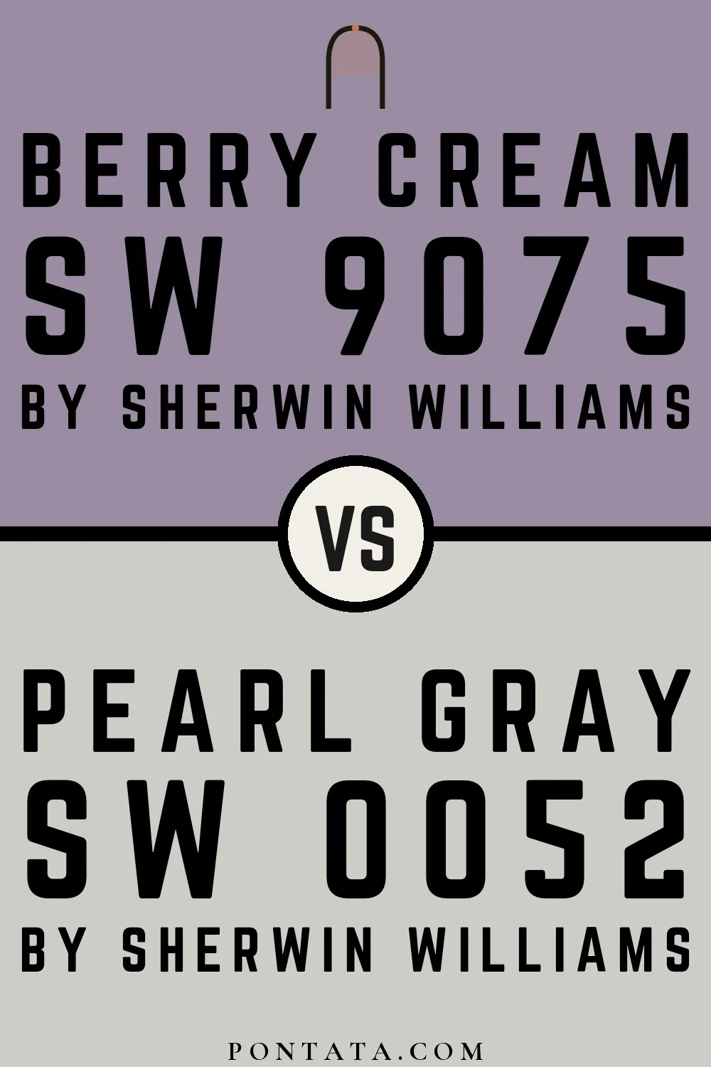
Berry Cream vs Pearl Gray
Berry Cream and Pearl Gray come from the same Sherwin-Williams collection. Hue-wise, Berry Cream belongs to the grey family and Pearl Gray to the green-grey family. The 33-point LRV gap — 61 for Pearl Gray vs 28 for Berry Cream — means Pearl Gray will open up a space more effectively. Where Berry Cream leans cool, Pearl Gray reads neutral — a distinction that shifts noticeably depending on the light source and surrounding finishes. A ΔE of 28.8 puts these firmly in different territory — two distinct design choices rather than close alternatives. Below you'll find 4 real-room photo comparisons where both colors appear side by side, plus 5 simulated room previews.
Berry Cream vs Pearl Gray in Real Spaces
4 real rooms side by side. Seeing Berry Cream and Pearl Gray in actual rooms makes the difference concrete; browse the spaces below to get a feel for how each color lives on a wall.
Living Room
A living room wall sees more varied light than almost any other surface in the house, which makes the choice between these two more nuanced than a chip suggests. Pearl Gray reflects noticeably more light off the walls, making the space read more open than Berry Cream.


Bedroom
Bedrooms are typically lit with warmer, lower light than the rest of the house — a condition that flatters warm tones and deepens cool ones. Pearl Gray returns significantly more light to the room — in a smaller or darker space, that difference in perceived brightness is hard to miss.


Bathroom
Small bathrooms intensify color. A shade that seems quiet in a larger room can feel immersive when you're surrounded by it on four walls. Pearl Gray returns significantly more light to the room — in a smaller or darker space, that difference in perceived brightness is hard to miss.

House
A full exterior is the most demanding test for a paint color — scale and outdoor light both amplify differences that seem small on a swatch. Pearl Gray returns significantly more light to the room — in a smaller or darker space, that difference in perceived brightness is hard to miss.


Color Details
Berry Cream vs Pearl Gray Simulated Comparison
5 simulated room previews — drag the slider on each to see Berry Cream on one side and Pearl Gray on the other.


Digital color is approximate. These simulations are generated from the manufacturer's hex values and overlaid on grayscale room photos — your screen's calibration, brightness, and viewing angle all affect how they render. Before committing to either color, test physical samples in your own space under the light you actually live with.
More Berry Cream comparisons
See how Berry Cream stacks up against other well-photographed colors across different brands and tones.


Snowbound reflects far more light (LRV 83 vs 28), opening up a space where Berry Cream encloses it.


Berry Cream reflects far more light (LRV 28 vs 12), opening up a space where Pewter Green encloses it.