Match Pretty in Pink

Benjamin Moore Pretty in Pink is a mid-tone shade, warm in character with an LRV of 41. The matches below are ranked by ΔE, a perceptual color-difference score.

View full Pretty in Pink color page →
Pretty in Pink
Benjamin Moore
Pretty in Pink
1334#EF949DLRV 41Warm

Closest matches across every brand

One match per brand, ranked by ΔE — a perceptual color difference score calculated from Lab color space values. Lower is closer. Click any card to compare side by side in simulated rooms.

Pretty in Pink
Pretty in Pink
Amaryllis
Amaryllis
Pretty in Pink vs Amaryllis
Benjamin Moore
Pretty in Pink
1334 · LRV 41
Sherwin-Williams
Amaryllis
6591 · LRV 41

With LRVs of 41 and 41, the two reflect almost the same amount of light. At ΔE 0.9 you'd need them side by side to tell them apart.

View color →ΔE 0.9 — Imperceptible
Pretty in Pink
Pretty in Pink
Primrose Garden
Pretty in Pink vs Primrose Garden
Benjamin Moore
Pretty in Pink
1334 · LRV 41
PPG
Primrose Garden
PPG1185-4 · LRV 42

With LRVs of 42 and 41, the two reflect almost the same amount of light. At ΔE 2.2 you'd need them side by side to tell them apart.

View color →ΔE 2.2 — Subtle
Heartbeat
Pretty in Pink
Pretty in Pink
Heartbeat vs Pretty in Pink
Benjamin Moore
Heartbeat
1319 · LRV 42
Benjamin Moore
Pretty in Pink
1334 · LRV 41

With LRVs of 42 and 41, the two reflect almost the same amount of light. At ΔE 2.5 you'd need them side by side to tell them apart.

Compare ↔ΔE 2.5 — Subtle
Pretty in Pink
Pretty in Pink
RAL 480-5
RAL 480-5
Pretty in Pink vs RAL 480-5
Benjamin Moore
Pretty in Pink
1334 · LRV 41
RAL EffectEffect
RAL 480-5
RAL 480-5 · LRV 41

Their light reflectance is nearly identical (LRV 41 vs 41), so neither reads brighter in a room. The ΔE 3.3 gap is real but not dramatic — distinct as a choice, harmonious together.

View color →ΔE 3.3 — Noticeable
Pretty in Pink
Pretty in Pink
Dollie
Dollie
Pretty in Pink vs Dollie
Benjamin Moore
Pretty in Pink
1334 · LRV 41
Cloverdale Paint
Dollie
1115 · LRV 41

With LRVs of 41 and 41, the two reflect almost the same amount of light. At ΔE 4.2 they're clearly different, yet close enough to share a room.

View color →ΔE 4.2 — Noticeable
Watermelon Punch
Watermelon Punch
Pretty in Pink
Pretty in Pink
Watermelon Punch vs Pretty in Pink
Behr
Watermelon Punch
PPU1-04A · LRV 36
Benjamin Moore
Pretty in Pink
1334 · LRV 41

Pretty in Pink reads slightly lighter (LRV 41 vs 36), a gap that shows most in low-lit rooms. At ΔE 11.0 these are two genuinely different directions, not variations on a theme.

View color →ΔE 11.0 — Distinct
Pretty in Pink
Pretty in Pink
Antique pink
Antique pink
Pretty in Pink vs Antique pink
Benjamin Moore
Pretty in Pink
1334 · LRV 41
RAL ClassicClassic
Antique pink
RAL 3014 · LRV 28

At LRV 41 vs 28, Pretty in Pink is decisively the brighter choice. A ΔE of 13.3 puts them firmly in different territory — a strong contrast if combined.

View color →ΔE 13.3 — Distinct
Pretty in Pink
Pretty in Pink
Flamingo
Pretty in Pink vs Flamingo
Benjamin Moore
Pretty in Pink
1334 · LRV 41
Tikkurila
Flamingo
K319 · LRV 34

A 7-point LRV gap (41 vs 34) makes Pretty in Pink the marginally brighter of the two. A ΔE of 13.3 puts them firmly in different territory — a strong contrast if combined.

View color →ΔE 13.3 — Distinct
Pretty in Pink
Pretty in Pink
Cooing Doves
Cooing Doves
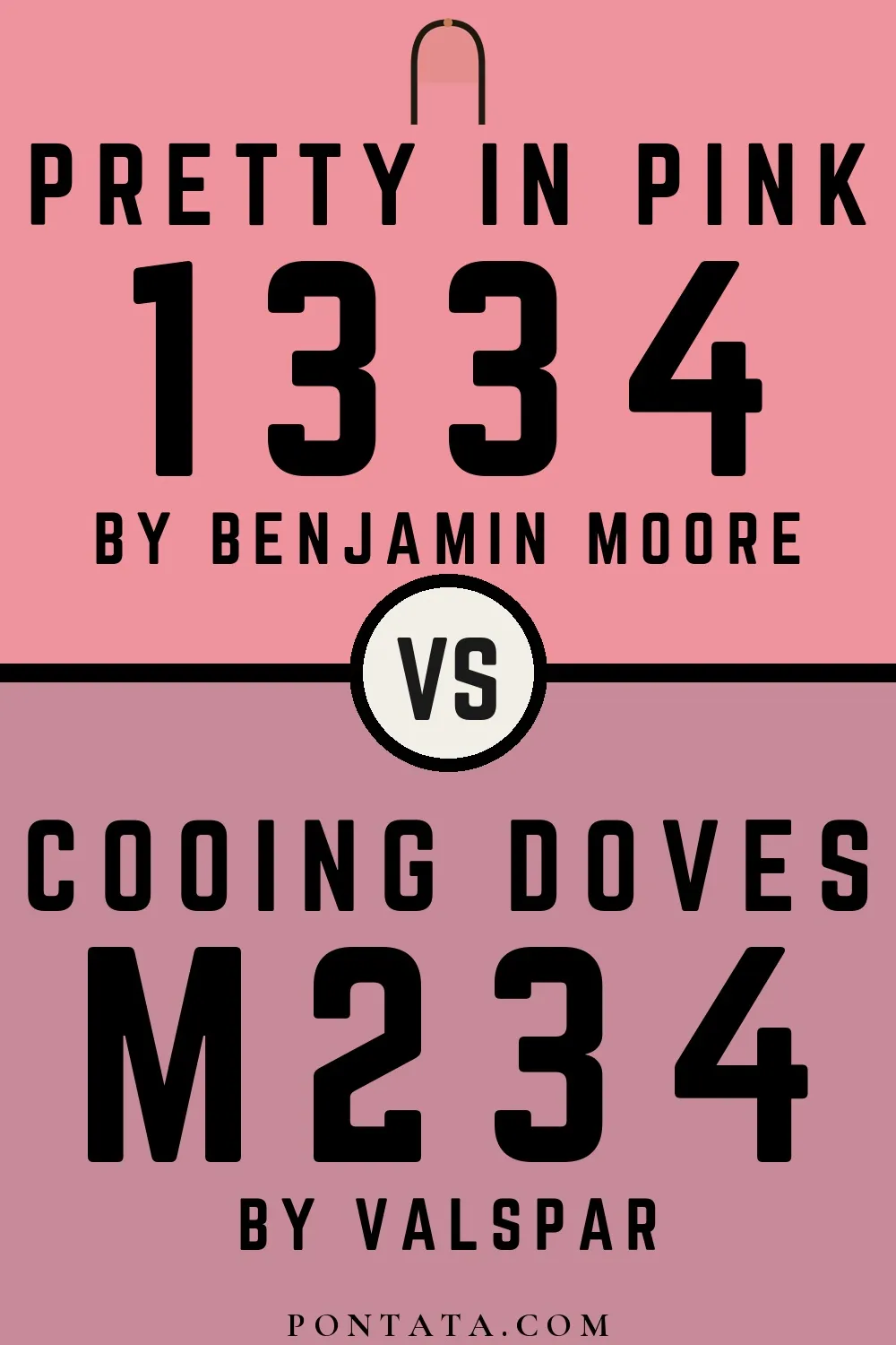
Pretty in Pink vs Cooing Doves
Benjamin Moore
Pretty in Pink
1334 · LRV 41
Valspar
Cooing Doves
M234 · LRV 33

Pretty in Pink reads slightly lighter (LRV 41 vs 33), a gap that shows most in low-lit rooms. At ΔE 15.0 these are two genuinely different directions, not variations on a theme.

View color →ΔE 15.0 — Distinct
Pretty in Pink
Pretty in Pink
Rangwali
Rangwali
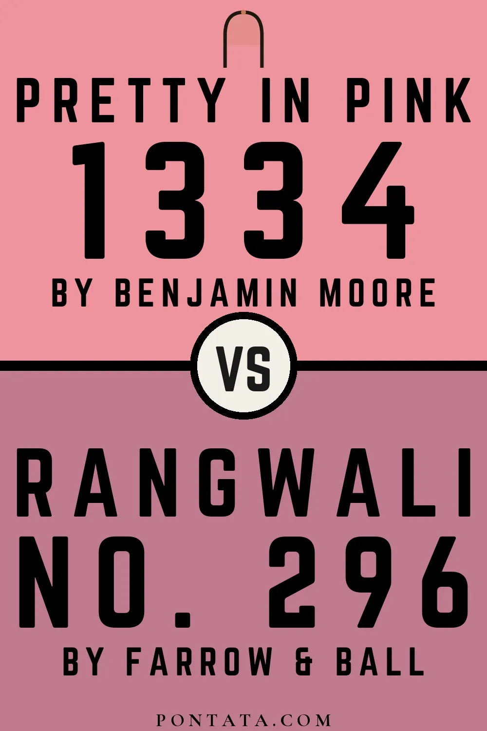
Pretty in Pink vs Rangwali
Benjamin Moore
Pretty in Pink
1334 · LRV 41
Farrow & Ball
Rangwali
296 · LRV 29

At LRV 41 vs 29, Pretty in Pink is decisively the brighter choice. A ΔE of 16.5 puts them firmly in different territory — a strong contrast if combined.

View color →ΔE 16.5 — Distinct
Pretty in Pink
Pretty in Pink
Carmine
Carmine
Pretty in Pink vs Carmine
Benjamin Moore
Pretty in Pink
1334 · LRV 41
Little Greene
Carmine
189 · LRV 25

Pretty in Pink reflects far more light (LRV 41 vs 25), opening up a space where Carmine encloses it. At ΔE 18.3 these are two genuinely different directions, not variations on a theme.

View color →ΔE 18.3 — Distinct
Pretty in Pink
Pretty in Pink
Raspberry Diva
Raspberry Diva
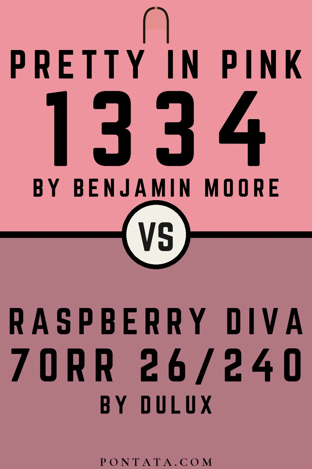
Pretty in Pink vs Raspberry Diva
Benjamin Moore
Pretty in Pink
1334 · LRV 41
Dulux
Raspberry Diva
70RR 26/240 · LRV 26

At LRV 41 vs 26, Pretty in Pink is decisively the brighter choice. A ΔE of 19.1 puts them firmly in different territory — a strong contrast if combined.

View color →ΔE 19.1 — Distinct
Pretty in Pink
Pretty in Pink
Muted Coral
Muted Coral
Pretty in Pink vs Muted Coral
Benjamin Moore
Pretty in Pink
1334 · LRV 41
Jotun
Muted Coral
20217 · LRV 27

At LRV 41 vs 27, Pretty in Pink is decisively the brighter choice. A ΔE of 21.5 puts them firmly in different territory — a strong contrast if combined.

View color →ΔE 21.5 — Distinct
Pretty in Pink
Pretty in Pink
S 4010-Y50R
S 4010-Y50R
Pretty in Pink vs S 4010-Y50R
Benjamin Moore
Pretty in Pink
1334 · LRV 41
NCS
S 4010-Y50R
S 4010-Y50R · LRV 30

Pretty in Pink reads slightly lighter (LRV 41 vs 30), a gap that shows most in low-lit rooms. At ΔE 29.8 these are two genuinely different directions, not variations on a theme.

View color →ΔE 29.8 — Very different