Match Look at the Bright Side
Cloverdale Paint Look at the Bright Side is a light-reflective shade with an LRV of 62. The matches below are ranked by ΔE, a perceptual color-difference score.
View full Look at the Bright Side color page →

Closest matches across every brand
One match per brand, ranked by ΔE — a perceptual color difference score calculated from Lab color space values. Lower is closer. Click any card to compare side by side in simulated rooms.


Look at the Bright Side reflects far more light (LRV 62 vs 50), opening up a space where Bumble Bee Yellow encloses it. At ΔE 4.4 they're clearly different, yet close enough to share a room.


Their light reflectance is nearly identical (LRV 62 vs 61), so neither reads brighter in a room. The ΔE 4.6 gap is real but not dramatic — distinct as a choice, harmonious together.


Look at the Bright Side reflects far more light (LRV 62 vs 44), opening up a space where RAL 290-6 encloses it. At ΔE 6.1 they're clearly different, yet close enough to share a room.


A 7-point LRV gap (62 vs 55) makes Look at the Bright Side the marginally brighter of the two. The ΔE 7.1 gap is real but not dramatic — distinct as a choice, harmonious together.

Look at the Bright Side reads slightly lighter (LRV 62 vs 56), a gap that shows most in low-lit rooms. At ΔE 8.1 they're clearly different, yet close enough to share a room.


Their light reflectance is nearly identical (LRV 62 vs 62), so neither reads brighter in a room. The ΔE 8.8 gap is real but not dramatic — distinct as a choice, harmonious together.


At LRV 62 vs 45, Look at the Bright Side is decisively the brighter choice. The ΔE 9.8 gap is real but not dramatic — distinct as a choice, harmonious together.
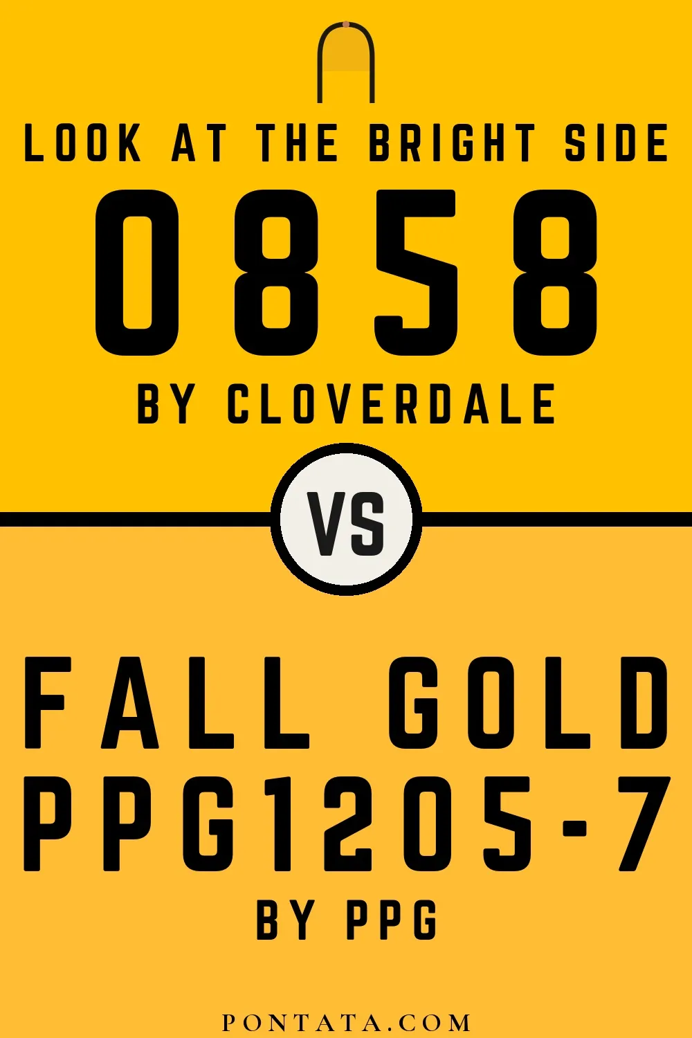

Look at the Bright Side reads slightly lighter (LRV 62 vs 56), a gap that shows most in low-lit rooms. At ΔE 13.3 these are two genuinely different directions, not variations on a theme.


Look at the Bright Side reflects far more light (LRV 62 vs 43), opening up a space where N302 encloses it. At ΔE 14.2 these are two genuinely different directions, not variations on a theme.


A 8-point LRV gap (62 vs 54) makes Look at the Bright Side the marginally brighter of the two. A ΔE of 24.6 puts them firmly in different territory — a strong contrast if combined.

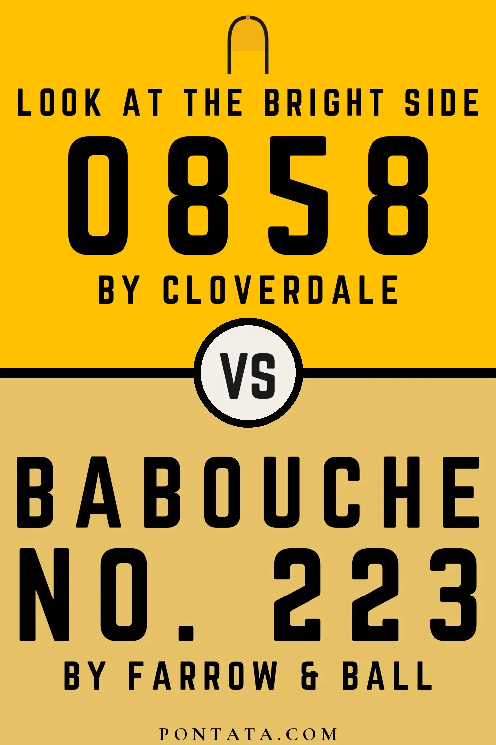

Look at the Bright Side reads slightly lighter (LRV 62 vs 57), a gap that shows most in low-lit rooms. At ΔE 37.4 these are two genuinely different directions, not variations on a theme.
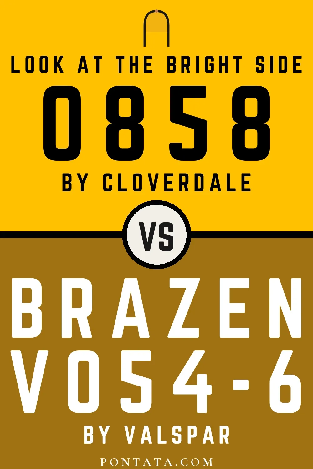

Look at the Bright Side reflects far more light (LRV 62 vs 19), opening up a space where Brazen encloses it. At ΔE 42.7 these are two genuinely different directions, not variations on a theme.


At LRV 62 vs 37, Look at the Bright Side is decisively the brighter choice. A ΔE of 54.5 puts them firmly in different territory — a strong contrast if combined.


Look at the Bright Side reflects far more light (LRV 62 vs 33), opening up a space where S 3030-Y30R encloses it. At ΔE 54.8 these are two genuinely different directions, not variations on a theme.