Match RAL 570-5

RAL Effect RAL 570-5 is a deep, low-reflectance shade with an LRV of 22. The matches below are ranked by ΔE, a perceptual color-difference score.

View full RAL 570-5 color page →
RAL 570-5
RAL EffectEffect
RAL 570-5
RAL 570-5#8078B3LRV 22

Closest matches across every brand

One match per brand, ranked by ΔE — a perceptual color difference score calculated from Lab color space values. Lower is closer. Click any card to compare side by side in simulated rooms.

Purple Rhapsody
RAL 570-5
RAL 570-5
Purple Rhapsody vs RAL 570-5
PPG
Purple Rhapsody
PPG1247-6 · LRV 22
RAL EffectEffect
RAL 570-5
RAL 570-5 · LRV 22

Their light reflectance is nearly identical (LRV 22 vs 22), so neither reads brighter in a room. The ΔE 3.5 gap is real but not dramatic — distinct as a choice, harmonious together.

Compare ↔ΔE 3.5Noticeable
California Lilac
RAL 570-5
RAL 570-5
California Lilac vs RAL 570-5
Benjamin Moore
California Lilac
2068-40 · LRV 27
RAL EffectEffect
RAL 570-5
RAL 570-5 · LRV 22

California Lilac reads slightly lighter (LRV 27 vs 22), a gap that shows most in low-lit rooms. At ΔE 5.8 they're clearly different, yet close enough to share a room.
Compare ↔ΔE 5.8Noticeable
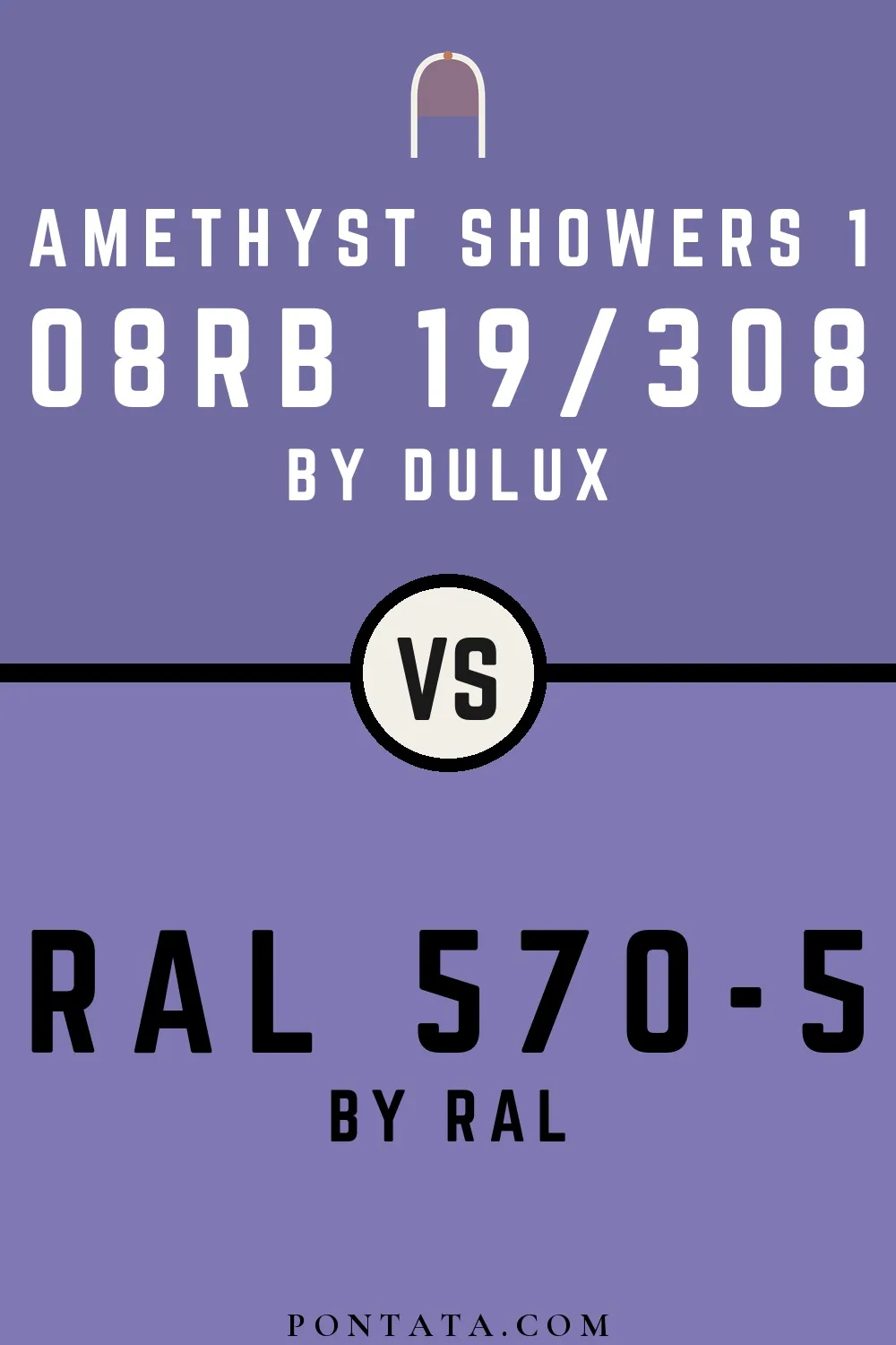
Amethyst Showers 1
RAL 570-5
RAL 570-5
Amethyst Showers 1 vs RAL 570-5
Dulux
Amethyst Showers 1
08RB 19/308 · LRV 19
RAL EffectEffect
RAL 570-5
RAL 570-5 · LRV 22

RAL 570-5 reads slightly lighter (LRV 22 vs 19), a gap that shows most in low-lit rooms. At ΔE 5.9 they're clearly different, yet close enough to share a room.

Compare ↔ΔE 5.9Noticeable
Crown Jewels
Crown Jewels
RAL 570-5
RAL 570-5
Crown Jewels vs RAL 570-5
Cloverdale Paint
Crown Jewels
1193 · LRV 22
RAL EffectEffect
RAL 570-5
RAL 570-5 · LRV 22

With LRVs of 22 and 22, the two reflect almost the same amount of light. At ΔE 6.3 they're clearly different, yet close enough to share a room.

Compare ↔ΔE 6.3Noticeable
RAL 570-5
RAL 570-6
RAL 570-5
RAL 570-6
RAL EffectEffect
RAL 570-5
RAL 570-5 · LRV 22
RAL EffectEffect
RAL 570-6
RAL 570-6 · LRV 17

A 5-point LRV gap (22 vs 17) makes RAL 570-5 the marginally brighter of the two. The ΔE 7.7 gap is real but not dramatic — distinct as a choice, harmonious together.

Compare ↔ΔE 7.7Noticeable
Blue lilac
Blue lilac
RAL 570-5
RAL 570-5
Blue lilac vs RAL 570-5
RAL ClassicClassic
Blue lilac
RAL 4005 · LRV 19
RAL EffectEffect
RAL 570-5
RAL 570-5 · LRV 22

A 3-point LRV gap (22 vs 19) makes RAL 570-5 the marginally brighter of the two. The ΔE 7.9 gap is real but not dramatic — distinct as a choice, harmonious together.

Compare ↔ΔE 7.9Noticeable
RAL 570-5
RAL 570-5
Forget-Me-Not
Forget-Me-Not
RAL 570-5 vs Forget-Me-Not
RAL EffectEffect
RAL 570-5
RAL 570-5 · LRV 22
Sherwin-Williams
Forget-Me-Not
6824 · LRV 16

A 6-point LRV gap (22 vs 16) makes RAL 570-5 the marginally brighter of the two. The ΔE 9.0 gap is real but not dramatic — distinct as a choice, harmonious together.

Compare ↔ΔE 9.0Noticeable
Mambo
Mambo
RAL 570-5
RAL 570-5
Mambo vs RAL 570-5
Little Greene
Mambo
112 · LRV 17
RAL EffectEffect
RAL 570-5
RAL 570-5 · LRV 22

RAL 570-5 reads slightly lighter (LRV 22 vs 17), a gap that shows most in low-lit rooms. At ΔE 13.3 these are two genuinely different directions, not variations on a theme.

Compare ↔ΔE 13.3Distinct
I Heart Potion
I Heart Potion
RAL 570-5
RAL 570-5
I Heart Potion vs RAL 570-5
Behr
I Heart Potion
P100-5 · LRV 29
RAL EffectEffect
RAL 570-5
RAL 570-5 · LRV 22

I Heart Potion reads slightly lighter (LRV 29 vs 22), a gap that shows most in low-lit rooms. At ΔE 14.3 these are two genuinely different directions, not variations on a theme.

Compare ↔ΔE 14.3Distinct
Pitch Blue
RAL 570-5
Pitch Blue
RAL 570-5
Farrow & Ball
Pitch Blue
220 · LRV 15
RAL EffectEffect
RAL 570-5
RAL 570-5 · LRV 22

RAL 570-5 reads slightly lighter (LRV 22 vs 15), a gap that shows most in low-lit rooms. At ΔE 17.7 these are two genuinely different directions, not variations on a theme.

Compare ↔ΔE 17.7Distinct
RAL 570-5
RAL 570-5
L356
RAL 570-5 vs L356
RAL EffectEffect
RAL 570-5
RAL 570-5 · LRV 22
Tikkurila
L356
L356 · LRV 12

A 10-point LRV gap (22 vs 12) makes RAL 570-5 the marginally brighter of the two. A ΔE of 19.0 puts them firmly in different territory — a strong contrast if combined.

Compare ↔ΔE 19.0Distinct
Blue Harmony
Blue Harmony
RAL 570-5
RAL 570-5
Blue Harmony vs RAL 570-5
Jotun
Blue Harmony
4594 · LRV 17
RAL EffectEffect
RAL 570-5
RAL 570-5 · LRV 22

RAL 570-5 reads slightly lighter (LRV 22 vs 17), a gap that shows most in low-lit rooms. At ΔE 29.0 these are two genuinely different directions, not variations on a theme.

Compare ↔ΔE 29.0Very different
S 5010-R90B
RAL 570-5
RAL 570-5
S 5010-R90B vs RAL 570-5
NCS
S 5010-R90B
S 5010-R90B · LRV 19
RAL EffectEffect
RAL 570-5
RAL 570-5 · LRV 22

Their light reflectance is nearly identical (LRV 22 vs 19), so neither reads brighter in a room. A ΔE of 29.6 puts them firmly in different territory — a strong contrast if combined.

Compare ↔ΔE 29.6Very different
RAL 570-5
RAL 570-5
Passageway
Passageway
RAL 570-5 vs Passageway
RAL EffectEffect
RAL 570-5
RAL 570-5 · LRV 22
Valspar
Passageway
V137-6 · LRV 14

A 8-point LRV gap (22 vs 14) makes RAL 570-5 the marginally brighter of the two. A ΔE of 31.3 puts them firmly in different territory — a strong contrast if combined.

Compare ↔ΔE 31.3Very different