
Fruity Cocktail
Benjamin Moore's Fruity Cocktail is a orange shade whose quieter details emerge through comparison. A red undertone may emerge most clearly where the paint meets a cleaner white, stone surface or contrasting textile. Its related shades below reveal where the color harmonizes—and where contrast brings it fully to life.
Hex
#F99D48LRV
42.39
Coordinating Colors


At LRV 70 vs 42, Ivory Porcelain is decisively the brighter choice.

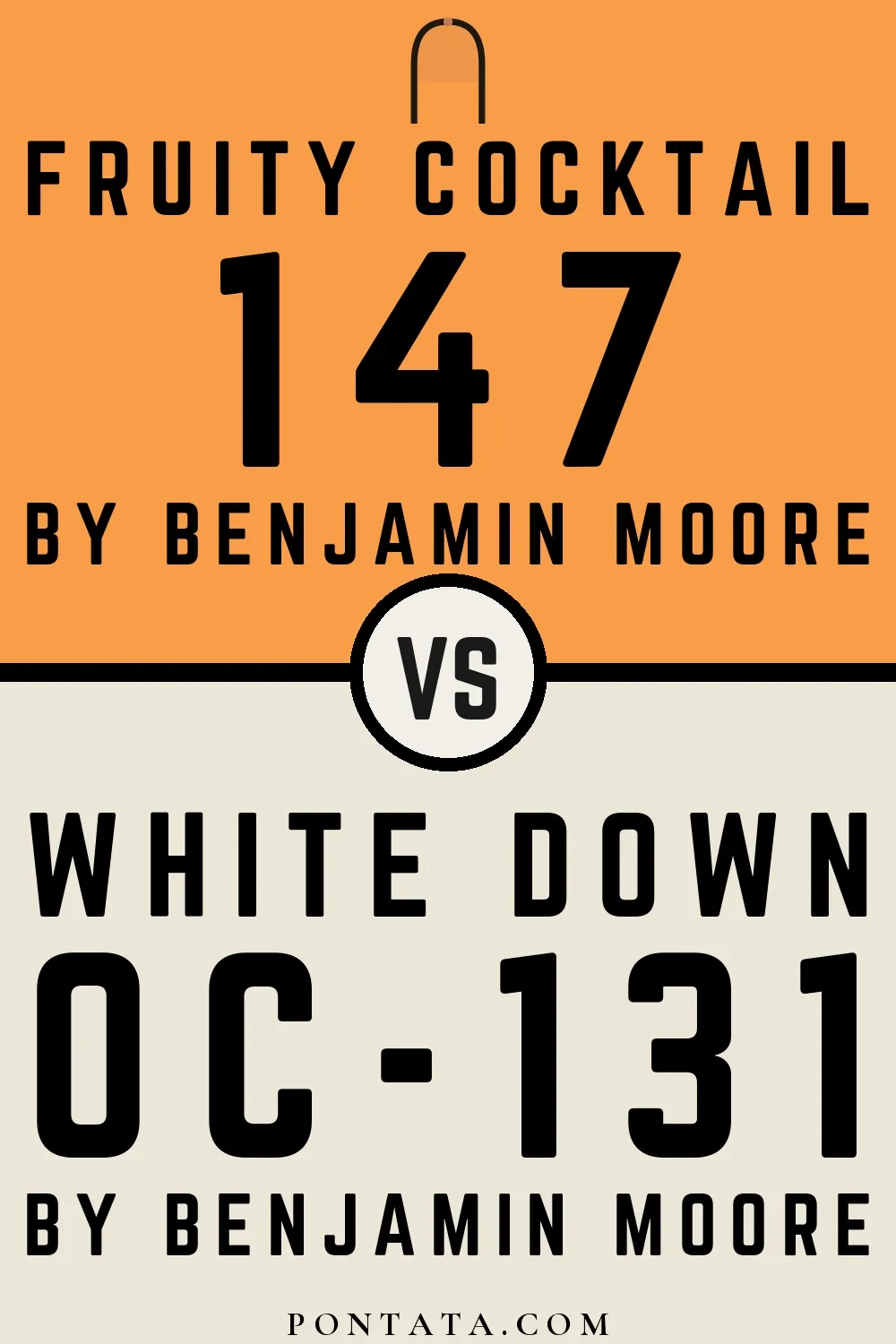
White Down reflects far more light (LRV 77 vs 42), opening up a space where Fruity Cocktail encloses it.

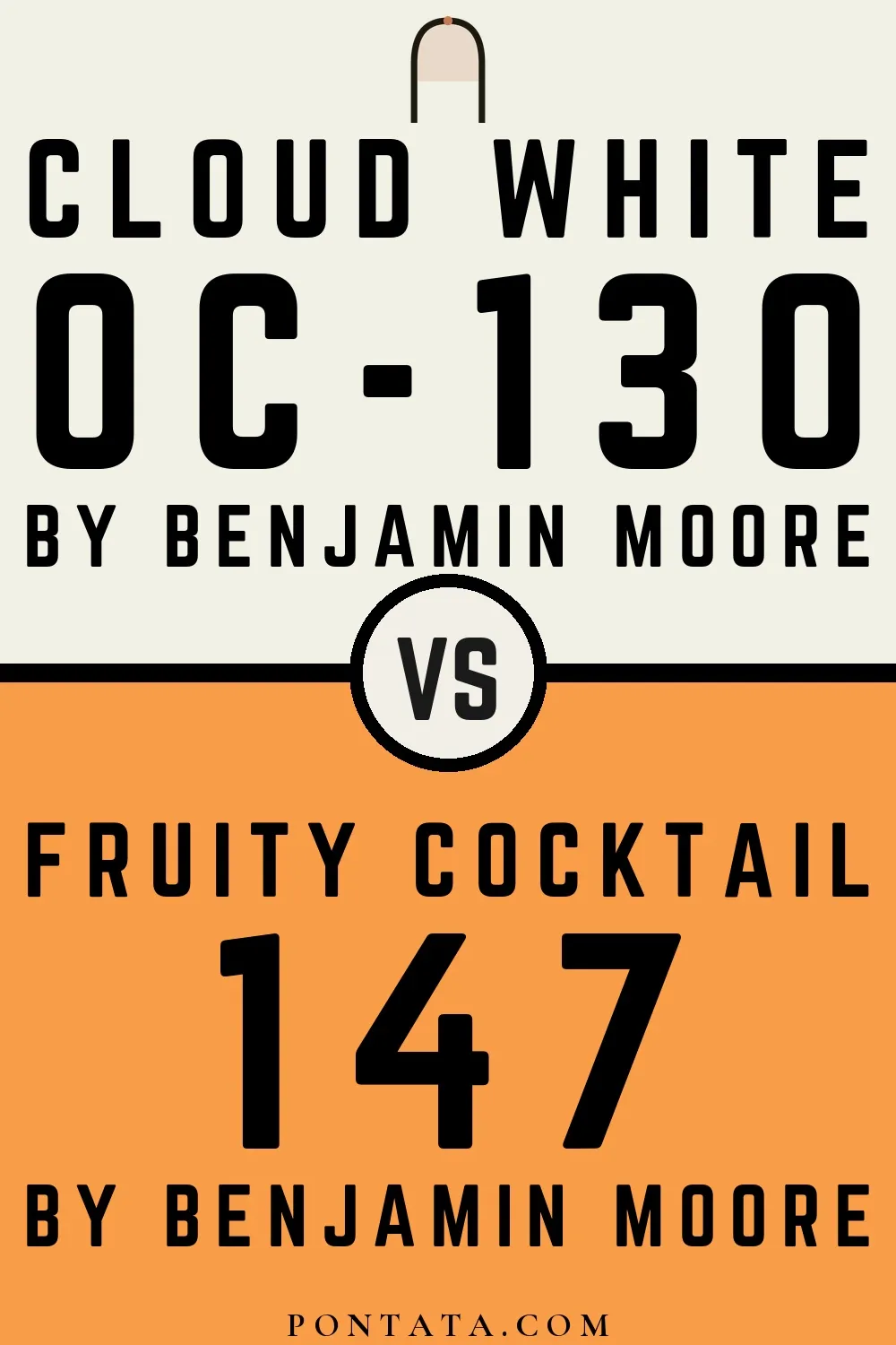
Cloud White reflects far more light (LRV 85 vs 42), opening up a space where Fruity Cocktail encloses it.


Simply White reflects far more light (LRV 90 vs 42), opening up a space where Fruity Cocktail encloses it.
Similar Colors


With LRVs of 45 and 42, the two reflect almost the same amount of light.


Fruity Cocktail reads slightly lighter (LRV 42 vs 39), a gap that shows most in low-lit rooms.


Their light reflectance is nearly identical (LRV 42 vs 41), so neither reads brighter in a room.


A 5-point LRV gap (47 vs 42) makes Mango Punch the marginally brighter of the two.
Lighter Colors


At LRV 55 vs 42, Seville Oranges is decisively the brighter choice.


Tooty Fruity reads slightly lighter (LRV 53 vs 42), a gap that shows most in low-lit rooms.


Golden Archway reads slightly lighter (LRV 48 vs 42), a gap that shows most in low-lit rooms.


Honeybell reflects far more light (LRV 55 vs 42), opening up a space where Fruity Cocktail encloses it.


At LRV 64 vs 42, Honey Burst is decisively the brighter choice.
Darker Colors


A 8-point LRV gap (42 vs 35) makes Fruity Cocktail the marginally brighter of the two.
Their light reflectance is nearly identical (LRV 42 vs 41), so neither reads brighter in a room.


A 5-point LRV gap (42 vs 38) makes Fruity Cocktail the marginally brighter of the two.
Fruity Cocktail reads slightly lighter (LRV 42 vs 39), a gap that shows most in low-lit rooms.

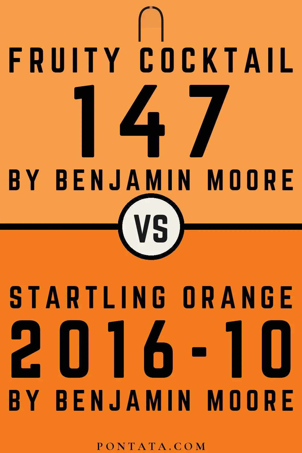
Fruity Cocktail reads slightly lighter (LRV 42 vs 32), a gap that shows most in low-lit rooms.
Color Codes
Manufacturer description
Bold yet buoyant, this dazzling orange expresses a carefree spirit.