
Melrose Pink
Melrose Pink begins as a pink color on paper, then shifts with every surface, shadow and neighboring material. Its pink classifications hint at the directions it may take as daylight, lamps and neighboring colors move around it. Move between the room imagery, color measurements and coordinating shades to build a fuller sense of how it might live in your space.
Hex
#BA7699LRV
26.46
Melrose Pink in Rooms
Follow Melrose Pink from one space to another and watch how light, scale and surrounding materials reshape its character. 1 sourced room photo offers a closer look at the color in lived-in settings.
1 Misc Photo
Melrose Pink (1363) brings its pink character into an assortment of spaces that reveals the color outside a single design formula. Its neutral temperature gives the surrounding palette unusual influence over the final mood.

Wall paint in Melrose Pink creates a delicate, sophisticated finish.
@citytosuburbinteriors
Coordinating Colors

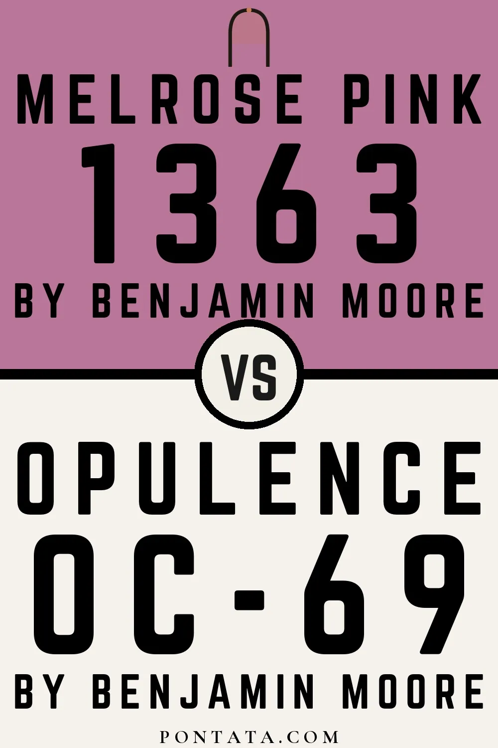

Opulence reflects far more light (LRV 88 vs 26), opening up a space where Melrose Pink encloses it.

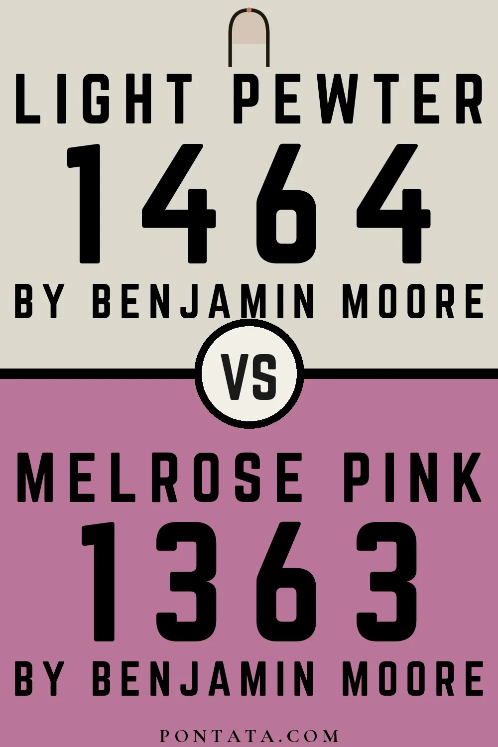
Light Pewter reflects far more light (LRV 68 vs 26), opening up a space where Melrose Pink encloses it.


Porcelain reflects far more light (LRV 57 vs 26), opening up a space where Melrose Pink encloses it.


White Dove reflects far more light (LRV 83 vs 26), opening up a space where Melrose Pink encloses it.
Similar Colors


Begonia reads slightly lighter (LRV 30 vs 26), a gap that shows most in low-lit rooms.


A 5-point LRV gap (31 vs 26) makes Pink Raspberry the marginally brighter of the two.


Their light reflectance is nearly identical (LRV 29 vs 26), so neither reads brighter in a room.


A 4-point LRV gap (30 vs 26) makes Taste of Berry the marginally brighter of the two.
Complementary Colors


Pleasant Valley reflects far more light (LRV 50 vs 26), opening up a space where Melrose Pink encloses it.


Stratton Blue reads slightly lighter (LRV 38 vs 26), a gap that shows most in low-lit rooms.

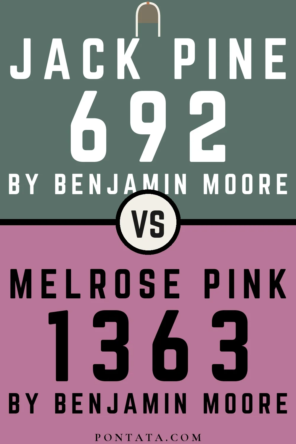
Melrose Pink reads slightly lighter (LRV 26 vs 16), a gap that shows most in low-lit rooms.


A 7-point LRV gap (34 vs 26) makes Azores the marginally brighter of the two.


Sage Tint reflects far more light (LRV 58 vs 26), opening up a space where Melrose Pink encloses it.


A 6-point LRV gap (26 vs 20) makes Melrose Pink the marginally brighter of the two.


Sylvan Mist reflects far more light (LRV 54 vs 26), opening up a space where Melrose Pink encloses it.
Lighter Colors


At LRV 39 vs 26, Cranberry Ice is decisively the brighter choice.
Darker Colors


At LRV 26 vs 14, Melrose Pink is decisively the brighter choice.
Color Codes
Manufacturer description
A deep mid-tone pink with a noticeable violet undertone.