
Ash Violet
At first glance, Ash Violet belongs to the purple family; in a room, light and context can make it far more elusive. Its grey and purple classifications hint at the directions it may take as daylight, lamps and neighboring colors move around it. Because screens flatten both light and texture, sample the paint beside the finishes that will ultimately surround it.
Hex
#A29BAALRV
34.14
Ash Violet's Color Strip
Ash Violet is the third shade on this 7-color strip, sitting between Grape Mist and Gentle Grape. The strip spans from Silver Peony at the lightest end to Dewberry at the deepest. Strip 188 puts these related shades in sequence, making it simple to find the tone that suits your room.


Ash Violet in Rooms
Follow Ash Violet from one space to another and watch how light, scale and surrounding materials reshape its character. 10 generated visualizations explore how the color might shape a finished room.
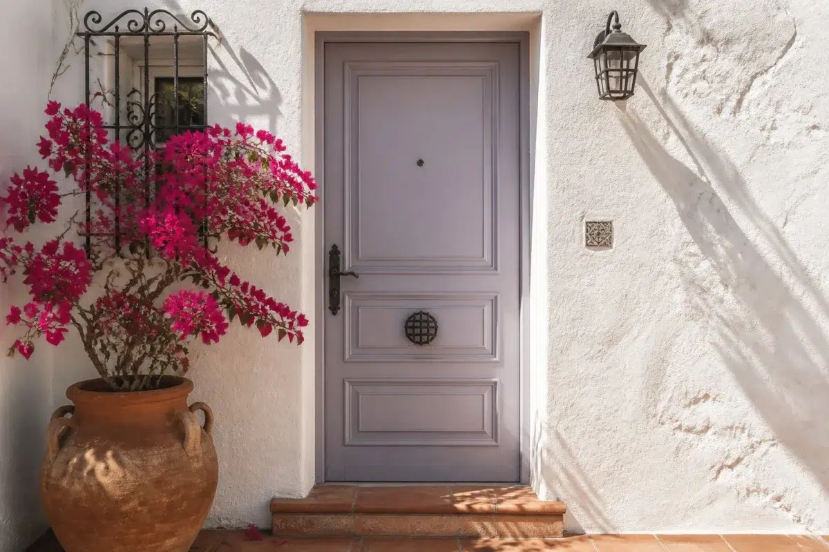
1 Front Door Photo
Ash Violet (6549) can change noticeably under direct sun, porch shade and evening exterior light. Sample it beside the finishes that will remain in the room.
mediterranean front door featuring Ash Violet by Sherwin-Williams
@mybudgetrecipes
1 Home Office Photo
1 generated visualization explores how the color might shape the finished space. Together they show Ash Violet (6549) as inspiration rather than a promise of an identical result.

Sherwin-Williams Ash Violet in a neutral home office
@mybudgetrecipes
1 Dining Room Photo
The room’s change from everyday meals to evening occasions can draw different notes from Ash Violet (6549). The grey, purple hue classifications suggest the subtle directions the color may take as the room changes.

Ash Violet paint in a elegant dining room
@mybudgetrecipes
1 Bedroom Photo
1 bedroom image place Ash Violet (6549) in a room designed around rest, softness and retreat. An LRV of 34.1 lets the color hold its identity across both brighter and more shaded parts of the room.

A traditional bedroom painted in Ash Violet
@mybudgetrecipes
1 Bathroom Photo
1 bathroom image place Ash Violet (6549) in a compact setting where tile, fixtures and color sit close together. An LRV of 34.1 lets the color hold its identity across both brighter and more shaded parts of the room.

Ash Violet — modern luxury bathroom
@mybudgetrecipes
1 Kitchen Photo
1 generated visualization explores how the color might shape the finished space. Together they show Ash Violet (6549) as inspiration rather than a promise of an identical result.

Ash Violet — classy kitchen
@mybudgetrecipes
1 Mudroom Photo
In a practical threshold where the outdoors enters the home, the most interesting quality of Ash Violet (6549) may be the way it responds to flooring, storage, timber, baskets and hardware. The grey, purple hue classifications suggest the subtle directions the color may take as the room changes.

Ash Violet paint in a neutral mudroom
@mybudgetrecipes
1 Living Room Photo
Its place within Energetic hints at the range of palettes it can inhabit. In this setting, let the movement from window light to lamplight and upholstery, timber, art and metal accents guide the final sample decision.

A hollywood regency living room painted in Ash Violet
@mybudgetrecipes
1 Patio Photo
In an outdoor room surrounded by sky, planting and open light, the most interesting quality of Ash Violet (6549) may be the way it responds to stone, timber, metal, textiles and greenery. The grey, purple hue classifications suggest the subtle directions the color may take as the room changes.

aesthetic patio featuring Ash Violet by Sherwin-Williams
@mybudgetrecipes
1 House Photo
Ash Violet (6549) brings its purple character into an exterior viewed across distance, weather and the changing sky. Its midtone saturation keeps the color expressive without letting it dominate every surface around it.

Ash Violet color — rustic modern house inspiration
@mybudgetrecipes
Expert Perspectives
Articles and features from across our network of home and design sites.
Coordinating Colors


At LRV 74 vs 34, Original White is decisively the brighter choice.


At LRV 84 vs 34, Ibis White is decisively the brighter choice.


At LRV 62 vs 34, Bellini Fizz is decisively the brighter choice.
Trim Color
At LRV 74 vs 34, Original White is decisively the brighter choice.
Similar Colors


Obi Lilac reads slightly lighter (LRV 39 vs 34), a gap that shows most in low-lit rooms.


A 3-point LRV gap (37 vs 34) makes Mysterious Mauve the marginally brighter of the two.


A 8-point LRV gap (34 vs 26) makes Ash Violet the marginally brighter of the two.


A 6-point LRV gap (40 vs 34) makes Beguiling Mauve the marginally brighter of the two.


A 6-point LRV gap (34 vs 28) makes Ash Violet the marginally brighter of the two.


Their light reflectance is nearly identical (LRV 35 vs 34), so neither reads brighter in a room.


Ash Violet reads slightly lighter (LRV 34 vs 29), a gap that shows most in low-lit rooms.

A 6-point LRV gap (40 vs 34) makes Modern Lavender the marginally brighter of the two.


Ash Violet reads slightly lighter (LRV 34 vs 26), a gap that shows most in low-lit rooms.


A 4-point LRV gap (39 vs 34) makes Intuitive the marginally brighter of the two.
Complementary Colors


At LRV 34 vs 10, Ash Violet is decisively the brighter choice.


Opaline reflects far more light (LRV 73 vs 34), opening up a space where Ash Violet encloses it.

At LRV 65 vs 34, Pine Frost is decisively the brighter choice.


Ash Violet reflects far more light (LRV 34 vs 9), opening up a space where Vogue Green encloses it.


At LRV 64 vs 34, Filmy Green is decisively the brighter choice.

A 5-point LRV gap (34 vs 30) makes Ash Violet the marginally brighter of the two.


At LRV 62 vs 34, Frostwork is decisively the brighter choice.
Lighter Colors
A 3-point LRV gap (37 vs 34) makes Mysterious Mauve the marginally brighter of the two.


At LRV 54 vs 34, Grape Mist is decisively the brighter choice.
Darker Colors


At LRV 34 vs 16, Ash Violet is decisively the brighter choice.
A 8-point LRV gap (34 vs 26) makes Ash Violet the marginally brighter of the two.

At LRV 34 vs 16, Ash Violet is decisively the brighter choice.
Color Codes
Manufacturer description
Slip into the twilight hour with this muted, sophisticated purple whose cool gray undertones whisper of quiet contemplation and understated elegance. Perfect for a creative studio or bedroom, it pairs beautifully with soft whites and dusty blues to create a serene, cocoon-like sanctuary.