
Atmospheric
Sherwin-Williams Atmospheric (6505) carries the measured structure of its color data and the less predictable beauty of paint in a finished space. Its cool classification gives it a crisper edge that may become clearer beside warm timber, cream or brass. Treat the digital swatch as an opening note, then watch a physical sample from morning light through evening lamps.
Hex
#C2DAE0LRV
66.86
Atmospheric's Color Strip
Atmospheric is the first shade on this 7-color strip, the lightest in this coordinated family. Browsing strip 175 alongside this color helps you gauge whether to go lighter, darker, or stay right here.


Atmospheric in Rooms
Follow Atmospheric from one space to another and watch how light, scale and surrounding materials reshape its character. 10 generated visualizations explore how the color might shape a finished room.
1 Dining Room Photo
1 dining room image trace Atmospheric (6505) through the room’s change from everyday meals to evening occasions. Its place within Living Well hints at the range of palettes it can inhabit.
Atmospheric paint in a elegant dining room
@mybudgetrecipes
1 Bedroom Photo
Atmospheric (6505) can change noticeably under gentle morning light and low evening lamps. Sample it beside the finishes that will remain in the room.

A traditional bedroom painted in Atmospheric
@mybudgetrecipes
1 Home Office Photo
Atmospheric (6505) brings its blue character into a focused room balancing work, concentration and comfort. Its midtone saturation keeps the color expressive without letting it dominate every surface around it.

Sherwin-Williams Atmospheric in a industrial home office
@mybudgetrecipes
1 Bathroom Photo
Atmospheric (6505) moves through 1 bathroom image without becoming a fixed prescription for the room. Its cool classification can bring a composed, clean tension to warmer finishes.

Atmospheric — vintage bathroom
@mybudgetrecipes
1 Front Door Photo
Viewed across 1 front door image in a small architectural moment with an outsized first impression, Atmospheric (6505) reveals how much color depends on scale, surface and shadow. An LRV of 66.9 lets the color hold its identity across both brighter and more shaded parts of the room.

traditional front door featuring Atmospheric by Sherwin-Williams
@mybudgetrecipes
1 Mudroom Photo
Its place within Living Well hints at the range of palettes it can inhabit. In this setting, let doorway light and the softer illumination of an internal passage and flooring, storage, timber, baskets and hardware guide the final sample decision.

Atmospheric paint in a tiny mudroom
@mybudgetrecipes
1 Patio Photo
1 generated visualization explores how the color might shape the finished space. Together they show Atmospheric (6505) as inspiration rather than a promise of an identical result.

mediterranean patio featuring Atmospheric by Sherwin-Williams
@mybudgetrecipes
1 Living Room Photo
The room’s shift from daytime energy to evening calm can draw different notes from Atmospheric (6505). The blue hue classifications suggest the subtle directions the color may take as the room changes.

A contemporary living room painted in Atmospheric
@mybudgetrecipes
1 Kitchen Photo
Viewed across 1 kitchen image in a hardworking room where color meets movement and strong surfaces, Atmospheric (6505) reveals how much color depends on scale, surface and shadow. An LRV of 66.9 lets the color hold its identity across both brighter and more shaded parts of the room.

Atmospheric — vintage kitchen
@mybudgetrecipes
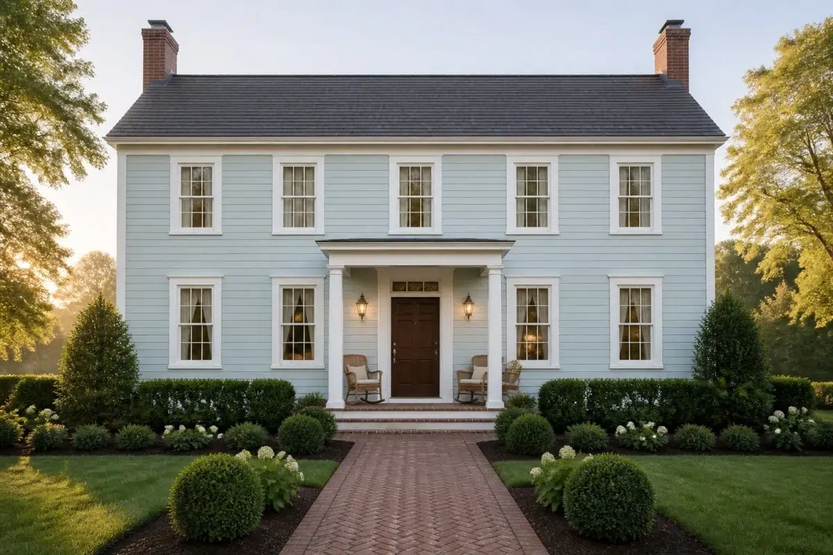
1 House Photo
Against roofing, masonry, timber, planting and trim, Atmospheric (6505) may feel quieter, sharper or more atmospheric than the digital swatch alone. An LRV of 66.9 lets the color hold its identity across both brighter and more shaded parts of the room.

Atmospheric color — traditional house inspiration
@mybudgetrecipes
Expert Perspectives
Articles and features from across our network of home and design sites.
Coordinating Colors


A 11-point LRV gap (78 vs 67) makes Sky High the marginally brighter of the two.


At LRV 79 vs 67, They call it Mellow is decisively the brighter choice.


At LRV 67 vs 31, Atmospheric is decisively the brighter choice.
Trim Color
A 11-point LRV gap (78 vs 67) makes Sky High the marginally brighter of the two.
Similar Colors


With LRVs of 68 and 67, the two reflect almost the same amount of light.


With LRVs of 67 and 66, the two reflect almost the same amount of light.

Soar reads slightly lighter (LRV 70 vs 67), a gap that shows most in low-lit rooms.

With LRVs of 67 and 67, the two reflect almost the same amount of light.


Aviary Blue reads slightly lighter (LRV 73 vs 67), a gap that shows most in low-lit rooms.

Open Air reads slightly lighter (LRV 70 vs 67), a gap that shows most in low-lit rooms.


Bathe Blue reads slightly lighter (LRV 71 vs 67), a gap that shows most in low-lit rooms.


Their light reflectance is nearly identical (LRV 68 vs 67), so neither reads brighter in a room.


Bravo Blue reads slightly lighter (LRV 77 vs 67), a gap that shows most in low-lit rooms.


A 9-point LRV gap (76 vs 67) makes Lauren's Surprise the marginally brighter of the two.
Complementary Colors

A 9-point LRV gap (76 vs 67) makes Mauve Tinge the marginally brighter of the two.


Atmospheric reflects far more light (LRV 67 vs 50), opening up a space where Studio Mauve encloses it.


At LRV 67 vs 35, Atmospheric is decisively the brighter choice.


At LRV 81 vs 67, Heavenly White is decisively the brighter choice.

Original White reads slightly lighter (LRV 74 vs 67), a gap that shows most in low-lit rooms.

Atmospheric reflects far more light (LRV 67 vs 35), opening up a space where Palisade encloses it.


Atmospheric reflects far more light (LRV 67 vs 13), opening up a space where Griffin encloses it.
Lighter Colors
A 9-point LRV gap (76 vs 67) makes Lauren's Surprise the marginally brighter of the two.
With LRVs of 67 and 66, the two reflect almost the same amount of light.
Their light reflectance is nearly identical (LRV 68 vs 67), so neither reads brighter in a room.
With LRVs of 68 and 67, the two reflect almost the same amount of light.
Bravo Blue reads slightly lighter (LRV 77 vs 67), a gap that shows most in low-lit rooms.
Darker Colors


Atmospheric reflects far more light (LRV 67 vs 41), opening up a space where Ebbtide encloses it.

At LRV 67 vs 49, Atmospheric is decisively the brighter choice.

A 10-point LRV gap (67 vs 57) makes Atmospheric the marginally brighter of the two.


Atmospheric reflects far more light (LRV 67 vs 39), opening up a space where Open Seas encloses it.


Atmospheric reflects far more light (LRV 67 vs 52), opening up a space where Agua Fría encloses it.
Color Codes
Manufacturer description
Bright skies and a sunny disposition are headed your way with this cool midtone blue. This light hue can make your small bathroom feel larger and more soothing.