
Awesome Violet
Sherwin-Williams Awesome Violet (6815) carries the measured structure of its color data and the less predictable beauty of paint in a finished space. It appears in Inbe Tweens, Living Well and Vintage Moxie, placing it within several distinct decorating stories rather than a single fixed look. The manufacturer's description below offers one reading; the room imagery leaves space for your own.
Hex
#A7B2D4LRV
44.98
Awesome Violet's Color Strip
Awesome Violet is the fourth shade on this 7-color strip, sitting between Agapanthus and Dahlia. The strip spans from Wishful Blue at the lightest end to Valiant Violet at the deepest. As part of strip 180, these colors are curated to work together — helpful when you're deciding how light or deep to go.


Awesome Violet in Rooms
Follow Awesome Violet from one space to another and watch how light, scale and surrounding materials reshape its character. 10 generated visualizations explore how the color might shape a finished room.
1 Dining Room Photo
1 generated visualization explores how the color might shape the finished space. Together they show Awesome Violet (6815) as inspiration rather than a promise of an identical result.
Awesome Violet paint in a mid century dining room
@mybudgetrecipes
1 Front Door Photo
The 1 front door image turn a purple swatch into something more spatial and expressive. Its brighter saturation allows the hue to remain present rather than fading quietly into the background.

mediterranean front door featuring Awesome Violet by Sherwin-Williams
@mybudgetrecipes
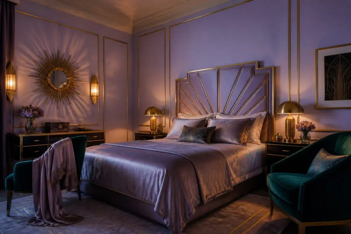
1 Bedroom Photo
Across 1 bedroom image, Awesome Violet (6815) meets gentle morning light and low evening lamps. Its cool classification can bring a composed, clean tension to warmer finishes.

A art deco bedroom painted in Awesome Violet
@mybudgetrecipes
1 Home Office Photo
These 1 home office image show how Awesome Violet (6815) can sit beside wood, paper, shelving and upholstered seating. The blue, purple hue classifications suggest the subtle directions the color may take as the room changes.

Sherwin-Williams Awesome Violet in a warm home office
@mybudgetrecipes
1 Bathroom Photo
1 generated visualization explores how the color might shape the finished space. Together they show Awesome Violet (6815) as inspiration rather than a promise of an identical result.

Awesome Violet — earthy bathroom
@mybudgetrecipes
1 Patio Photo
Viewed across 1 patio image in an outdoor room surrounded by sky, planting and open light, Awesome Violet (6815) reveals how much color depends on scale, surface and shadow. An LRV of 45.0 lets the color hold its identity across both brighter and more shaded parts of the room.

contemporary patio featuring Awesome Violet by Sherwin-Williams
@mybudgetrecipes
1 House Photo
Viewed across 1 house image in an exterior viewed across distance, weather and the changing sky, Awesome Violet (6815) reveals how much color depends on scale, surface and shadow. An LRV of 45.0 lets the color hold its identity across both brighter and more shaded parts of the room.

Awesome Violet color — maximalist house inspiration
@mybudgetrecipes
1 Mudroom Photo
The 1 mudroom image turn a purple swatch into something more spatial and expressive. Its brighter saturation allows the hue to remain present rather than fading quietly into the background.

Awesome Violet paint in a small mudroom
@mybudgetrecipes
1 Living Room Photo
Awesome Violet (6815) can change noticeably under the movement from window light to lamplight. Sample it beside the finishes that will remain in the room.

A hollywood regency living room painted in Awesome Violet
@mybudgetrecipes
1 Kitchen Photo
1 kitchen image trace Awesome Violet (6815) through the changing light from breakfast through dinner. Its place within Inbe Tweens and Living Well hints at the range of palettes it can inhabit.

Awesome Violet — organic modern kitchen
@mybudgetrecipes
Expert Perspectives
Articles and features from across our network of home and design sites.
Coordinating Colors


At LRV 72 vs 45, Spatial White is decisively the brighter choice.


At LRV 84 vs 45, Pure White is decisively the brighter choice.


Awesome Violet reflects far more light (LRV 45 vs 25), opening up a space where Almond Roca encloses it.
Trim Color
At LRV 72 vs 45, Spatial White is decisively the brighter choice.
Similar Colors


A 4-point LRV gap (45 vs 41) makes Awesome Violet the marginally brighter of the two.


A 11-point LRV gap (56 vs 45) makes Agapanthus the marginally brighter of the two.


Their light reflectance is nearly identical (LRV 45 vs 44), so neither reads brighter in a room.


Awesome Violet reads slightly lighter (LRV 45 vs 35), a gap that shows most in low-lit rooms.


At LRV 60 vs 45, Hyacinth Tint is decisively the brighter choice.


Awesome Violet reads slightly lighter (LRV 45 vs 38), a gap that shows most in low-lit rooms.

A 3-point LRV gap (48 vs 45) makes Wisteria the marginally brighter of the two.


Awesome Violet reflects far more light (LRV 45 vs 32), opening up a space where Dahlia encloses it.


Awesome Violet reads slightly lighter (LRV 45 vs 40), a gap that shows most in low-lit rooms.


A 7-point LRV gap (45 vs 38) makes Awesome Violet the marginally brighter of the two.
Complementary Colors


Awesome Violet reflects far more light (LRV 45 vs 13), opening up a space where Griffin encloses it.


Awesome Violet reflects far more light (LRV 45 vs 20), opening up a space where Warm Stone encloses it.


At LRV 61 vs 45, Mercurial is decisively the brighter choice.


Awesome Violet reflects far more light (LRV 45 vs 21), opening up a space where Habitat encloses it.


A 9-point LRV gap (45 vs 36) makes Awesome Violet the marginally brighter of the two.


Lunar Lite reflects far more light (LRV 73 vs 45), opening up a space where Awesome Violet encloses it.


Awesome Violet reflects far more light (LRV 45 vs 15), opening up a space where Cocoon encloses it.
Lighter Colors


At LRV 63 vs 45, Breathtaking is decisively the brighter choice.
At LRV 60 vs 45, Hyacinth Tint is decisively the brighter choice.
A 11-point LRV gap (56 vs 45) makes Agapanthus the marginally brighter of the two.
Darker Colors
A 4-point LRV gap (45 vs 41) makes Awesome Violet the marginally brighter of the two.
Awesome Violet reflects far more light (LRV 45 vs 32), opening up a space where Dahlia encloses it.

Awesome Violet reflects far more light (LRV 45 vs 23), opening up a space where Venture Violet encloses it.
Color Codes
Manufacturer description
This vibrant purple commands attention with its cool, jewel-toned saturation and whisper of blue undertones that feel both modern and luxurious. Perfect for a creative studio, accent wall, or powder room where boldness is celebrated and complemented by crisp whites or soft grays.