
Baroness
Baroness is a Purple paint color from Sherwin-Williams, but its character reaches beyond a single label. It appears in 2015 Buoyant, placing it within several distinct decorating stories rather than a single fixed look. The manufacturer's description below offers one reading; the room imagery leaves space for your own.
Hex
#A785A7LRV
27.74
Baroness's Color Strip
Baroness is the fourth shade on this 7-color strip, sitting between Novel Lilac and Veri Berri. The strip spans from Spangle at the lightest end to Kimono Violet at the deepest. Strip 183 makes it easy to compare shades side by side and find the right depth for your space.


Baroness in Rooms
Follow Baroness from one space to another and watch how light, scale and surrounding materials reshape its character. 10 generated visualizations explore how the color might shape a finished room.
1 Bedroom Photo
Baroness (6837) moves through 1 bedroom image without becoming a fixed prescription for the room. Its cool classification can bring a composed, clean tension to warmer finishes.
A moody bedroom painted in Baroness
@mybudgetrecipes
1 Bathroom Photo
Baroness (6837) offers a starting mood rather than a finished formula: Its cool classification can bring a composed, clean tension to warmer finishes. Test it under window light, mirrors and focused task lighting.

Baroness — industrial bathroom
@mybudgetrecipes
1 Home Office Photo
Baroness (6837) offers a starting mood rather than a finished formula: Its cool classification can bring a composed, clean tension to warmer finishes. Test it under daylight beside desk lamps and screen glow.

Sherwin-Williams Baroness in a moody home office
@mybudgetrecipes
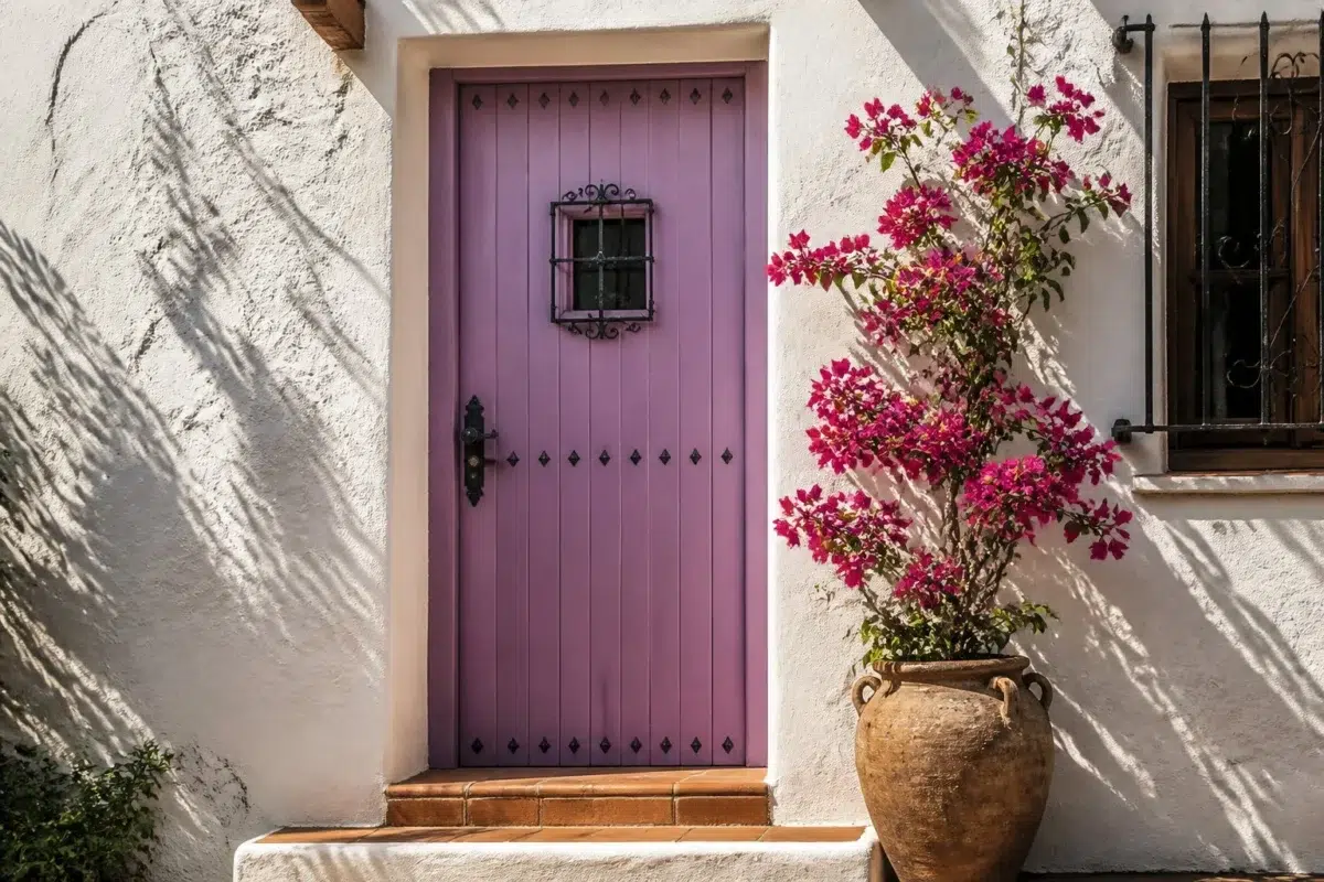
1 Front Door Photo
Baroness (6837) moves through 1 front door image without becoming a fixed prescription for the room. Its cool classification can bring a composed, clean tension to warmer finishes.

mediterranean front door featuring Baroness by Sherwin-Williams
@mybudgetrecipes
1 Dining Room Photo
Its place within 2015 Buoyant hints at the range of palettes it can inhabit. In this setting, let natural light, candles and pendant lighting and timber, table linen, glass and artwork guide the final sample decision.

Baroness paint in a moody dining room
@mybudgetrecipes
1 Mudroom Photo
1 generated visualization explores how the color might shape the finished space. Together they show Baroness (6837) as inspiration rather than a promise of an identical result.

Baroness paint in a classy mudroom
@mybudgetrecipes
1 Living Room Photo
Against upholstery, timber, art and metal accents, Baroness (6837) may feel quieter, sharper or more atmospheric than the digital swatch alone. An LRV of 27.7 lets the color hold its identity across both brighter and more shaded parts of the room.

A cozy living room painted in Baroness
@mybudgetrecipes
1 Patio Photo
1 patio image trace Baroness (6837) through the broad shift from bright afternoon to dusk. Its place within 2015 Buoyant hints at the range of palettes it can inhabit.

aesthetic patio featuring Baroness by Sherwin-Williams
@mybudgetrecipes
1 House Photo
Viewed across 1 house image in an exterior viewed across distance, weather and the changing sky, Baroness (6837) reveals how much color depends on scale, surface and shadow. An LRV of 27.7 lets the color hold its identity across both brighter and more shaded parts of the room.

Baroness color — maximalist house inspiration
@mybudgetrecipes
1 Kitchen Photo
Against stone, timber, tile and metal finishes, Baroness (6837) may feel quieter, sharper or more atmospheric than the digital swatch alone. An LRV of 27.7 lets the color hold its identity across both brighter and more shaded parts of the room.

Baroness — contemporary kitchen
@mybudgetrecipes
Expert Perspectives
Articles and features from across our network of home and design sites.
Coordinating Colors


Ibis White reflects far more light (LRV 84 vs 28), opening up a space where Baroness encloses it.


At LRV 63 vs 28, Wool Skein is decisively the brighter choice.

Their light reflectance is nearly identical (LRV 28 vs 27), so neither reads brighter in a room.
Trim Color
Ibis White reflects far more light (LRV 84 vs 28), opening up a space where Baroness encloses it.
Similar Colors

Their light reflectance is nearly identical (LRV 28 vs 28), so neither reads brighter in a room.


With LRVs of 28 and 28, the two reflect almost the same amount of light.


With LRVs of 29 and 28, the two reflect almost the same amount of light.


Baroness reads slightly lighter (LRV 28 vs 21), a gap that shows most in low-lit rooms.

Baroness reads slightly lighter (LRV 28 vs 22), a gap that shows most in low-lit rooms.


With LRVs of 28 and 28, the two reflect almost the same amount of light.


A 4-point LRV gap (28 vs 24) makes Baroness the marginally brighter of the two.

With LRVs of 28 and 27, the two reflect almost the same amount of light.
Complementary Colors


Window Pane reflects far more light (LRV 72 vs 28), opening up a space where Baroness encloses it.


Holly Glen reflects far more light (LRV 57 vs 28), opening up a space where Baroness encloses it.


A 6-point LRV gap (34 vs 28) makes Agate Green the marginally brighter of the two.


Lighter Colors


At LRV 42 vs 28, Novel Lilac is decisively the brighter choice.
Darker Colors

At LRV 28 vs 13, Baroness is decisively the brighter choice.
Baroness reads slightly lighter (LRV 28 vs 21), a gap that shows most in low-lit rooms.
Color Codes
Manufacturer description
This jewel-toned purple radiates a regal elegance with its cool, saturated depth and mysterious allure—perfect for creating a sophisticated sanctuary in a bedroom or study. Pair it with rich jewel tones, deep woods, or crisp whites to amplify its dramatic, confident presence.