
Beachcomber
Sherwin-Williams Beachcomber (9617) carries the measured structure of its color data and the less predictable beauty of paint in a finished space. It appears in Emerald Designer Edition - Warm + Welcoming, placing it within several distinct decorating stories rather than a single fixed look. Treat the digital swatch as an opening note, then watch a physical sample from morning light through evening lamps.
Hex
#D0C1ACLRV
54.74
Beachcomber in Rooms
Follow Beachcomber from one space to another and watch how light, scale and surrounding materials reshape its character. 10 generated visualizations explore how the color might shape a finished room.
1 Home Office Photo
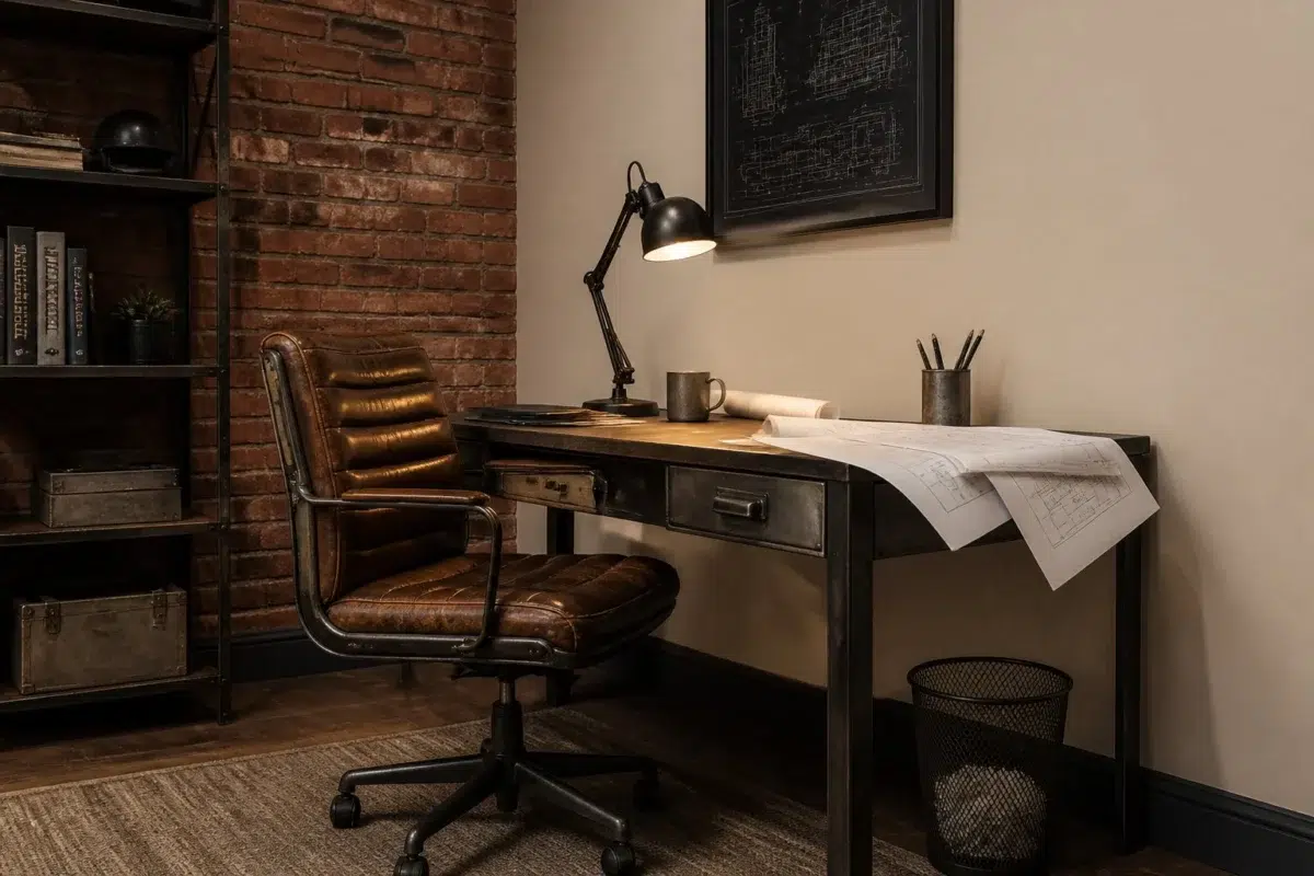
These 1 home office image show how Beachcomber (9617) can sit beside wood, paper, shelving and upholstered seating. The beige, greige hue classifications suggest the subtle directions the color may take as the room changes.
Sherwin-Williams Beachcomber in a industrial home office
@mybudgetrecipes
1 Bedroom Photo
The slower pace of morning and night can draw different notes from Beachcomber (9617). The beige, greige hue classifications suggest the subtle directions the color may take as the room changes.

A organic modern bedroom painted in Beachcomber
@mybudgetrecipes
1 Front Door Photo
1 front door image place Beachcomber (9617) in a small architectural moment with an outsized first impression. An LRV of 54.7 lets the color hold its identity across both brighter and more shaded parts of the room.

minimalist front door featuring Beachcomber by Sherwin-Williams
@mybudgetrecipes
1 Dining Room Photo
The room’s change from everyday meals to evening occasions can draw different notes from Beachcomber (9617). The beige, greige hue classifications suggest the subtle directions the color may take as the room changes.

Beachcomber paint in a parisian dining room
@mybudgetrecipes
1 Bathroom Photo
Against tile, stone, glass, timber and metal fixtures, Beachcomber (9617) may feel quieter, sharper or more atmospheric than the digital swatch alone. An LRV of 54.7 lets the color hold its identity across both brighter and more shaded parts of the room.

Beachcomber — wabi-sabi bathroom
@mybudgetrecipes
1 Mudroom Photo
Across 1 mudroom image, Beachcomber (9617) meets doorway light and the softer illumination of an internal passage. Its warm classification can feel inviting beside tactile, natural materials.

Beachcomber paint in a rustic modern mudroom
@mybudgetrecipes
1 Patio Photo
Across 1 patio image, Beachcomber (9617) meets direct sun, reflected daylight and deep exterior shade. Its warm classification can feel inviting beside tactile, natural materials.

coastal patio featuring Beachcomber by Sherwin-Williams
@mybudgetrecipes
1 Living Room Photo
The 1 living room image turn a neutral swatch into something more spatial and expressive. Its warm classification can feel inviting beside tactile, natural materials.

A hollywood regency living room painted in Beachcomber
@mybudgetrecipes
1 House Photo
Beachcomber (9617) moves through 1 house image without becoming a fixed prescription for the room. Its warm classification can feel inviting beside tactile, natural materials.

Beachcomber color — rustic modern house inspiration
@mybudgetrecipes
1 Kitchen Photo
Beachcomber (9617) can change noticeably under daylight, task lighting and evening pendants. Sample it beside the finishes that will remain in the room.

Beachcomber — modern luxury kitchen
@mybudgetrecipes
Expert Perspectives
Articles and features from across our network of home and design sites.
Coordinating Colors


Cotton reflects far more light (LRV 83 vs 55), opening up a space where Beachcomber encloses it.


A 9-point LRV gap (63 vs 55) makes Moorstone the marginally brighter of the two.


Beachcomber reflects far more light (LRV 55 vs 14), opening up a space where Mountain Pass encloses it.
Similar Colors


With LRVs of 55 and 54, the two reflect almost the same amount of light.


Their light reflectance is nearly identical (LRV 55 vs 54), so neither reads brighter in a room.


Their light reflectance is nearly identical (LRV 55 vs 53), so neither reads brighter in a room.

Their light reflectance is nearly identical (LRV 57 vs 55), so neither reads brighter in a room.


Beachcomber reads slightly lighter (LRV 55 vs 51), a gap that shows most in low-lit rooms.


With LRVs of 55 and 53, the two reflect almost the same amount of light.


With LRVs of 57 and 55, the two reflect almost the same amount of light.


With LRVs of 55 and 54, the two reflect almost the same amount of light.


With LRVs of 55 and 52, the two reflect almost the same amount of light.


A 4-point LRV gap (55 vs 51) makes Beachcomber the marginally brighter of the two.
Complementary Colors


At LRV 55 vs 7, Beachcomber is decisively the brighter choice.


At LRV 55 vs 11, Beachcomber is decisively the brighter choice.


At LRV 55 vs 7, Beachcomber is decisively the brighter choice.


At LRV 69 vs 55, Starry Night is decisively the brighter choice.


Beachcomber reflects far more light (LRV 55 vs 20), opening up a space where Soulful Blue encloses it.


At LRV 55 vs 22, Beachcomber is decisively the brighter choice.


Beachcomber reflects far more light (LRV 55 vs 28), opening up a space where Dusty Heather encloses it.
Lighter Colors

A 8-point LRV gap (62 vs 55) makes Reticence the marginally brighter of the two.


Their light reflectance is nearly identical (LRV 55 vs 53), so neither reads brighter in a room.


At LRV 73 vs 55, Aesthetic White is decisively the brighter choice.


Everyday White reflects far more light (LRV 72 vs 55), opening up a space where Beachcomber encloses it.


A 9-point LRV gap (64 vs 55) makes Dumpling the marginally brighter of the two.
Darker Colors

Beachcomber reflects far more light (LRV 55 vs 35), opening up a space where Sugared Almond encloses it.


A 11-point LRV gap (55 vs 44) makes Beachcomber the marginally brighter of the two.
With LRVs of 55 and 54, the two reflect almost the same amount of light.
Beachcomber reads slightly lighter (LRV 55 vs 51), a gap that shows most in low-lit rooms.
Their light reflectance is nearly identical (LRV 55 vs 53), so neither reads brighter in a room.
Color Codes
Manufacturer description
Wander sun-bleached driftwood and soft sandy shores with this warm neutral that captures the serene essence of coastal living. Its earthy, slightly sandy undertones create a calming backdrop perfect for bedrooms, bathrooms, or any space seeking quiet, weathered elegance.
Attributed to Sherwin-Williams catalog data.