
Blue Beyond
There is more to Sherwin-Williams Blue Beyond (6961) than the swatch alone: its depth, undertones and setting all shape the final impression. Its cool classification gives it a crisper edge that may become clearer beside warm timber, cream or brass. 10 generated visualizations explore how the color might shape a finished room.
Hex
#91B8D9LRV
45.12
Blue Beyond in Rooms
Follow Blue Beyond from one space to another and watch how light, scale and surrounding materials reshape its character. 10 generated visualizations explore how the color might shape a finished room.
1 Bathroom Photo
Viewed across 1 bathroom image in a compact setting where tile, fixtures and color sit close together, Blue Beyond (6961) reveals how much color depends on scale, surface and shadow. An LRV of 45.1 lets the color hold its identity across both brighter and more shaded parts of the room.
Blue Beyond — industrial bathroom
@mybudgetrecipes
1 Bedroom Photo
In a room designed around rest, softness and retreat, the most interesting quality of Blue Beyond (6961) may be the way it responds to bed linen, timber, wool and upholstered textures. The blue hue classifications suggest the subtle directions the color may take as the room changes.

A organic modern bedroom painted in Blue Beyond
@mybudgetrecipes
1 Home Office Photo
The 1 home office image turn a blue swatch into something more spatial and expressive. Its cool classification can bring a composed, clean tension to warmer finishes.

Sherwin-Williams Blue Beyond in a warm home office
@mybudgetrecipes
1 Front Door Photo
The threshold between the street and the interior can draw different notes from Blue Beyond (6961). The blue hue classifications suggest the subtle directions the color may take as the room changes.

scandinavian front door featuring Blue Beyond by Sherwin-Williams
@mybudgetrecipes
1 Dining Room Photo
Blue Beyond (6961) offers a starting mood rather than a finished formula: Its cool classification can bring a composed, clean tension to warmer finishes. Test it under natural light, candles and pendant lighting.

Blue Beyond paint in a elegant dining room
@mybudgetrecipes
1 Kitchen Photo
1 generated visualization explores how the color might shape the finished space. Together they show Blue Beyond (6961) as inspiration rather than a promise of an identical result.

Blue Beyond — classy kitchen
@mybudgetrecipes
1 Patio Photo
Against stone, timber, metal, textiles and greenery, Blue Beyond (6961) may feel quieter, sharper or more atmospheric than the digital swatch alone. An LRV of 45.1 lets the color hold its identity across both brighter and more shaded parts of the room.

minimalist patio featuring Blue Beyond by Sherwin-Williams
@mybudgetrecipes
1 Mudroom Photo
The daily movement of arrivals, departures and changing weather can draw different notes from Blue Beyond (6961). The blue hue classifications suggest the subtle directions the color may take as the room changes.

Blue Beyond paint in a small mudroom
@mybudgetrecipes
1 House Photo
The façade’s movement through sun, shade and season can draw different notes from Blue Beyond (6961). The blue hue classifications suggest the subtle directions the color may take as the room changes.

Blue Beyond color — scandinavian house inspiration
@mybudgetrecipes
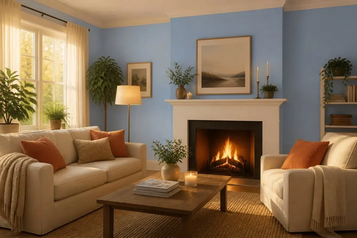
1 Living Room Photo
In a space shaped by conversation, quiet evenings and changing daylight, the most interesting quality of Blue Beyond (6961) may be the way it responds to upholstery, timber, art and metal accents. The blue hue classifications suggest the subtle directions the color may take as the room changes.

A cozy living room painted in Blue Beyond
@mybudgetrecipes
Expert Perspectives
Articles and features from across our network of home and design sites.
Coordinating Colors


At LRV 45 vs 9, Blue Beyond is decisively the brighter choice.


At LRV 45 vs 24, Blue Beyond is decisively the brighter choice.
Similar Colors


With LRVs of 45 and 44, the two reflect almost the same amount of light.


Their light reflectance is nearly identical (LRV 45 vs 42), so neither reads brighter in a room.


Blue Beyond reads slightly lighter (LRV 45 vs 38), a gap that shows most in low-lit rooms.


Blue Beyond reads slightly lighter (LRV 45 vs 40), a gap that shows most in low-lit rooms.


With LRVs of 45 and 43, the two reflect almost the same amount of light.


Blue Beyond reads slightly lighter (LRV 45 vs 37), a gap that shows most in low-lit rooms.

Porch Ceiling reads slightly lighter (LRV 53 vs 45), a gap that shows most in low-lit rooms.


A 4-point LRV gap (49 vs 45) makes Undercool the marginally brighter of the two.


A 6-point LRV gap (51 vs 45) makes Sky Fall the marginally brighter of the two.


Their light reflectance is nearly identical (LRV 45 vs 44), so neither reads brighter in a room.
Complementary Colors


Blue Beyond reads slightly lighter (LRV 45 vs 35), a gap that shows most in low-lit rooms.


Heavenly White reflects far more light (LRV 81 vs 45), opening up a space where Blue Beyond encloses it.

At LRV 74 vs 45, Original White is decisively the brighter choice.

A 10-point LRV gap (45 vs 35) makes Blue Beyond the marginally brighter of the two.


At LRV 45 vs 13, Blue Beyond is decisively the brighter choice.


At LRV 45 vs 20, Blue Beyond is decisively the brighter choice.


Mercurial reflects far more light (LRV 61 vs 45), opening up a space where Blue Beyond encloses it.
Lighter Colors
Porch Ceiling reads slightly lighter (LRV 53 vs 45), a gap that shows most in low-lit rooms.
Darker Colors
Their light reflectance is nearly identical (LRV 45 vs 42), so neither reads brighter in a room.


At LRV 45 vs 30, Blue Beyond is decisively the brighter choice.
Color Codes
Manufacturer description
This serene medium blue carries cool undertones that evoke the tranquil horizon where sky meets water on a distant shore. Perfect for bedrooms or spa-like bathrooms, it brings a sense of calm contemplation and peaceful escape to any room.