
Blue Hill
Sherwin-Williams's Blue Hill is a blue shade whose quieter details emerge through comparison. Its blue classifications hint at the directions it may take as daylight, lamps and neighboring colors move around it. Because screens flatten both light and texture, sample the paint beside the finishes that will ultimately surround it.
Hex
#1E454DLRV
NaN
Blue Hill in Rooms
Follow Blue Hill from one space to another and watch how light, scale and surrounding materials reshape its character. 10 generated visualizations explore how the color might shape a finished room.
1 Bathroom Photo
Blue Hill (2939) brings its blue character into a compact setting where tile, fixtures and color sit close together. Its cool classification can bring a composed, clean tension to warmer finishes.
Blue Hill — japandi bathroom
@mybudgetrecipes
1 Bedroom Photo
Blue Hill (2939) can change noticeably under gentle morning light and low evening lamps. Sample it beside the finishes that will remain in the room.

A industrial bedroom painted in Blue Hill
@mybudgetrecipes
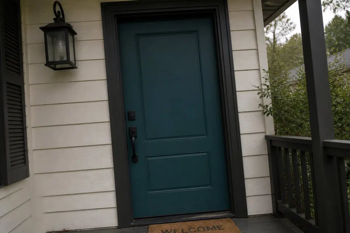
1 Front Door Photo
The threshold between the street and the interior can draw different notes from Blue Hill (2939). The blue hue classifications suggest the subtle directions the color may take as the room changes.

bold front door featuring Blue Hill by Sherwin-Williams
@mybudgetrecipes
1 Home Office Photo
Blue Hill (2939) offers a starting mood rather than a finished formula: Its cool classification can bring a composed, clean tension to warmer finishes. Test it under daylight beside desk lamps and screen glow.

Sherwin-Williams Blue Hill in a unique home office
@mybudgetrecipes
1 Dining Room Photo
The blue hue classifications suggest the subtle directions the color may take as the room changes. In this setting, let natural light, candles and pendant lighting and timber, table linen, glass and artwork guide the final sample decision.

Blue Hill paint in a elegant dining room
@mybudgetrecipes
1 Mudroom Photo
These 1 mudroom image show how Blue Hill (2939) can sit beside flooring, storage, timber, baskets and hardware. The blue hue classifications suggest the subtle directions the color may take as the room changes.

Blue Hill paint in a neutral mudroom
@mybudgetrecipes
1 Living Room Photo
Blue Hill (2939) can change noticeably under the movement from window light to lamplight. Sample it beside the finishes that will remain in the room.

A contemporary living room painted in Blue Hill
@mybudgetrecipes
1 House Photo
Blue Hill (2939) brings its blue character into an exterior viewed across distance, weather and the changing sky. Its cool classification can bring a composed, clean tension to warmer finishes.

Blue Hill color — transitional house inspiration
@mybudgetrecipes
1 Kitchen Photo
Across 1 kitchen image, Blue Hill (2939) meets daylight, task lighting and evening pendants. Its cool classification can bring a composed, clean tension to warmer finishes.

Blue Hill — earthy kitchen
@mybudgetrecipes
1 Patio Photo
In an outdoor room surrounded by sky, planting and open light, the most interesting quality of Blue Hill (2939) may be the way it responds to stone, timber, metal, textiles and greenery. The blue hue classifications suggest the subtle directions the color may take as the room changes.

aesthetic patio featuring Blue Hill by Sherwin-Williams
@mybudgetrecipes
Expert Perspectives
Articles and features from across our network of home and design sites.
Coordinating Colors


At LRV NaN vs NaN, Paperwhite is decisively the brighter choice.


At LRV NaN vs NaN, Jersey Cream is decisively the brighter choice.
Similar Colors


At LRV NaN vs NaN, Moscow Midnight is decisively the brighter choice.


At LRV NaN vs NaN, Dark Night is decisively the brighter choice.


At LRV NaN vs NaN, Marea Baja is decisively the brighter choice.


At LRV NaN vs NaN, Gale Force is decisively the brighter choice.


Loyal Blue reflects far more light (LRV NaN vs NaN), opening up a space where Blue Hill encloses it.


At LRV NaN vs NaN, Connor's Lakefront is decisively the brighter choice.
Complementary Colors

Mauve Tinge reflects far more light (LRV NaN vs NaN), opening up a space where Blue Hill encloses it.


At LRV NaN vs NaN, Studio Mauve is decisively the brighter choice.


Truly Taupe reflects far more light (LRV NaN vs NaN), opening up a space where Blue Hill encloses it.


Heavenly White reflects far more light (LRV NaN vs NaN), opening up a space where Blue Hill encloses it.

At LRV NaN vs NaN, Original White is decisively the brighter choice.


At LRV NaN vs NaN, Blue Hill is decisively the brighter choice.
Lighter Colors

At LRV NaN vs NaN, Turkish Tile is decisively the brighter choice.
At LRV NaN vs NaN, Moscow Midnight is decisively the brighter choice.


Color Codes
Manufacturer description
Sink into the contemplative depths of this dark, moody blue with its cool undertones that whisper of twilight skies and distant horizons. Perfect for creating an intimate, grounded sanctuary in a bedroom or study, this sophisticated shade pairs beautifully with warm wood tones and soft metallics.