
Carefree
Carefree begins as a blue color on paper, then shifts with every surface, shadow and neighboring material. Its blue classifications hint at the directions it may take as daylight, lamps and neighboring colors move around it. The manufacturer's description below offers one reading; the room imagery leaves space for your own.
Hex
#DCE9E9LRV
79.12
Carefree in Rooms
Follow Carefree from one space to another and watch how light, scale and surrounding materials reshape its character. 10 generated visualizations explore how the color might shape a finished room.
1 Front Door Photo
1 front door image place Carefree (6777) in a small architectural moment with an outsized first impression. Its LRV of 79.1 gives it a light-reflective character, though shadows and neighboring finishes can still draw out surprising depth.
stylish front door featuring Carefree by Sherwin-Williams
@mybudgetrecipes
1 Dining Room Photo
These 1 dining room image show how Carefree (6777) can sit beside timber, table linen, glass and artwork. The blue hue classifications suggest the subtle directions the color may take as the room changes.

Carefree paint in a moody dining room
@mybudgetrecipes
1 Bathroom Photo
Carefree (6777) moves through 1 bathroom image without becoming a fixed prescription for the room. Its cool classification can bring a composed, clean tension to warmer finishes.

Carefree — moody bathroom
@mybudgetrecipes
1 Home Office Photo
In a focused room balancing work, concentration and comfort, the most interesting quality of Carefree (6777) may be the way it responds to wood, paper, shelving and upholstered seating. The blue hue classifications suggest the subtle directions the color may take as the room changes.

Sherwin-Williams Carefree in a industrial home office
@mybudgetrecipes
1 Bedroom Photo
The 1 bedroom image turn a blue swatch into something more spatial and expressive. Its cool classification can bring a composed, clean tension to warmer finishes.

A minimalist bedroom painted in Carefree
@mybudgetrecipes
1 Patio Photo
Viewed across 1 patio image in an outdoor room surrounded by sky, planting and open light, Carefree (6777) reveals how much color depends on scale, surface and shadow. Its LRV of 79.1 gives it a light-reflective character, though shadows and neighboring finishes can still draw out surprising depth.

wabi-sabi patio featuring Carefree by Sherwin-Williams
@mybudgetrecipes
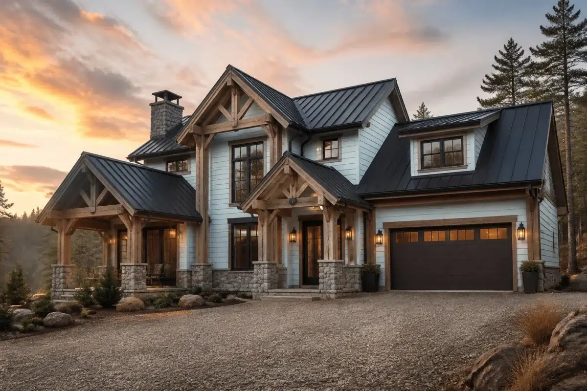
1 House Photo
These 1 house image show how Carefree (6777) can sit beside roofing, masonry, timber, planting and trim. The blue hue classifications suggest the subtle directions the color may take as the room changes.

Carefree color — rustic modern house inspiration
@mybudgetrecipes
1 Kitchen Photo
Carefree (6777) offers a starting mood rather than a finished formula: Its cool classification can bring a composed, clean tension to warmer finishes. Test it under daylight, task lighting and evening pendants.

Carefree — earthy kitchen
@mybudgetrecipes
1 Living Room Photo
1 living room image trace Carefree (6777) through the room’s shift from daytime energy to evening calm. The blue hue classifications suggest the subtle directions the color may take as the room changes.

A elegant living room painted in Carefree
@mybudgetrecipes
1 Mudroom Photo
Viewed across 1 mudroom image in a practical threshold where the outdoors enters the home, Carefree (6777) reveals how much color depends on scale, surface and shadow. Its LRV of 79.1 gives it a light-reflective character, though shadows and neighboring finishes can still draw out surprising depth.

Carefree paint in a industrial mudroom
@mybudgetrecipes
Expert Perspectives
Articles and features from across our network of home and design sites.
Coordinating Colors


Carefree reflects far more light (LRV 79 vs 43), opening up a space where Mineral Deposit encloses it.
Similar Colors


Their light reflectance is nearly identical (LRV 79 vs 78), so neither reads brighter in a room.

With LRVs of 80 and 79, the two reflect almost the same amount of light.


A 3-point LRV gap (79 vs 76) makes Carefree the marginally brighter of the two.


A 5-point LRV gap (84 vs 79) makes Faraway Blue the marginally brighter of the two.

Their light reflectance is nearly identical (LRV 79 vs 79), so neither reads brighter in a room.

Their light reflectance is nearly identical (LRV 80 vs 79), so neither reads brighter in a room.
Complementary Colors

Their light reflectance is nearly identical (LRV 79 vs 76), so neither reads brighter in a room.


Carefree reflects far more light (LRV 79 vs 50), opening up a space where Studio Mauve encloses it.


Carefree reflects far more light (LRV 79 vs 5), opening up a space where Bitter Chocolate encloses it.


At LRV 79 vs 57, Carefree is decisively the brighter choice.


At LRV 79 vs 27, Carefree is decisively the brighter choice.


At LRV 79 vs 5, Carefree is decisively the brighter choice.
Lighter Colors
A 5-point LRV gap (84 vs 79) makes Faraway Blue the marginally brighter of the two.
Darker Colors

Their light reflectance is nearly identical (LRV 79 vs 78), so neither reads brighter in a room.


A 3-point LRV gap (79 vs 76) makes Carefree the marginally brighter of the two.
Color Codes
Manufacturer description
This breezy, almost-white pale blue carries the weightless quality of a clear summer sky reflected indoors. Perfect for bathrooms, bedrooms, or any space seeking an airy, serene atmosphere with just a whisper of cool undertone.