
Cerise
Sherwin-Williams Cerise (6580) carries the measured structure of its color data and the less predictable beauty of paint in a finished space. Its pink and red classifications hint at the directions it may take as daylight, lamps and neighboring colors move around it. Treat the digital swatch as an opening note, then watch a physical sample from morning light through evening lamps.
Hex
#99324ELRV
9.65
Cerise's Color Strip
Cerise is the seventh shade on this 7-color strip, the deepest shade in this coordinated family. As part of strip 104, these colors are curated to work together — helpful when you're deciding how light or deep to go.

Cerise in Rooms
Follow Cerise from one space to another and watch how light, scale and surrounding materials reshape its character. 10 generated visualizations explore how the color might shape a finished room.
1 Home Office Photo
Against wood, paper, shelving and upholstered seating, Cerise (6580) may feel quieter, sharper or more atmospheric than the digital swatch alone. With an LRV of 9.7, it carries enough visual weight to make light, trim and texture feel especially deliberate.
Sherwin-Williams Cerise in a art deco home office
@mybudgetrecipes
1 Kitchen Photo
In a hardworking room where color meets movement and strong surfaces, the most interesting quality of Cerise (6580) may be the way it responds to stone, timber, tile and metal finishes. The pink, red hue classifications suggest the subtle directions the color may take as the room changes.

Cerise — contemporary kitchen
@mybudgetrecipes
1 Mudroom Photo
The daily movement of arrivals, departures and changing weather can draw different notes from Cerise (6580). The pink, red hue classifications suggest the subtle directions the color may take as the room changes.

Cerise paint in a traditional mudroom
@mybudgetrecipes
1 Patio Photo
1 patio image place Cerise (6580) in an outdoor room surrounded by sky, planting and open light. With an LRV of 9.7, it carries enough visual weight to make light, trim and texture feel especially deliberate.

warm patio featuring Cerise by Sherwin-Williams
@mybudgetrecipes
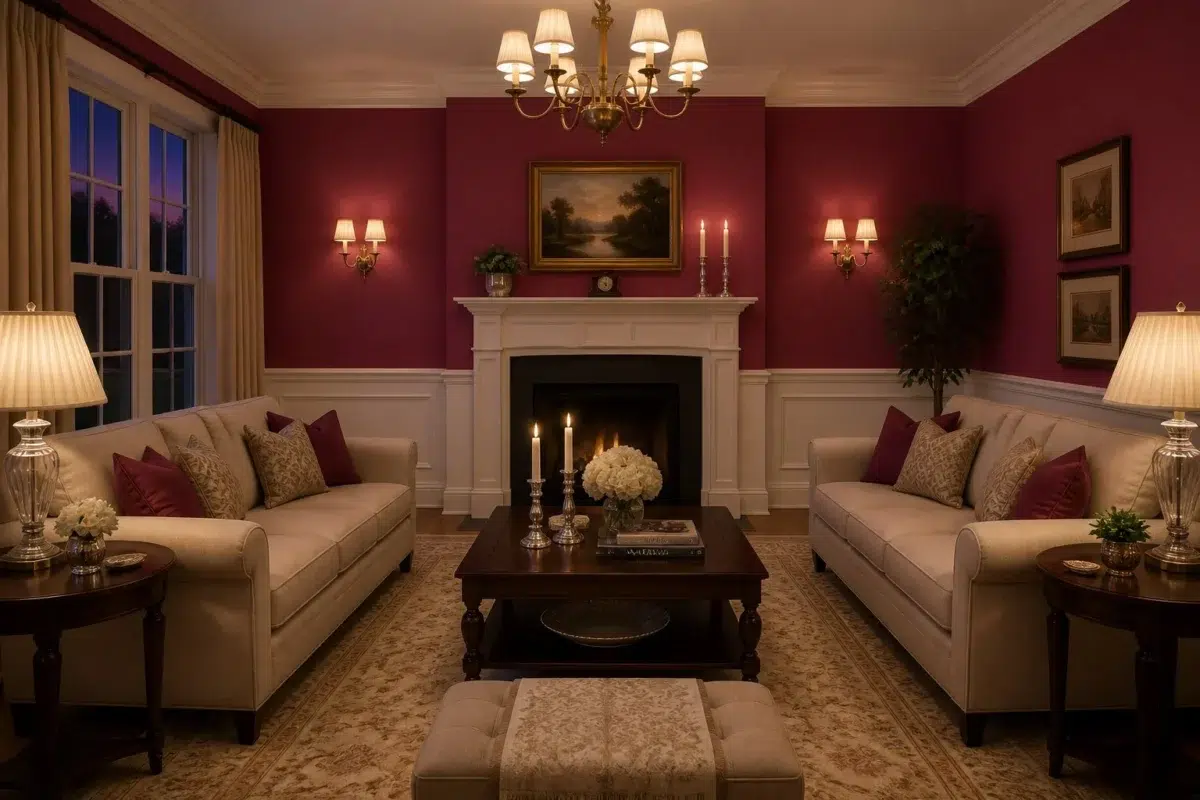
1 Living Room Photo
Across 1 living room image, Cerise (6580) meets the movement from window light to lamplight. Its cool classification can bring a composed, clean tension to warmer finishes.

A traditional living room painted in Cerise
@mybudgetrecipes
1 Bedroom Photo
The slower pace of morning and night can draw different notes from Cerise (6580). The pink, red hue classifications suggest the subtle directions the color may take as the room changes.

A organic modern bedroom painted in Cerise
@mybudgetrecipes
1 Bathroom Photo
Cerise (6580) can change noticeably under window light, mirrors and focused task lighting. Sample it beside the finishes that will remain in the room.

Cerise — wabi-sabi bathroom
@mybudgetrecipes
1 Dining Room Photo
Cerise (6580) moves through 1 dining room image without becoming a fixed prescription for the room. Its cool classification can bring a composed, clean tension to warmer finishes.

Cerise paint in a mid century dining room
@mybudgetrecipes
1 House Photo
In an exterior viewed across distance, weather and the changing sky, the most interesting quality of Cerise (6580) may be the way it responds to roofing, masonry, timber, planting and trim. The pink, red hue classifications suggest the subtle directions the color may take as the room changes.

Sherwin-Williams Cerise in a scandinavian house
@mybudgetrecipes
1 Front Door Photo
Viewed across 1 front door image in a small architectural moment with an outsized first impression, Cerise (6580) reveals how much color depends on scale, surface and shadow. With an LRV of 9.7, it carries enough visual weight to make light, trim and texture feel especially deliberate.

scandinavian front door featuring Cerise by Sherwin-Williams
@mybudgetrecipes
Expert Perspectives
Articles and features from across our network of home and design sites.
Coordinating Colors


Ibis White reflects far more light (LRV 84 vs 10), opening up a space where Cerise encloses it.

Ligonier Tan reflects far more light (LRV 47 vs 10), opening up a space where Cerise encloses it.


A 7-point LRV gap (16 vs 10) makes Antiquarian Brown the marginally brighter of the two.
Trim Color
Ibis White reflects far more light (LRV 84 vs 10), opening up a space where Cerise encloses it.
Similar Colors


With LRVs of 10 and 9, the two reflect almost the same amount of light.


Their light reflectance is nearly identical (LRV 12 vs 10), so neither reads brighter in a room.


Their light reflectance is nearly identical (LRV 10 vs 8), so neither reads brighter in a room.


Their light reflectance is nearly identical (LRV 12 vs 10), so neither reads brighter in a room.


A 4-point LRV gap (10 vs 6) makes Cerise the marginally brighter of the two.


Complementary Colors


Cerise reads slightly lighter (LRV 10 vs 5), a gap that shows most in low-lit rooms.


Teal Stencil reads slightly lighter (LRV 19 vs 10), a gap that shows most in low-lit rooms.


A 3-point LRV gap (13 vs 10) makes Rookwood Sash Green the marginally brighter of the two.
Lighter Colors


Their light reflectance is nearly identical (LRV 12 vs 10), so neither reads brighter in a room.


At LRV 23 vs 10, Dragon Fruit is decisively the brighter choice.


Darker Colors

A 6-point LRV gap (10 vs 4) makes Cerise the marginally brighter of the two.
A 4-point LRV gap (10 vs 6) makes Cerise the marginally brighter of the two.
Color Codes
Manufacturer description
This sultry deep red with cool blue undertones conjures the drama of velvet curtains and late-night sophistication, perfect for creating an intimate cocoon in bedrooms or dining rooms. Its bright saturation glows with jewel-like intensity, anchoring a space with bold elegance and timeless glamour.