
Chapeau Violet
Chapeau Violet is a blue paint color from Sherwin-Williams, but its character reaches beyond a single label. Its cool classification gives it a crisper edge that may become clearer beside warm timber, cream or brass. Treat the digital swatch as an opening note, then watch a physical sample from morning light through evening lamps.
Hex
#DEE5ECLRV
77.73
Chapeau Violet in Rooms
Follow Chapeau Violet from one space to another and watch how light, scale and surrounding materials reshape its character. 10 generated visualizations explore how the color might shape a finished room.
1 Dining Room Photo
Viewed across 1 dining room image in a gathering space that can move from daylight to ceremony, Chapeau Violet (7136) reveals how much color depends on scale, surface and shadow. Its LRV of 77.7 gives it a light-reflective character, though shadows and neighboring finishes can still draw out surprising depth.
Chapeau Violet paint in a moody dining room
@mybudgetrecipes
1 Bathroom Photo
The 1 bathroom image turn a blue swatch into something more spatial and expressive. Its cool classification can bring a composed, clean tension to warmer finishes.

Chapeau Violet — coastal bathroom
@mybudgetrecipes
1 Bedroom Photo
Chapeau Violet (7136) brings its blue character into a room designed around rest, softness and retreat. Its cool classification can bring a composed, clean tension to warmer finishes.

A art deco bedroom painted in Chapeau Violet
@mybudgetrecipes
1 Front Door Photo
1 generated visualization explores how the color might shape the finished space. Together they show Chapeau Violet (7136) as inspiration rather than a promise of an identical result.

minimalist front door featuring Chapeau Violet by Sherwin-Williams
@mybudgetrecipes
1 Home Office Photo
In a focused room balancing work, concentration and comfort, the most interesting quality of Chapeau Violet (7136) may be the way it responds to wood, paper, shelving and upholstered seating. The blue, purple hue classifications suggest the subtle directions the color may take as the room changes.

Sherwin-Williams Chapeau Violet in a scandinavian home office
@mybudgetrecipes
1 Kitchen Photo
Chapeau Violet (7136) moves through 1 kitchen image without becoming a fixed prescription for the room. Its cool classification can bring a composed, clean tension to warmer finishes.

Chapeau Violet — minimalist kitchen
@mybudgetrecipes
1 Mudroom Photo
The 1 mudroom image turn a blue swatch into something more spatial and expressive. Its cool classification can bring a composed, clean tension to warmer finishes.

Chapeau Violet paint in a tiny mudroom
@mybudgetrecipes
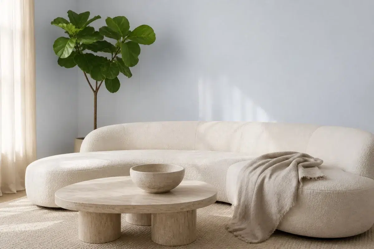
1 Living Room Photo
The blue, purple hue classifications suggest the subtle directions the color may take as the room changes. In this setting, let the movement from window light to lamplight and upholstery, timber, art and metal accents guide the final sample decision.

A organic modern living room painted in Chapeau Violet
@mybudgetrecipes
1 House Photo
Chapeau Violet (7136) can change noticeably under full daylight, cloud cover and long evening shadows. Sample it beside the finishes that will remain in the room.

Chapeau Violet color — modern luxury house inspiration
@mybudgetrecipes
1 Patio Photo
1 patio image place Chapeau Violet (7136) in an outdoor room surrounded by sky, planting and open light. Its LRV of 77.7 gives it a light-reflective character, though shadows and neighboring finishes can still draw out surprising depth.

minimalist patio featuring Chapeau Violet by Sherwin-Williams
@mybudgetrecipes
Expert Perspectives
Articles and features from across our network of home and design sites.
Coordinating Colors


Chapeau Violet reflects far more light (LRV 78 vs 59), opening up a space where Jazz Age Coral encloses it.


At LRV 78 vs 60, Chapeau Violet is decisively the brighter choice.
Similar Colors

A 3-point LRV gap (81 vs 78) makes Twinkle the marginally brighter of the two.

A 4-point LRV gap (78 vs 74) makes Chapeau Violet the marginally brighter of the two.

With LRVs of 78 and 76, the two reflect almost the same amount of light.

Chapeau Violet reads slightly lighter (LRV 78 vs 72), a gap that shows most in low-lit rooms.


With LRVs of 78 and 76, the two reflect almost the same amount of light.

A 4-point LRV gap (78 vs 74) makes Chapeau Violet the marginally brighter of the two.


With LRVs of 78 and 77, the two reflect almost the same amount of light.

Lavender Wisp reads slightly lighter (LRV 83 vs 78), a gap that shows most in low-lit rooms.

A 3-point LRV gap (78 vs 75) makes Chapeau Violet the marginally brighter of the two.


A 9-point LRV gap (78 vs 69) makes Chapeau Violet the marginally brighter of the two.
Complementary Colors


At LRV 78 vs 35, Chapeau Violet is decisively the brighter choice.


A 4-point LRV gap (81 vs 78) makes Heavenly White the marginally brighter of the two.

Chapeau Violet reads slightly lighter (LRV 78 vs 74), a gap that shows most in low-lit rooms.

Chapeau Violet reflects far more light (LRV 78 vs 35), opening up a space where Palisade encloses it.


Chapeau Violet reflects far more light (LRV 78 vs 13), opening up a space where Griffin encloses it.


Chapeau Violet reflects far more light (LRV 78 vs 20), opening up a space where Warm Stone encloses it.


At LRV 78 vs 61, Chapeau Violet is decisively the brighter choice.
Darker Colors


A 10-point LRV gap (78 vs 67) makes Chapeau Violet the marginally brighter of the two.
A 4-point LRV gap (78 vs 74) makes Chapeau Violet the marginally brighter of the two.


Chapeau Violet reads slightly lighter (LRV 78 vs 69), a gap that shows most in low-lit rooms.
Color Codes
Manufacturer description
This ethereal pale violet whispers of lavender fields bathed in soft twilight, with cool undertones that bring an air of refined serenity to any room. Perfect for bedrooms or creative spaces, it pairs beautifully with crisp whites and soft grays for an understated, sophisticated elegance.