
Cherish Cream
Cherish Cream is a beige paint color from Sherwin-Williams, but its character reaches beyond a single label. Its beige classifications hint at the directions it may take as daylight, lamps and neighboring colors move around it. The manufacturer's description below offers one reading; the room imagery leaves space for your own.
Hex
#F4E3CBLRV
78.44
Cherish Cream in Rooms
Follow Cherish Cream from one space to another and watch how light, scale and surrounding materials reshape its character. 10 generated visualizations explore how the color might shape a finished room.
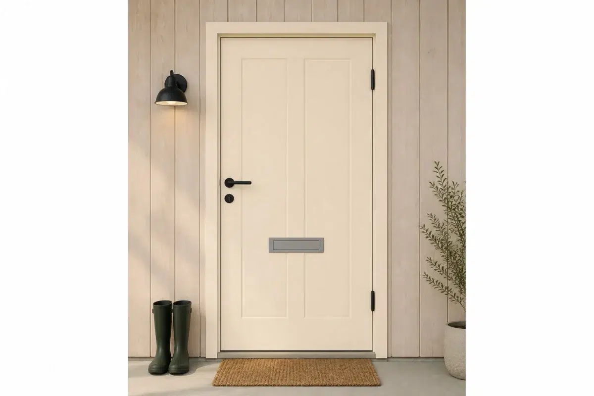
1 Front Door Photo
Cherish Cream (6651) offers a starting mood rather than a finished formula: Its warm classification can feel inviting beside tactile, natural materials. Test it under direct sun, porch shade and evening exterior light.
scandinavian front door featuring Cherish Cream by Sherwin-Williams
@mybudgetrecipes
1 Dining Room Photo
Cherish Cream (6651) offers a starting mood rather than a finished formula: Its warm classification can feel inviting beside tactile, natural materials. Test it under natural light, candles and pendant lighting.

Cherish Cream paint in a art deco dining room
@mybudgetrecipes
1 Bathroom Photo
Cherish Cream (6651) can change noticeably under window light, mirrors and focused task lighting. Sample it beside the finishes that will remain in the room.

Cherish Cream — minimalist bathroom
@mybudgetrecipes
1 Home Office Photo
The transition between focused work and the rest of the home can draw different notes from Cherish Cream (6651). The beige hue classifications suggest the subtle directions the color may take as the room changes.

Sherwin-Williams Cherish Cream in a contemporary home office
@mybudgetrecipes
1 Bedroom Photo
Cherish Cream (6651) moves through 1 bedroom image without becoming a fixed prescription for the room. Its warm classification can feel inviting beside tactile, natural materials.

A cozy bedroom painted in Cherish Cream
@mybudgetrecipes
1 Mudroom Photo
In a practical threshold where the outdoors enters the home, the most interesting quality of Cherish Cream (6651) may be the way it responds to flooring, storage, timber, baskets and hardware. The beige hue classifications suggest the subtle directions the color may take as the room changes.

Cherish Cream paint in a coastal mudroom
@mybudgetrecipes
1 Living Room Photo
The beige hue classifications suggest the subtle directions the color may take as the room changes. In this setting, let the movement from window light to lamplight and upholstery, timber, art and metal accents guide the final sample decision.

A industrial living room painted in Cherish Cream
@mybudgetrecipes
1 Kitchen Photo
Cherish Cream (6651) brings its beige character into a hardworking room where color meets movement and strong surfaces. Its warm classification can feel inviting beside tactile, natural materials.

Cherish Cream — classy kitchen
@mybudgetrecipes
1 House Photo
The 1 house image turn a beige swatch into something more spatial and expressive. Its warm classification can feel inviting beside tactile, natural materials.

Cherish Cream color — rustic modern house inspiration
@mybudgetrecipes
1 Patio Photo
1 generated visualization explores how the color might shape the finished space. Together they show Cherish Cream (6651) as inspiration rather than a promise of an identical result.

coastal patio featuring Cherish Cream by Sherwin-Williams
@mybudgetrecipes
Expert Perspectives
Articles and features from across our network of home and design sites.
Coordinating Colors


A 6-point LRV gap (84 vs 78) makes Pure White the marginally brighter of the two.


Cherish Cream reflects far more light (LRV 78 vs 27), opening up a space where Copper Wire encloses it.
Similar Colors


With LRVs of 78 and 78, the two reflect almost the same amount of light.

Their light reflectance is nearly identical (LRV 78 vs 78), so neither reads brighter in a room.


Their light reflectance is nearly identical (LRV 78 vs 78), so neither reads brighter in a room.


With LRVs of 78 and 78, the two reflect almost the same amount of light.


A 4-point LRV gap (83 vs 78) makes French Vanilla the marginally brighter of the two.


With LRVs of 78 and 76, the two reflect almost the same amount of light.


Their light reflectance is nearly identical (LRV 80 vs 78), so neither reads brighter in a room.


With LRVs of 79 and 78, the two reflect almost the same amount of light.


Their light reflectance is nearly identical (LRV 78 vs 76), so neither reads brighter in a room.


Their light reflectance is nearly identical (LRV 80 vs 78), so neither reads brighter in a room.
Complementary Colors


At LRV 78 vs 37, Cherish Cream is decisively the brighter choice.


At LRV 78 vs 37, Cherish Cream is decisively the brighter choice.

At LRV 78 vs 25, Cherish Cream is decisively the brighter choice.


At LRV 78 vs 18, Cherish Cream is decisively the brighter choice.


A 11-point LRV gap (78 vs 68) makes Cherish Cream the marginally brighter of the two.

At LRV 78 vs 56, Cherish Cream is decisively the brighter choice.


At LRV 78 vs 43, Cherish Cream is decisively the brighter choice.
Lighter Colors
Their light reflectance is nearly identical (LRV 80 vs 78), so neither reads brighter in a room.


With LRVs of 80 and 78, the two reflect almost the same amount of light.


A 3-point LRV gap (82 vs 78) makes Creme the marginally brighter of the two.


Paperwhite reads slightly lighter (LRV 87 vs 78), a gap that shows most in low-lit rooms.

A 7-point LRV gap (86 vs 78) makes Venetian Lace the marginally brighter of the two.
Darker Colors
With LRVs of 78 and 78, the two reflect almost the same amount of light.
Their light reflectance is nearly identical (LRV 78 vs 76), so neither reads brighter in a room.
With LRVs of 78 and 76, the two reflect almost the same amount of light.

At LRV 78 vs 57, Cherish Cream is decisively the brighter choice.


Cherish Cream reflects far more light (LRV 78 vs 61), opening up a space where Compatible Cream encloses it.
Color Codes
Manufacturer description
This luminous cream bathes a room in the warmth of soft candlelight, its gentle golden undertones creating an atmosphere of comfort and intimacy. Perfect for bedrooms and living spaces, it pairs beautifully with warm whites and soft pastels to establish a welcoming, nurturing sanctuary.