
Iron Ore
Iron Ore is a Neutral paint color from Sherwin-Williams, but its character reaches beyond a single label. Its neutral temperature leaves room for surrounding materials and light to pull the color warmer or cooler. Treat the digital swatch as an opening note, then watch a physical sample from morning light through evening lamps.
Hex
#434341LRV
5.55
Iron Ore's Color Strip
Iron Ore is the seventh shade on this 7-color strip, the deepest shade in this coordinated family. Browsing strip 251 alongside this color helps you gauge whether to go lighter, darker, or stay right here.


Iron Ore in Rooms
Follow Iron Ore from one space to another and watch how light, scale and surrounding materials reshape its character. 114 sourced room photos sit alongside 77 generated visualizations.
25 Living Room Photos
Iron Ore (7069) offers a starting mood rather than a finished formula: Its neutral temperature gives the surrounding palette unusual influence over the final mood. Test it under the movement from window light to lamplight.
Living room walls establish warmth in Iron Ore.
@mybudgetrecipes
23 Bedroom Photos
The 23 bedroom images turn a neutral swatch into something more spatial and expressive. Its muted saturation softens the color’s edges, making texture and shadow part of the composition.

Bedroom walls create a restful retreat in Iron Ore.
@mybudgetrecipes
8 Kitchen Photos
Against stone, timber, tile and metal finishes, Iron Ore (7069) may feel quieter, sharper or more atmospheric than the digital swatch alone. With an LRV of 5.5, it carries enough visual weight to make light, trim and texture feel especially deliberate.

Kitchen cabinetry achieves timeless elegance in Iron Ore.
@mybudgetrecipes
18 Bathroom Photos
Iron Ore (7069) can change noticeably under window light, mirrors and focused task lighting. Sample it beside the finishes that will remain in the room.

Bathroom walls embrace dramatic depth in Iron Ore.
@mybudgetrecipes
8 Home Office Photos
8 home office images trace Iron Ore (7069) through the transition between focused work and the rest of the home. Its place within Top 50 Colors hints at the range of palettes it can inhabit.

Office workspace gains focus with Iron Ore walls.
@mybudgetrecipes
32 House Photos
Against roofing, masonry, timber, planting and trim, Iron Ore (7069) may feel quieter, sharper or more atmospheric than the digital swatch alone. With an LRV of 5.5, it carries enough visual weight to make light, trim and texture feel especially deliberate.

Exterior facade transforms with Iron Ore's sophisticated tone.
@mybudgetrecipes
11 Front Door Photos
11 front door images place Iron Ore (7069) in a small architectural moment with an outsized first impression. With an LRV of 5.5, it carries enough visual weight to make light, trim and texture feel especially deliberate.

Front door makes a strong architectural statement in Iron Ore.
@mybudgetrecipes
26 Misc Photos
Across 26 misc images, Iron Ore (7069) meets the varied light of hallways, corners and transitional rooms. Its neutral temperature gives the surrounding palette unusual influence over the final mood.

Wall finish demonstrates Iron Ore's versatile appeal.
@itsaboutflippintime
17 Kitchen Cabinets Photos
The 17 kitchen cabinets images turn a neutral swatch into something more spatial and expressive. Its muted saturation softens the color’s edges, making texture and shadow part of the composition.

Kitchen cabinets in Iron Ore pair with marble countertops for contrast.
@fieldandforestdesign
9 Dining Room Photos
In a gathering space that can move from daylight to ceremony, the most interesting quality of Iron Ore (7069) may be the way it responds to timber, table linen, glass and artwork. The grey hue classifications suggest the subtle directions the color may take as the room changes.

Dining room walls in Iron Ore provide an elegant backdrop for gatherings.
@cozywhitehouse
7 Mudroom Photos
7 mudroom images trace Iron Ore (7069) through the daily movement of arrivals, departures and changing weather. Its place within Top 50 Colors hints at the range of palettes it can inhabit.

Built-in cabinetry and walls in Iron Ore command this high-contrast mudroom.
@simplywalldecor
7 Patio Photos
The broad shift from bright afternoon to dusk can draw different notes from Iron Ore (7069). The grey hue classifications suggest the subtle directions the color may take as the room changes.

Privacy screening in Iron Ore defines the outdoor space with modern architectural purpose.
@simplywalldecor
Expert Perspectives
Articles and features from across our network of home and design sites.

7 Iron Ore Bathroom Ideas: Inspiring Design Concepts - Simply Wall Décor
Iron Ore by Sherwin Williams is a soft black paint color that works well in bathrooms. This deep charcoal shade creates a bold backdrop for bathroom vanities,

7 Iron Ore Bedroom Ideas: Inspiring Designs for a Sophisticated Retreat - Simply Wall Décor
Iron ore is a soft black paint color from Sherwin Williams that works well in bedrooms. This deep charcoal gray shade creates a calm backdrop that makes your

7 Iron Ore Dining Room Ideas: Inspiring Design Concepts - Simply Wall Décor
Iron Ore by Sherwin Williams is a deep charcoal paint color that sits between black and gray. It works well in dining rooms because it creates a bold backdrop

7 Iron Ore Front Door Ideas: Modern Looks and Timeless Pairings - Simply Wall Décor
Your front door is the first thing visitors notice, and the color you choose sets the tone for your entire home. Iron Ore by Sherwin Williams has become one

7 Iron Ore Home Office Ideas: Stylish Concepts for Every Space - Simply Wall Décor
Iron Ore by Sherwin Williams is a deep charcoal paint color that creates a sophisticated backdrop for your home office. This rich shade works as an accent

7 Iron Ore House Ideas: Modern Exteriors With Bold Contrast - Simply Wall Décor
Sherwin Williams Iron Ore is a soft black paint color that works well on house exteriors. This deep charcoal gray has warm undertones that make it less harsh

7 Iron Ore Kitchen Ideas: Inspiring Modern & Luxurious Designs - Simply Wall Décor
Iron ore is a dark charcoal paint color that has become a popular choice for kitchen cabinets. It sits between black and dark gray, offering depth without the

7 Iron Ore Living Room Ideas: Bold Styles for Modern Spaces - Simply Wall Décor
Sherwin Williams Iron Ore is a deep charcoal gray paint that works well in living rooms. This color has a soft black appearance with subtle undertones that

7 Iron Ore Mudroom Ideas: Striking Inspirations for Every Home - Simply Wall Décor
Walking into your home with muddy shoes and wet coats can quickly turn your entryway into chaos. A mudroom painted in Sherwin Williams Iron Ore offers a

7 Iron Ore Patio Ideas: Modern Outdoor Style Inspiration - Simply Wall Décor
Iron Ore by Sherwin Williams isn't just for walls and front doors. This soft black paint color can transform your patio into a stylish outdoor space that
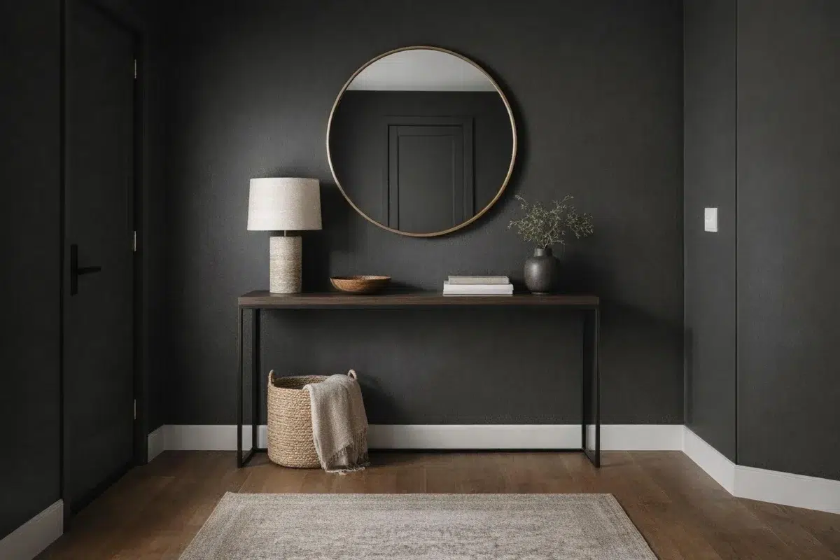
Iron Ore by Sherwin Williams SW 7069: A Rich, Dark Neutral for Modern Homes
Iron Ore (SW 7069) by Sherwin-Williams is a deep charcoal paint color that brings sophistication to any space. This versatile neutral has become increasingly popular for both interior and exterior projects because of its perfect balance between pure black and dark gray. It has cool undertones that give it a bit of personality and depth
Coordinating Colors


Nebulous White reflects far more light (LRV 74 vs 6), opening up a space where Iron Ore encloses it.


At LRV 86 vs 6, Extra White is decisively the brighter choice.


Trim Color
Nebulous White reflects far more light (LRV 74 vs 6), opening up a space where Iron Ore encloses it.
Similar Colors


Their light reflectance is nearly identical (LRV 6 vs 4), so neither reads brighter in a room.


With LRVs of 7 and 6, the two reflect almost the same amount of light.


With LRVs of 6 and 6, the two reflect almost the same amount of light.


With LRVs of 6 and 6, the two reflect almost the same amount of light.


Color Codes
Manufacturer description
This cool, deep and mysterious charcoal can lend an air of sophistication when used sparingly in well-lit spaces – or on exteriors.
Attributed to Sherwin-Williams catalog data.