
Upward
With a focus on versatile and reflective tones, Upward (6239) is a standout Blue in our database. It was selected for this featured gallery for its ability to provide a clean, timeless feel that works across various lighting conditions. See it applied across 57 real world scenarios and find professional pairing data below.
Hex
#BFC9D0
LRV
57.40
Upward's Color Strip
Upward is the first shade on this 7-color strip, the lightest in this coordinated family. As part of strip 224, these colors are curated to work together — helpful when you're deciding how light or deep to go.


Upward in Real Rooms
Upward has a high LRV of 57.4 — it reflects a lot of light and will read pale and airy in most spaces. It's neutral in temperature and , making it adaptable across different lighting conditions and room orientations. Grouped in the Blue family, the photos below show it applied in a living room, bedroom, kitchen, bathroom, home office, house, front door, misc, mudroom and kitchen cabinets.
3 Living Room Photos
There is a specific "glow" that Upward takes on during the golden hour in a living room. As the sun sets, the pigments react with the low-angled light to create a hazy, ethereal atmosphere that feels incredibly high-end. It's a color that rewards those who use the room during the transition of the day.
Living room walls in Upward bring a gentle, airy blue tone to the space.
@mybudgetrecipes

Living room walls in Upward create sophisticated, welcoming atmosphere.
@coastalsignaturehomes

Living space painted Upward blue brings calm elegance to gatherings.
@newhouseowners
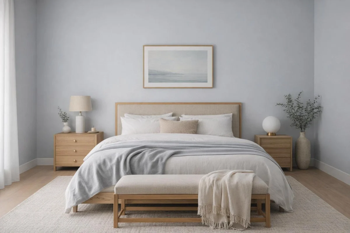
16 Bedroom Photos
There's a rhythmic quality to Upward in a bedroom. It's a color that supports the circadian rhythm, mirroring the natural shadows of the evening and providing a neutral, non-stimulating canvas for the brain to decompress after a long day of digital exposure.

Bedroom accent wall painted Upward creates soft depth without overwhelming the room.
@mybudgetrecipes
1 Kitchen Photo
On kitchen walls, Upward adds a considered, intentional feel without demanding too much attention in a busy space. It holds its own against both warm wood countertops and cool quartz or marble, making it an incredibly flexible choice for the hardest-working and most high-traffic room in the house.

Kitchen cabinet fronts in Upward deliver a fresh, cohesive look throughout the space.
@mybudgetrecipes
7 Bathroom Photos
Bathrooms test color in specific ways — task lighting, tile grout, and chrome or brass fixtures all compete for attention. Upward holds its own against all of it, and tends to photograph even better than it reads in person.

Bathroom walls in Upward establish a spa-like, tranquil environment for daily routines.
@mybudgetrecipes
1 Home Office Photo
Upward in a home office signals that the space was thought about. The color holds up under the scrutiny of video calls without feeling staged, and it stays comfortable across the full working day in a way that brighter colors often don't.

Desk area painted in Upward provides calm focus for work and concentration.
@mybudgetrecipes
1 House Photo
When choosing Upward for an exterior, you are opting for a color that respects the landscape. It feels like it grew out of the earth rather than being dropped onto it, creating a harmonious relationship between the architecture and the garden.

Exterior siding glows in soft Upward blue throughout this charming home.
@mybudgetrecipes
3 Front Door Photos
In a world of boring front doors, Upward is a breath of fresh air. It's a sophisticated choice that works with almost any siding color, providing a much-needed focal point that guides guests naturally toward the entrance.

Bold front door painted in Upward creates an inviting entryway statement.
@mybudgetrecipes

Painted front door in Upward creates a welcoming entryway with timeless appeal.
@simple.pretty.lifestyle

This front door in Upward offers classic curb appeal and sophisticated charm.
@simple.pretty.lifestyle
12 Misc Photos
Observe the use of Upward on architectural "oddities"—slanted ceilings, built-in nooks, or under-stair closets. The color helps these strange angles feel like deliberate design features rather than construction afterthoughts.

Hallway walls wrapped in Upward blue establish a calming passage.
@bluewaterdesignstudios
5 Mudroom Photos
Using Upward on mudroom walls makes the white trim and hooks pop. It creates a high-contrast, organized look that makes even a room full of sports gear and rain boots look like it has a system and a sense of order.

Mudroom cabinetry finished in Upward provides both function and style.
@nextlevelpaintco

Mudroom walls in Upward create an organized, inviting entry space.
@harryhomeowner

Laundry room cabinetry in Upward combines practicality with aesthetic appeal.
@larson_interiors

Utility room walls painted Upward balance function with soft color.
@ana_interiors

Laundry room shelving in Upward organizes and beautifies utility spaces.
@harryhomeowner
8 Kitchen Cabinets Photos
The way Upward interacts with under-cabinet lighting is transformative. It catches the glow and reflects a softer, more diffused light onto the countertops, making the workspace feel more inviting and less utilitarian.

Kitchen cabinetry in Upward brings refreshing color to cooking spaces.
@not_too_shabby_lady
Expert Perspectives
In-depth articles and real-home features from across our network of home and design sites.
Coordinating Colors


At LRV 86 vs 57, Extra White is decisively the brighter choice.


A 9-point LRV gap (66 vs 57) makes Natural Linen the marginally brighter of the two.
Trim Color
Similar Colors


Their light reflectance is nearly identical (LRV 57 vs 57), so neither reads brighter in a room.


A 5-point LRV gap (62 vs 57) makes North Star the marginally brighter of the two.


With LRVs of 58 and 57, the two reflect almost the same amount of light.


With LRVs of 60 and 57, the two reflect almost the same amount of light.
Complementary Colors


At LRV 57 vs 35, Upward is decisively the brighter choice.


At LRV 81 vs 57, Heavenly White is decisively the brighter choice.

Original White reflects far more light (LRV 74 vs 57), opening up a space where Upward encloses it.


Upward reflects far more light (LRV 57 vs 20), opening up a space where Warm Stone encloses it.


Lighter Colors


Aura White reflects far more light (LRV 76 vs 57), opening up a space where Upward encloses it.


At LRV 74 vs 57, Silent Ripple is decisively the brighter choice.
Darker Colors


A 10-point LRV gap (57 vs 48) makes Upward the marginally brighter of the two.