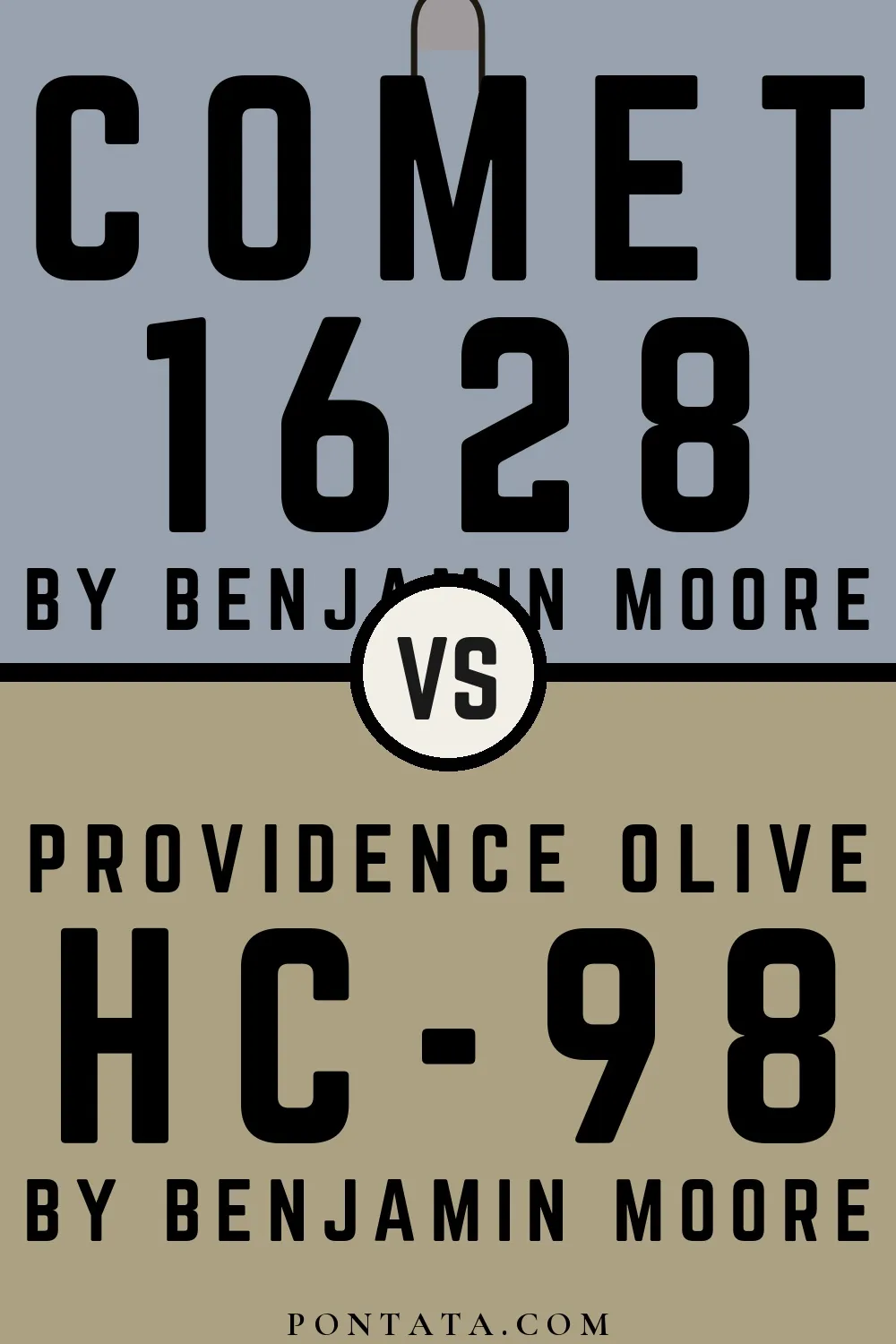
Comet vs Providence Olive
Comet and Providence Olive come from the same Benjamin Moore collection. Comet reads as blue-grey, while Providence Olive reads as beige-greige — two distinct hue families, not close cousins. Their light reflectance values are nearly the same — 36 vs 35 — so neither will read significantly brighter or darker than the other. Where Comet leans blue, Providence Olive reads yellow and red — a distinction that shifts noticeably depending on the light source and surrounding finishes. A ΔE of 25.2 puts these firmly in different territory — two distinct design choices rather than close alternatives. Below, 5 simulated room previews show how each color reads at scale — real-room photos will be added as they become available.
Color Details
Comet vs Providence Olive Simulated Comparison
5 simulated room previews — drag the slider on each to see Comet on one side and Providence Olive on the other.


Digital color is approximate. These simulations are generated from the manufacturer's hex values and overlaid on grayscale room photos — your screen's calibration, brightness, and viewing angle all affect how they render. Before committing to either color, test physical samples in your own space under the light you actually live with.