
Providence Olive
At first glance, Providence Olive belongs to the gray family; in a room, light and context can make it far more elusive. A yellow and red undertone may emerge most clearly where the paint meets a cleaner white, stone surface or contrasting textile. Its related shades below reveal where the color harmonizes—and where contrast brings it fully to life.
Hex
#ACA182LRV
35.44
Providence Olive in Rooms
Follow Providence Olive from one space to another and watch how light, scale and surrounding materials reshape its character. 2 sourced room photos offer a closer look at the color in lived-in settings.
2 House Photos
Catalog words such as Moody, Rich offer another lens on its character. In this setting, let full daylight, cloud cover and long evening shadows and roofing, masonry, timber, planting and trim guide the final sample decision.

Exterior siding in Providence Olive presents a refined, nature-inspired curb appeal.
@crestedbuttecolors

Home exterior painted Providence Olive showcases timeless, earthy elegance.
@crestedbuttecolors
Coordinating Colors


At LRV 72 vs 35, Halo is decisively the brighter choice.


A 11-point LRV gap (35 vs 25) makes Providence Olive the marginally brighter of the two.


Providence Olive reflects far more light (LRV 35 vs 15), opening up a space where Kendall Charcoal encloses it.


Carrington Beige reflects far more light (LRV 62 vs 35), opening up a space where Providence Olive encloses it.
Similar Colors


A 3-point LRV gap (35 vs 32) makes Providence Olive the marginally brighter of the two.
Complementary Colors


A 12-point LRV gap (35 vs 24) makes Providence Olive the marginally brighter of the two.


With LRVs of 35 and 34, the two reflect almost the same amount of light.

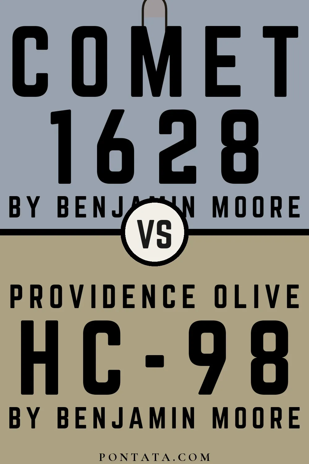
Their light reflectance is nearly identical (LRV 36 vs 35), so neither reads brighter in a room.

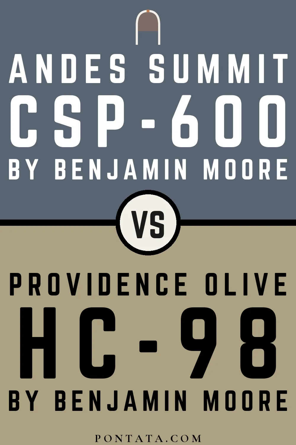
Providence Olive reflects far more light (LRV 35 vs 14), opening up a space where Andes Summit encloses it.


Providence Olive reflects far more light (LRV 35 vs 12), opening up a space where Evening Dove encloses it.


At LRV 35 vs 8, Providence Olive is decisively the brighter choice.

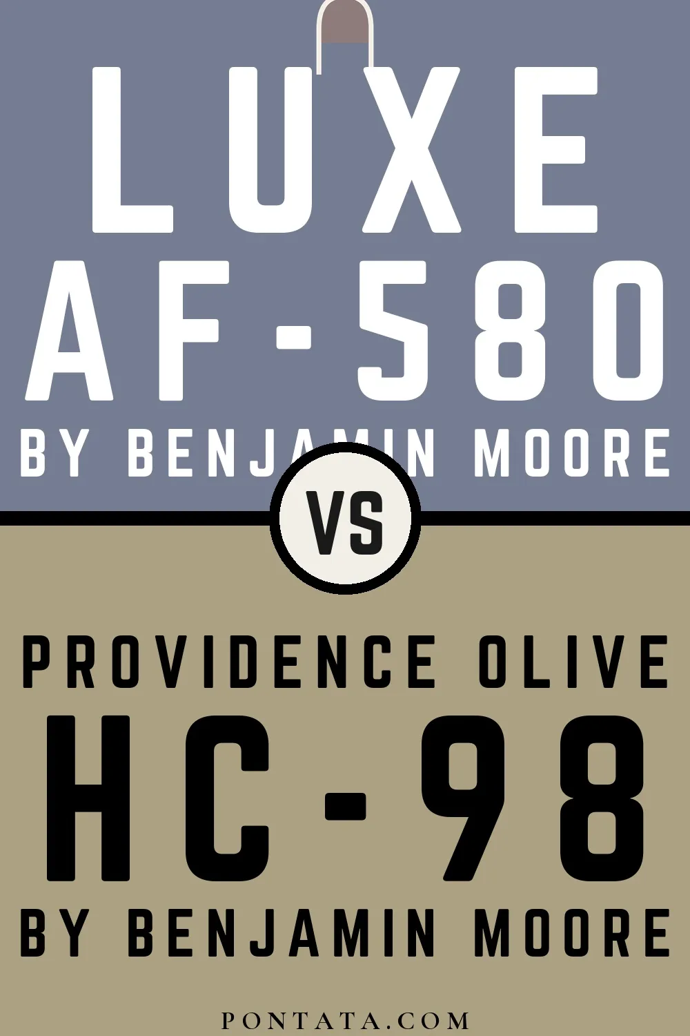
At LRV 35 vs 22, Providence Olive is decisively the brighter choice.
Lighter Colors

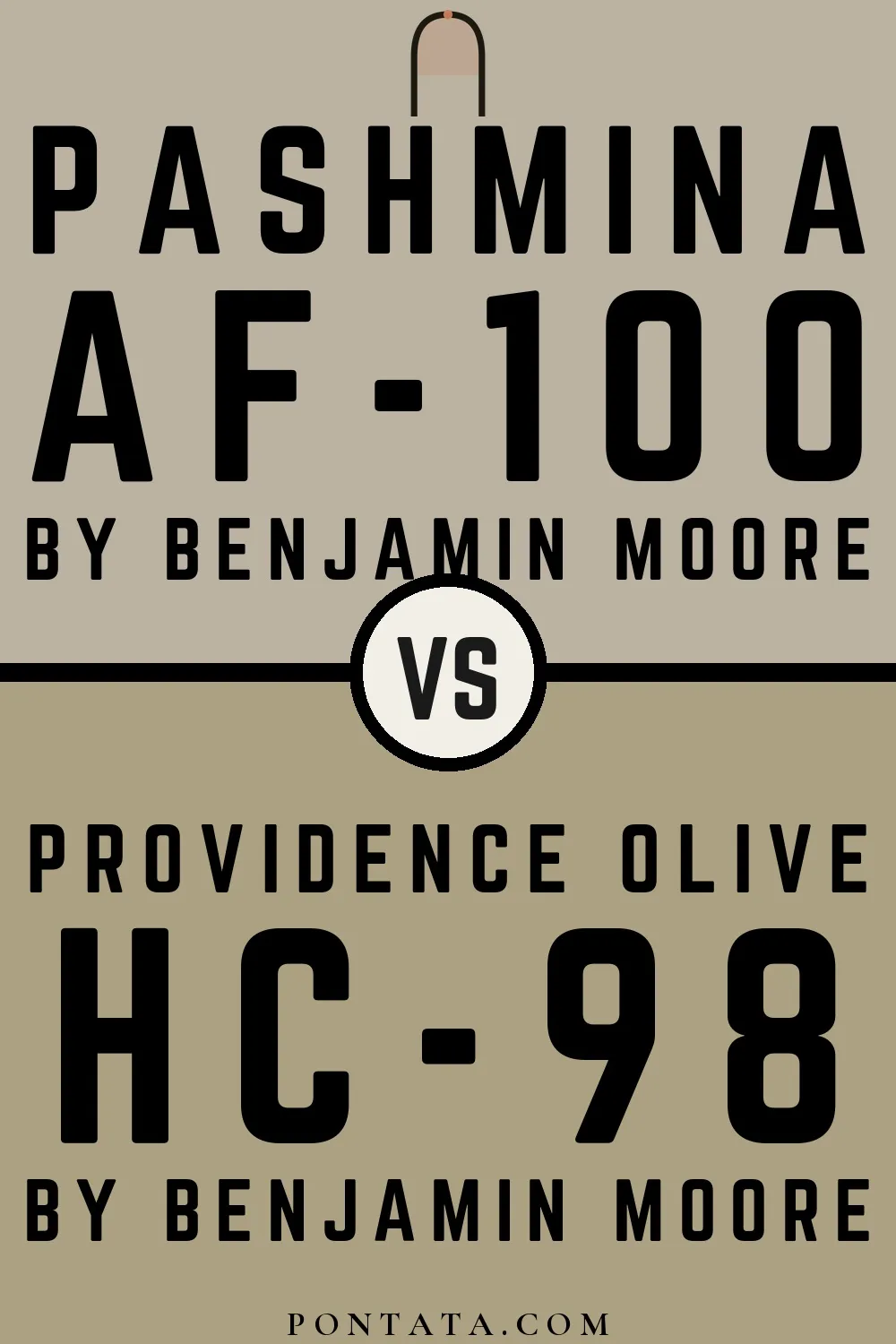
Pashmina reads slightly lighter (LRV 44 vs 35), a gap that shows most in low-lit rooms.


Their light reflectance is nearly identical (LRV 36 vs 35), so neither reads brighter in a room.

A 4-point LRV gap (39 vs 35) makes Dried Basil the marginally brighter of the two.


Their light reflectance is nearly identical (LRV 36 vs 35), so neither reads brighter in a room.


Their light reflectance is nearly identical (LRV 38 vs 35), so neither reads brighter in a room.
Darker Colors


Providence Olive reads slightly lighter (LRV 35 vs 26), a gap that shows most in low-lit rooms.


A 5-point LRV gap (35 vs 30) makes Providence Olive the marginally brighter of the two.


Providence Olive reflects far more light (LRV 35 vs 21), opening up a space where Smoke Bush encloses it.

Providence Olive reads slightly lighter (LRV 35 vs 23), a gap that shows most in low-lit rooms.
A 3-point LRV gap (35 vs 32) makes Providence Olive the marginally brighter of the two.
Color Codes
Manufacturer description
A blend of brown and green undertones defines this medium neutral.