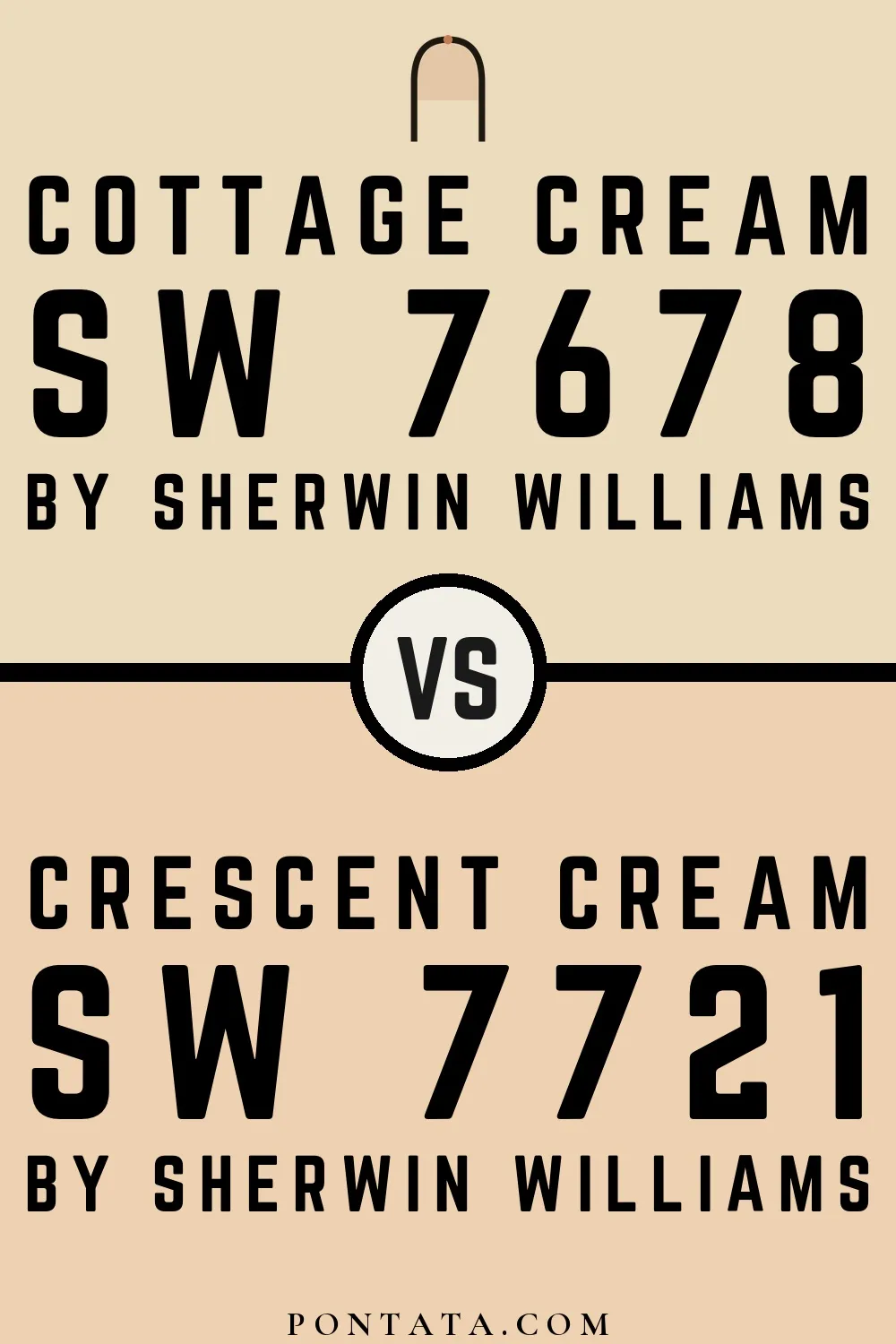
Cottage Cream vs Crescent Cream
Both from Sherwin-Williams's palette. These are both beiges, so the question isn't which hue to choose — it's where within beige to land. Cottage Cream (LRV 72) reflects noticeably more light than Crescent Cream (LRV 67), a difference of 6 points that becomes especially apparent in rooms with limited natural light. Both lean warm, so they'll behave similarly in mixed or changing light conditions. The ΔE 5.1 gap is real but not dramatic — close enough to use together, distinct enough to matter as a choice. Below you'll find 10 real-room photo comparisons where both colors appear side by side, plus 5 simulated room previews.
Cottage Cream vs Crescent Cream in Real Spaces
10 real rooms side by side. Cottage Cream and Crescent Cream are close enough that the difference can be hard to judge from a chip alone — these photos show how each reads at scale, across different spaces and lighting conditions.
Living Room
In a living room, color works across both daylight and evening light — the same wall can read very differently at noon and at 8pm. The brightness difference is modest but present — Cottage Cream gives the walls a little more lift.


Bedroom
The context that matters most in a bedroom is how a color reads under a bedside lamp at night, not under noon daylight. Cottage Cream reads slightly lighter here — a subtle but real difference in how open the space feels.


Kitchen
In a kitchen, colors are seen under bright task lighting that amplifies undertones — what reads neutral elsewhere can show its hand here. Cottage Cream reads slightly lighter here — a subtle but real difference in how open the space feels.


Dining Room
A dining room lit by a dimmed pendant or candles is one of the most forgiving environments for paint — warm light softens almost everything. Cottage Cream has the edge in reflectance, which shows as a quiet sense of added space rather than an obvious contrast.


Bathroom
Bathrooms are one of the few spaces where you're genuinely enclosed by the paint color, which makes the choice between these two more consequential. Cottage Cream reads slightly lighter here — a subtle but real difference in how open the space feels.


Home Office
The test for a home office color isn't how it looks in a quick glance — it's whether it still feels right after a full day of work. Cottage Cream reads slightly lighter here — a subtle but real difference in how open the space feels.


Mudroom
Mudrooms are seen in passing, often under whatever light comes through the door — a context that favors colors with some depth. Cottage Cream has the edge in reflectance, which shows as a quiet sense of added space rather than an obvious contrast.


Patio
Outside, paint color competes with sky, landscaping, and direct sun — all of which shift how both of these read compared to an indoor chip. Cottage Cream has the edge in reflectance, which shows as a quiet sense of added space rather than an obvious contrast.


House
Seen across an entire facade, subtle tonal differences become pronounced. What reads as nearly the same on a chip often reads as clearly different at scale. Cottage Cream reads slightly lighter here — a subtle but real difference in how open the space feels.


Front Door
A front door is a focal point — small color differences read clearly at this concentrated scale. The brightness difference is modest but present — Cottage Cream gives the walls a little more lift.


Color Details
Cottage Cream vs Crescent Cream Simulated Comparison
5 simulated room previews — drag the slider on each to see Cottage Cream on one side and Crescent Cream on the other.


Digital color is approximate. These simulations are generated from the manufacturer's hex values and overlaid on grayscale room photos — your screen's calibration, brightness, and viewing angle all affect how they render. Before committing to either color, test physical samples in your own space under the light you actually live with.