
Cottage Cream
Sherwin-Williams's Cottage Cream is a yellow shade whose quieter details emerge through comparison. Its beige classifications hint at the directions it may take as daylight, lamps and neighboring colors move around it. Because screens flatten both light and texture, sample the paint beside the finishes that will ultimately surround it.
Hex
#EDDBBDLRV
72.29
Cottage Cream's Color Strip
Cottage Cream is the second shade on this 7-color strip, sitting between Buff and Straw Harvest. The strip spans from Buff at the lightest end to Rustic City at the deepest. Strip 296 puts these related shades in sequence, making it simple to find the tone that suits your room.


Cottage Cream in Rooms
Follow Cottage Cream from one space to another and watch how light, scale and surrounding materials reshape its character. 10 generated visualizations explore how the color might shape a finished room.
1 Front Door Photo
1 generated visualization explores how the color might shape the finished space. Together they show Cottage Cream (7678) as inspiration rather than a promise of an identical result.
traditional front door featuring Cottage Cream by Sherwin-Williams
@mybudgetrecipes
1 Bathroom Photo
1 bathroom image place Cottage Cream (7678) in a compact setting where tile, fixtures and color sit close together. Its LRV of 72.3 gives it a light-reflective character, though shadows and neighboring finishes can still draw out surprising depth.

Cottage Cream — wabi-sabi bathroom
@mybudgetrecipes
1 Bedroom Photo
Viewed across 1 bedroom image in a room designed around rest, softness and retreat, Cottage Cream (7678) reveals how much color depends on scale, surface and shadow. Its LRV of 72.3 gives it a light-reflective character, though shadows and neighboring finishes can still draw out surprising depth.

A industrial bedroom painted in Cottage Cream
@mybudgetrecipes
1 Home Office Photo
Cottage Cream (7678) moves through 1 home office image without becoming a fixed prescription for the room. Its warm classification can feel inviting beside tactile, natural materials.

Sherwin-Williams Cottage Cream in a industrial home office
@mybudgetrecipes
1 Dining Room Photo
Cottage Cream (7678) offers a starting mood rather than a finished formula: Its warm classification can feel inviting beside tactile, natural materials. Test it under natural light, candles and pendant lighting.

Cottage Cream paint in a mid century dining room
@mybudgetrecipes
1 Patio Photo
Cottage Cream (7678) brings its yellow character into an outdoor room surrounded by sky, planting and open light. Its midtone saturation keeps the color expressive without letting it dominate every surface around it.

wabi-sabi patio featuring Cottage Cream by Sherwin-Williams
@mybudgetrecipes
1 Living Room Photo
These 1 living room image show how Cottage Cream (7678) can sit beside upholstery, timber, art and metal accents. The beige hue classifications suggest the subtle directions the color may take as the room changes.

A minimalist living room painted in Cottage Cream
@mybudgetrecipes
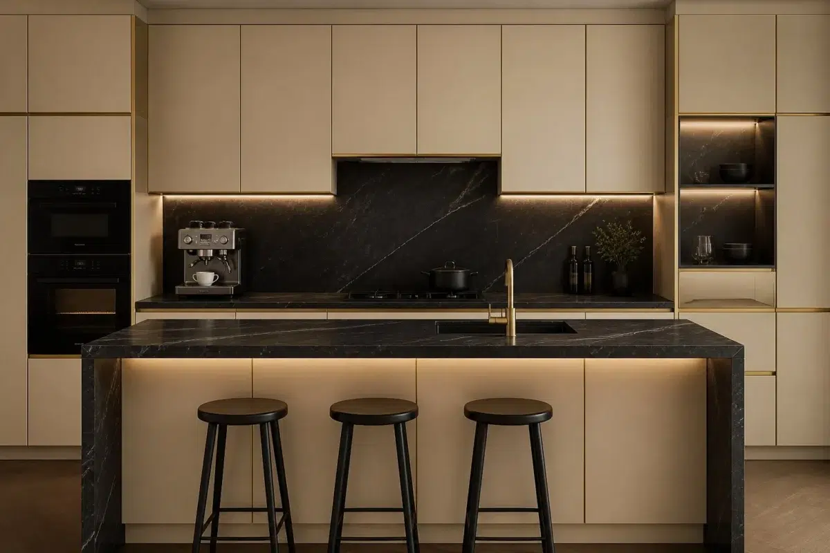
1 Kitchen Photo
Against stone, timber, tile and metal finishes, Cottage Cream (7678) may feel quieter, sharper or more atmospheric than the digital swatch alone. Its LRV of 72.3 gives it a light-reflective character, though shadows and neighboring finishes can still draw out surprising depth.

Cottage Cream — bold kitchen
@mybudgetrecipes
1 House Photo
Against roofing, masonry, timber, planting and trim, Cottage Cream (7678) may feel quieter, sharper or more atmospheric than the digital swatch alone. Its LRV of 72.3 gives it a light-reflective character, though shadows and neighboring finishes can still draw out surprising depth.

Cottage Cream color — maximalist house inspiration
@mybudgetrecipes
1 Mudroom Photo
Across 1 mudroom image, Cottage Cream (7678) meets doorway light and the softer illumination of an internal passage. Its warm classification can feel inviting beside tactile, natural materials.

Cottage Cream paint in a traditional mudroom
@mybudgetrecipes
Expert Perspectives
Articles and features from across our network of home and design sites.
Coordinating Colors


Dover White reads slightly lighter (LRV 83 vs 72), a gap that shows most in low-lit rooms.


Roman Column reflects far more light (LRV 88 vs 72), opening up a space where Cottage Cream encloses it.


At LRV 72 vs 15, Cottage Cream is decisively the brighter choice.
Trim Color
Dover White reads slightly lighter (LRV 83 vs 72), a gap that shows most in low-lit rooms.
Similar Colors


Their light reflectance is nearly identical (LRV 74 vs 72), so neither reads brighter in a room.


Their light reflectance is nearly identical (LRV 75 vs 72), so neither reads brighter in a room.


Classic Ivory reads slightly lighter (LRV 76 vs 72), a gap that shows most in low-lit rooms.


With LRVs of 72 and 70, the two reflect almost the same amount of light.


A 4-point LRV gap (76 vs 72) makes Paper Lantern the marginally brighter of the two.


With LRVs of 72 and 70, the two reflect almost the same amount of light.


Their light reflectance is nearly identical (LRV 72 vs 71), so neither reads brighter in a room.


Their light reflectance is nearly identical (LRV 75 vs 72), so neither reads brighter in a room.


A 3-point LRV gap (75 vs 72) makes Vital Yellow the marginally brighter of the two.


A 6-point LRV gap (78 vs 72) makes Gardenia the marginally brighter of the two.
Complementary Colors


A 7-point LRV gap (72 vs 65) makes Cottage Cream the marginally brighter of the two.


At LRV 72 vs 38, Cottage Cream is decisively the brighter choice.


At LRV 72 vs 38, Cottage Cream is decisively the brighter choice.


Cottage Cream reflects far more light (LRV 72 vs 29), opening up a space where Dried Lavender encloses it.


At LRV 72 vs 6, Cottage Cream is decisively the brighter choice.


Cottage Cream reflects far more light (LRV 72 vs 25), opening up a space where Smoky Azurite encloses it.


At LRV 72 vs 21, Cottage Cream is decisively the brighter choice.
Lighter Colors


Choice Cream reads slightly lighter (LRV 77 vs 72), a gap that shows most in low-lit rooms.
A 3-point LRV gap (75 vs 72) makes Vital Yellow the marginally brighter of the two.
Roman Column reflects far more light (LRV 88 vs 72), opening up a space where Cottage Cream encloses it.


A 3-point LRV gap (76 vs 72) makes Corallite the marginally brighter of the two.


A 10-point LRV gap (82 vs 72) makes Medici Ivory the marginally brighter of the two.
Darker Colors

At LRV 72 vs 57, Cottage Cream is decisively the brighter choice.


At LRV 72 vs 58, Cottage Cream is decisively the brighter choice.


Cottage Cream reflects far more light (LRV 72 vs 47), opening up a space where Tarnished Trumpet encloses it.


Cottage Cream reflects far more light (LRV 72 vs 54), opening up a space where Dakota Wheat encloses it.


Cottage Cream reads slightly lighter (LRV 72 vs 61), a gap that shows most in low-lit rooms.
Color Codes
Manufacturer description
Perfect for everyday living, this buttery yellow is a neutral canvas for any style regardless of lighting.
Attributed to Sherwin-Williams catalog data.