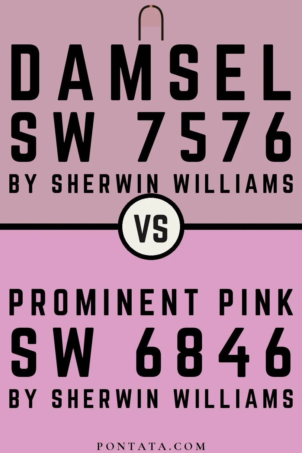
Damsel vs Prominent Pink
Both from Sherwin-Williams's palette. These are both pinks, so the question isn't which hue to choose — it's where within pink to land. Prominent Pink (LRV 43) reflects noticeably more light than Damsel (LRV 39), a difference of 4 points that becomes especially apparent in rooms with limited natural light. Both lean cool, so they'll behave similarly in mixed or changing light conditions. With a ΔE of 14.1, the contrast is hard to miss. These aren't variations on a theme — they're two different answers to the same question. Below, 5 simulated room previews show how each color reads at scale — real-room photos will be added as they become available.
Color Details
Damsel vs Prominent Pink Simulated Comparison
5 simulated room previews — drag the slider on each to see Damsel on one side and Prominent Pink on the other.


Digital color is approximate. These simulations are generated from the manufacturer's hex values and overlaid on grayscale room photos — your screen's calibration, brightness, and viewing angle all affect how they render. Before committing to either color, test physical samples in your own space under the light you actually live with.