Sherwin-Williams • 6846

Prominent Pink

Sherwin-Williams Prominent Pink (6846) carries the measured structure of its color data and the less predictable beauty of paint in a finished space. Its cool classification gives it a crisper edge that may become clearer beside warm timber, cream or brass. Move between the room imagery, color measurements and coordinating shades to build a fuller sense of how it might live in your space.

LRV

43.31

Find matches across brands →
Light Reflectance Value
43.31
Medium
TemperatureCool

Coordinating Colors

Prominent Pink
Tanbark
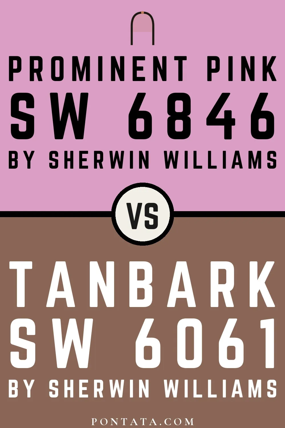
Prominent Pink vs Tanbark
Sherwin-Williams
Prominent Pink
6846 · LRV 43
Sherwin-Williams
Tanbark
6061 · LRV 15

Prominent Pink reflects far more light (LRV 43 vs 15), opening up a space where Tanbark encloses it.

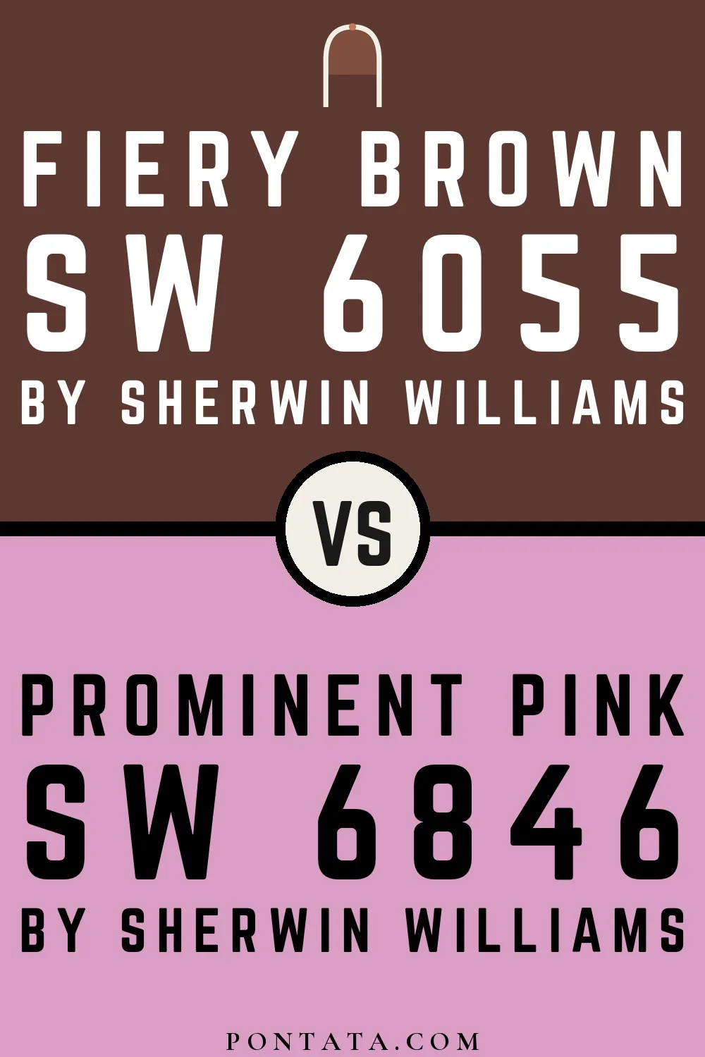
Fiery Brown
Fiery Brown
Prominent Pink
Fiery Brown vs Prominent Pink
Sherwin-Williams
Fiery Brown
6055 · LRV 5
Sherwin-Williams
Prominent Pink
6846 · LRV 43

At LRV 43 vs 5, Prominent Pink is decisively the brighter choice.

Similar Colors

Partytime
Prominent Pink
Partytime vs Prominent Pink
Sherwin-Williams
Partytime
6849 · LRV 49
Sherwin-Williams
Prominent Pink
6846 · LRV 43

Partytime reads slightly lighter (LRV 49 vs 43), a gap that shows most in low-lit rooms.

Prominent Pink
Queenly
Prominent Pink vs Queenly
Sherwin-Williams
Prominent Pink
6846 · LRV 43
Sherwin-Williams
Queenly
6977 · LRV 48

Queenly reads slightly lighter (LRV 48 vs 43), a gap that shows most in low-lit rooms.

Haute Pink
Haute Pink
Prominent Pink
Haute Pink vs Prominent Pink
Sherwin-Williams
Haute Pink
6570 · LRV 41
Sherwin-Williams
Prominent Pink
6846 · LRV 43

Their light reflectance is nearly identical (LRV 43 vs 41), so neither reads brighter in a room.

Fussy Pink
Fussy Pink
Prominent Pink
Fussy Pink vs Prominent Pink
Sherwin-Williams
Fussy Pink
6853 · LRV 47
Sherwin-Williams
Prominent Pink
6846 · LRV 43

Fussy Pink reads slightly lighter (LRV 47 vs 43), a gap that shows most in low-lit rooms.

Prominent Pink
Rosebay
Prominent Pink vs Rosebay
Sherwin-Williams
Prominent Pink
6846 · LRV 43
Sherwin-Williams
Rosebay
6563 · LRV 39

Prominent Pink reads slightly lighter (LRV 43 vs 39), a gap that shows most in low-lit rooms.

Novel Lilac
Novel Lilac
Prominent Pink
Novel Lilac vs Prominent Pink
Sherwin-Williams
Novel Lilac
6836 · LRV 42
Sherwin-Williams
Prominent Pink
6846 · LRV 43

Their light reflectance is nearly identical (LRV 43 vs 42), so neither reads brighter in a room.

Prominent Pink
Vivacious Pink
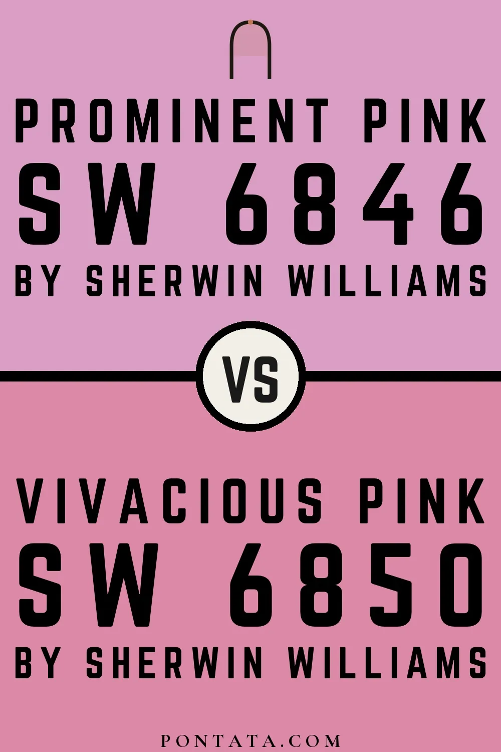
Prominent Pink vs Vivacious Pink
Sherwin-Williams
Prominent Pink
6846 · LRV 43
Sherwin-Williams
Vivacious Pink
6850 · LRV 36

A 7-point LRV gap (43 vs 36) makes Prominent Pink the marginally brighter of the two.

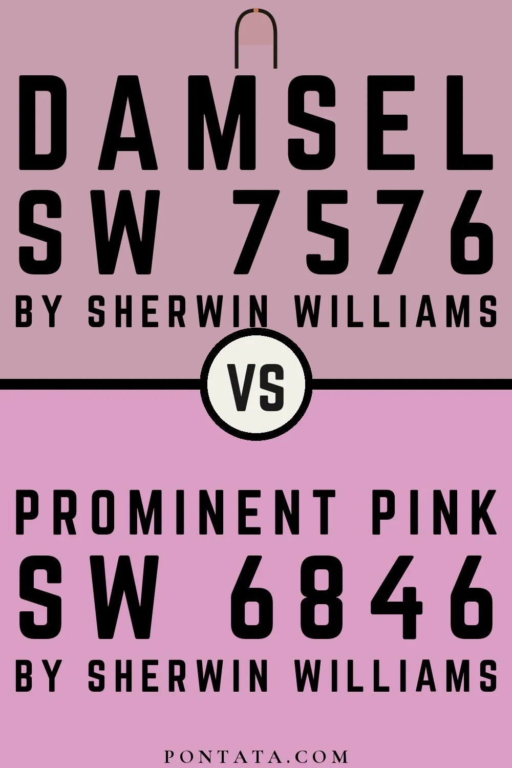
Damsel
Damsel
Prominent Pink
Damsel vs Prominent Pink
Sherwin-Williams
Damsel
7576 · LRV 39
Sherwin-Williams
Prominent Pink
6846 · LRV 43

A 4-point LRV gap (43 vs 39) makes Prominent Pink the marginally brighter of the two.
Child's Play
Child's Play
Prominent Pink
Child's Play vs Prominent Pink
Sherwin-Williams
Child's Play
6845 · LRV 58
Sherwin-Williams
Prominent Pink
6846 · LRV 43

At LRV 58 vs 43, Child's Play is decisively the brighter choice.

Ice Plant
Ice Plant
Prominent Pink
Ice Plant vs Prominent Pink
Sherwin-Williams
Ice Plant
6847 · LRV 31
Sherwin-Williams
Prominent Pink
6846 · LRV 43

Prominent Pink reflects far more light (LRV 43 vs 31), opening up a space where Ice Plant encloses it.

Complementary Colors

Prominent Pink
Window Pane
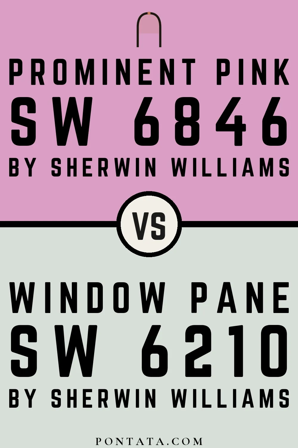
Prominent Pink vs Window Pane
Sherwin-Williams
Prominent Pink
6846 · LRV 43
Sherwin-Williams
Window Pane
6210 · LRV 72

Window Pane reflects far more light (LRV 72 vs 43), opening up a space where Prominent Pink encloses it.

Piedmont
Prominent Pink
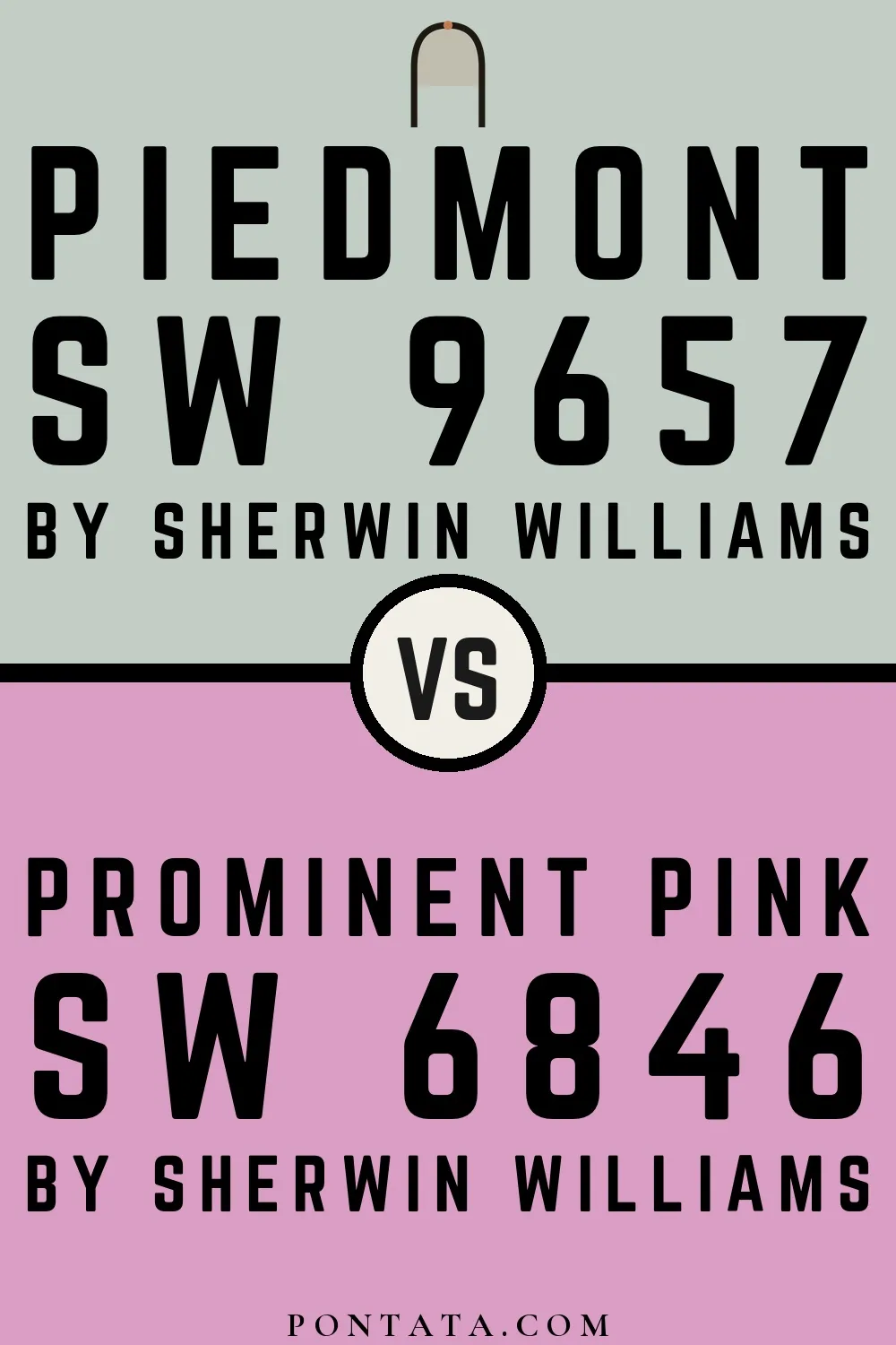
Piedmont vs Prominent Pink
Sherwin-Williams
Piedmont
9657 · LRV 60
Sherwin-Williams
Prominent Pink
6846 · LRV 43

At LRV 60 vs 43, Piedmont is decisively the brighter choice.

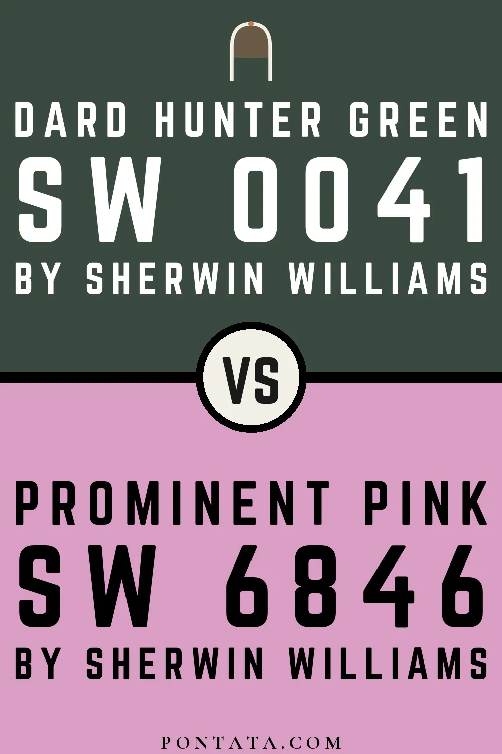
Dard Hunter Green
Dard Hunter Green
Prominent Pink
Dard Hunter Green vs Prominent Pink
Sherwin-Williams
Dard Hunter Green
0041 · LRV 6
Sherwin-Williams
Prominent Pink
6846 · LRV 43

At LRV 43 vs 6, Prominent Pink is decisively the brighter choice.

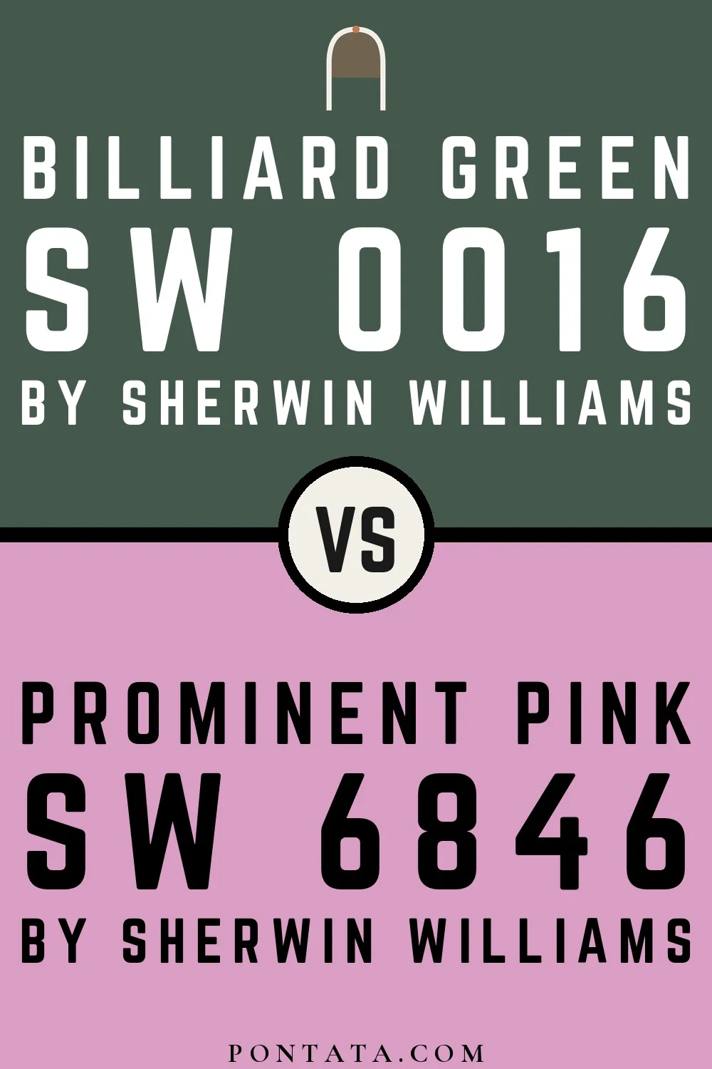
Billiard Green
Billiard Green
Prominent Pink
Billiard Green vs Prominent Pink
Sherwin-Williams
Billiard Green
0016 · LRV 9
Sherwin-Williams
Prominent Pink
6846 · LRV 43

Prominent Pink reflects far more light (LRV 43 vs 9), opening up a space where Billiard Green encloses it.

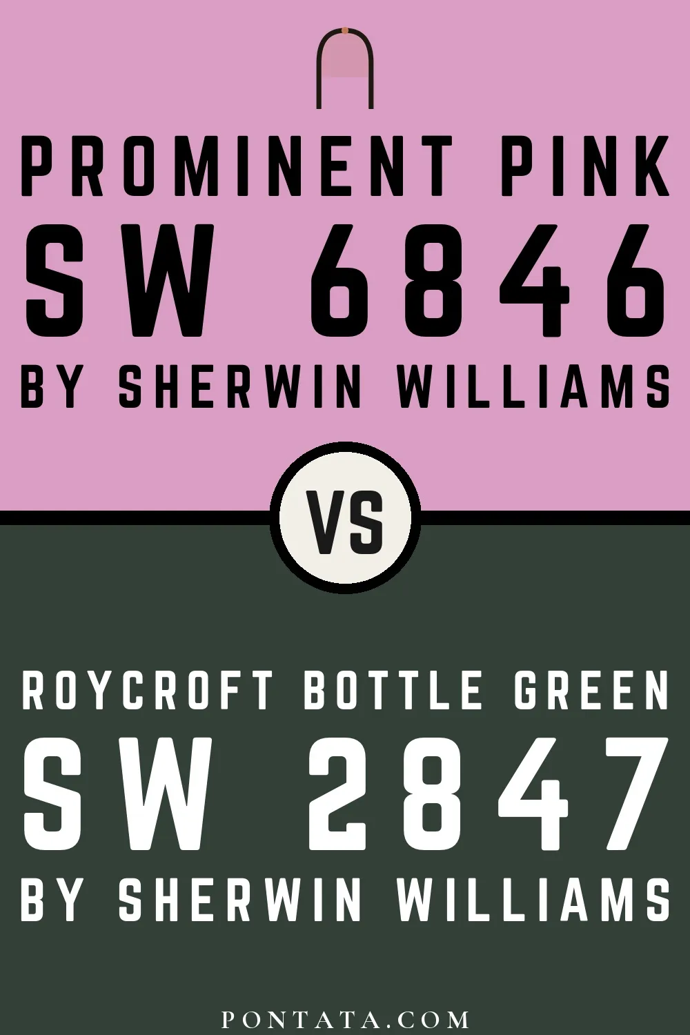
Prominent Pink
Roycroft Bottle Green
Prominent Pink vs Roycroft Bottle Green
Sherwin-Williams
Prominent Pink
6846 · LRV 43

Prominent Pink reflects far more light (LRV 43 vs 5), opening up a space where Roycroft Bottle Green encloses it.

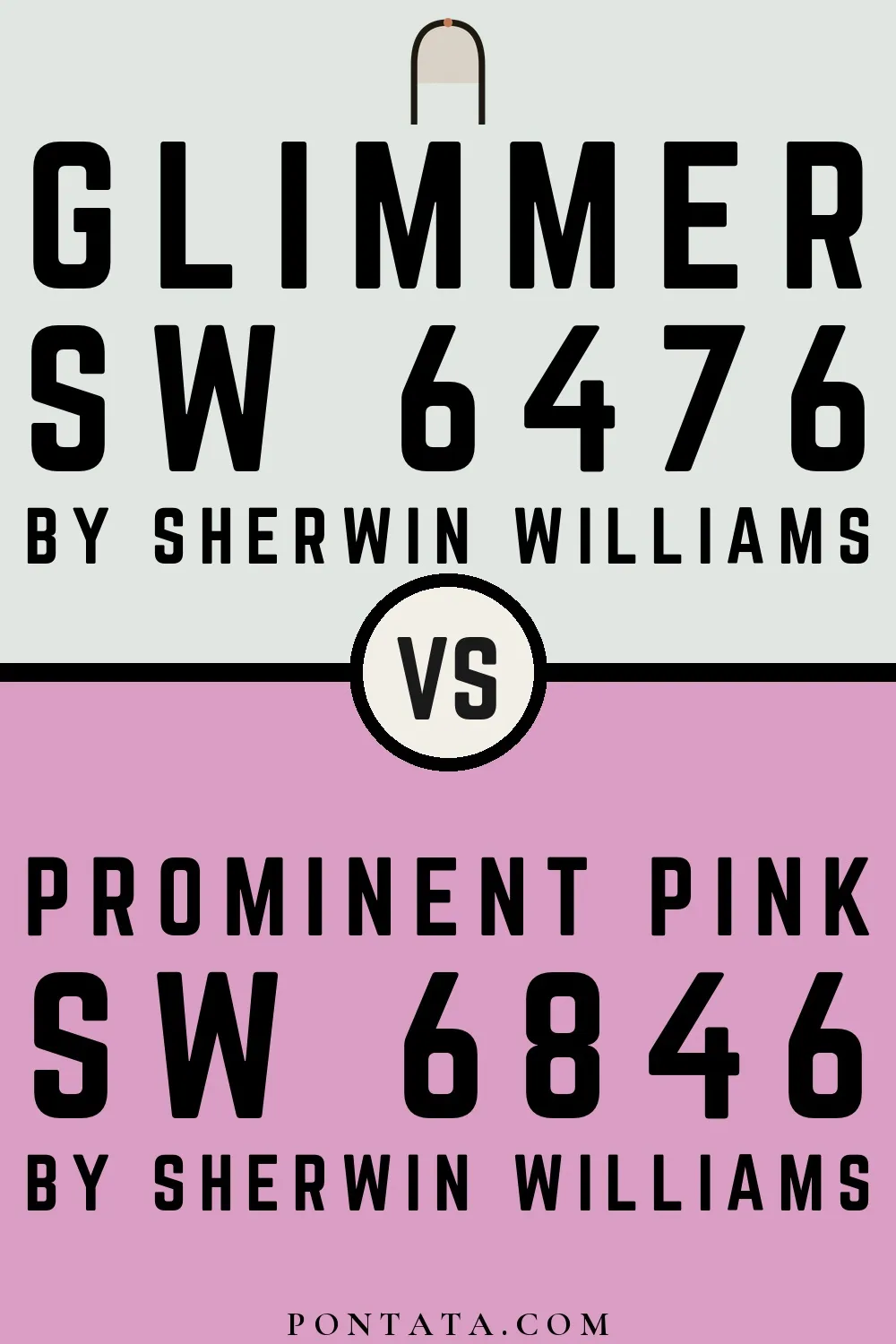
Glimmer
Glimmer
Prominent Pink
Glimmer vs Prominent Pink
Sherwin-Williams
Glimmer
6476 · LRV 78
Sherwin-Williams
Prominent Pink
6846 · LRV 43

Glimmer reflects far more light (LRV 78 vs 43), opening up a space where Prominent Pink encloses it.

Parisian Patina
Parisian Patina
Prominent Pink
Parisian Patina vs Prominent Pink
Sherwin-Williams
Parisian Patina
9041 · LRV 30
Sherwin-Williams
Prominent Pink
6846 · LRV 43

Prominent Pink reflects far more light (LRV 43 vs 30), opening up a space where Parisian Patina encloses it.

Lighter Colors

Merry Pink
Prominent Pink
Merry Pink vs Prominent Pink
Sherwin-Williams
Merry Pink
6844 · LRV 64
Sherwin-Williams
Prominent Pink
6846 · LRV 43

At LRV 64 vs 43, Merry Pink is decisively the brighter choice.

Child's Play
Child's Play
Prominent Pink
Child's Play vs Prominent Pink
Sherwin-Williams
Child's Play
6845 · LRV 58
Sherwin-Williams
Prominent Pink
6846 · LRV 43

At LRV 58 vs 43, Child's Play is decisively the brighter choice.

Darker Colors

Ice Plant
Ice Plant
Prominent Pink
Ice Plant vs Prominent Pink
Sherwin-Williams
Ice Plant
6847 · LRV 31
Sherwin-Williams
Prominent Pink
6846 · LRV 43

Prominent Pink reflects far more light (LRV 43 vs 31), opening up a space where Ice Plant encloses it.

Color Codes

RGB218, 158, 197
HSL321° 45% 74%
CMYK0 28 10 15
CIE LabL: 71.8 a: 28.3 b: -11.2
XYZX: 51.22 Y: 43.39 Z: 58.49

Manufacturer description

This sophisticated mauve-pink strikes a perfect balance between boldness and restraint, with cool undertones that prevent it from feeling saccharine or juvenile. It brings an unexpected warmth to bedrooms and living spaces while pairing beautifully with soft grays, creams, and muted jewel tones.

Attributed to Sherwin-Williams catalog data ↗