
Afternoon
Sherwin-Williams's Afternoon is a yellow shade whose quieter details emerge through comparison. Its brighter saturation keeps the hue present and expressive, even when the overall color is pale. 10 generated visualizations explore how the color might shape a finished room.
Hex
#FBCB78LRV
64.60
Afternoon's Color Strip
Afternoon is the fourth shade on this 7-color strip, sitting between Pollen Powder and Butterfield. The strip spans from Banana Cream at the lightest end to Sunflower at the deepest. Strip 133 puts these related shades in sequence, making it simple to find the tone that suits your room.


Afternoon in Rooms
Follow Afternoon from one space to another and watch how light, scale and surrounding materials reshape its character. 10 generated visualizations explore how the color might shape a finished room.
1 Bedroom Photo
Across 1 bedroom image, Afternoon (6675) meets gentle morning light and low evening lamps. Its warm classification can feel inviting beside tactile, natural materials.
A moody bedroom painted in Afternoon
@mybudgetrecipes
1 Front Door Photo
Afternoon (6675) offers a starting mood rather than a finished formula: Its warm classification can feel inviting beside tactile, natural materials. Test it under direct sun, porch shade and evening exterior light.

stylish front door featuring Afternoon by Sherwin-Williams
@mybudgetrecipes
1 Bathroom Photo
Afternoon (6675) can change noticeably under window light, mirrors and focused task lighting. Sample it beside the finishes that will remain in the room.

Afternoon — modern luxury bathroom
@mybudgetrecipes
1 Dining Room Photo
In a gathering space that can move from daylight to ceremony, the most interesting quality of Afternoon (6675) may be the way it responds to timber, table linen, glass and artwork. The beige hue classifications suggest the subtle directions the color may take as the room changes.

Afternoon paint in a mid century dining room
@mybudgetrecipes
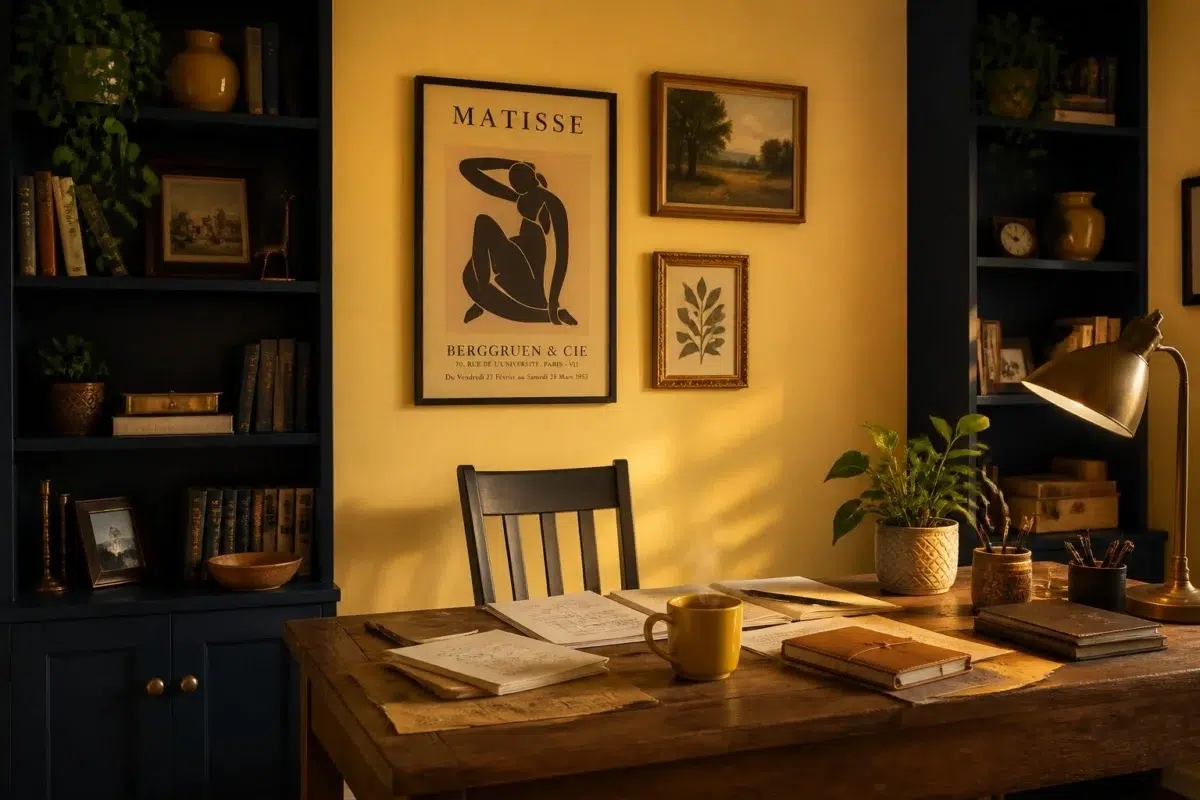
1 Home Office Photo
1 home office image trace Afternoon (6675) through the transition between focused work and the rest of the home. The beige hue classifications suggest the subtle directions the color may take as the room changes.

Sherwin-Williams Afternoon in a unique home office
@mybudgetrecipes
1 Kitchen Photo
1 kitchen image trace Afternoon (6675) through the changing light from breakfast through dinner. The beige hue classifications suggest the subtle directions the color may take as the room changes.

Afternoon — vintage kitchen
@mybudgetrecipes
1 House Photo
The 1 house image turn a yellow swatch into something more spatial and expressive. Its brighter saturation allows the hue to remain present rather than fading quietly into the background.

Afternoon color — modern luxury house inspiration
@mybudgetrecipes
1 Living Room Photo
Afternoon (6675) moves through 1 living room image without becoming a fixed prescription for the room. Its warm classification can feel inviting beside tactile, natural materials.

A cozy living room painted in Afternoon
@mybudgetrecipes
1 Mudroom Photo
Afternoon (6675) offers a starting mood rather than a finished formula: Its warm classification can feel inviting beside tactile, natural materials. Test it under doorway light and the softer illumination of an internal passage.

Afternoon paint in a earthy mudroom
@mybudgetrecipes
1 Patio Photo
Across 1 patio image, Afternoon (6675) meets direct sun, reflected daylight and deep exterior shade. Its warm classification can feel inviting beside tactile, natural materials.

warm patio featuring Afternoon by Sherwin-Williams
@mybudgetrecipes
Expert Perspectives
Articles and features from across our network of home and design sites.
Coordinating Colors


At LRV 80 vs 65, Morning Sun is decisively the brighter choice.


Dover White reflects far more light (LRV 83 vs 65), opening up a space where Afternoon encloses it.


Trim Color
At LRV 80 vs 65, Morning Sun is decisively the brighter choice.
Similar Colors


Pollen Powder reads slightly lighter (LRV 68 vs 65), a gap that shows most in low-lit rooms.


Their light reflectance is nearly identical (LRV 67 vs 65), so neither reads brighter in a room.

With LRVs of 65 and 64, the two reflect almost the same amount of light.


A 6-point LRV gap (70 vs 65) makes Honey Bees the marginally brighter of the two.


Afternoon reads slightly lighter (LRV 65 vs 57), a gap that shows most in low-lit rooms.

Complementary Colors


Liberty Blue reflects far more light (LRV NaN vs NaN), opening up a space where Afternoon encloses it.


At LRV 65 vs 8, Afternoon is decisively the brighter choice.


At LRV 65 vs 6, Afternoon is decisively the brighter choice.


At LRV 65 vs 6, Afternoon is decisively the brighter choice.


Lighter Colors


Classical Yellow reads slightly lighter (LRV 69 vs 65), a gap that shows most in low-lit rooms.


They call it Mellow reflects far more light (LRV 79 vs 65), opening up a space where Afternoon encloses it.


Pollen Powder reads slightly lighter (LRV 68 vs 65), a gap that shows most in low-lit rooms.
A 6-point LRV gap (70 vs 65) makes Honey Bees the marginally brighter of the two.
Darker Colors


At LRV 65 vs 50, Afternoon is decisively the brighter choice.

Afternoon reflects far more light (LRV 65 vs 50), opening up a space where Nasturtium encloses it.

A 9-point LRV gap (65 vs 56) makes Afternoon the marginally brighter of the two.
Afternoon reads slightly lighter (LRV 65 vs 57), a gap that shows most in low-lit rooms.
Color Codes
Manufacturer description
This bright, saturated yellow captures the golden warmth of a lazy afternoon sun streaming through open windows, filling a room with cheerful, energizing light. Perfect for kitchens, playrooms, or any space where you want to spark joy and optimism, it pairs beautifully with crisp whites and soft warm grays.