
Dover White
At first glance, Dover White belongs to the white family; in a room, light and context can make it far more elusive. With an LRV of 82.5, it sits on the light-reflective side of the palette and can feel especially open in generous daylight. Because screens flatten both light and texture, sample the paint beside the finishes that will ultimately surround it.
Hex
#F0EADCLRV
82.54
Dover White's Color Strip
Dover White is the second shade on this 7-color strip, sitting between Whitetail and Creamy. The strip spans from Whitetail at the lightest end to Patience at the deepest. Strip 261 puts these related shades in sequence, making it simple to find the tone that suits your room.


Dover White in Rooms
Follow Dover White from one space to another and watch how light, scale and surrounding materials reshape its character. 20 sourced room photos sit alongside 7 generated visualizations.
6 Living Room Photos
Across 6 living room images, Dover White (6385) meets the movement from window light to lamplight. Its warm classification can feel inviting beside tactile, natural materials.
Living room walls in Dover White brighten the entire space.
@mybudgetrecipes
4 Bedroom Photos
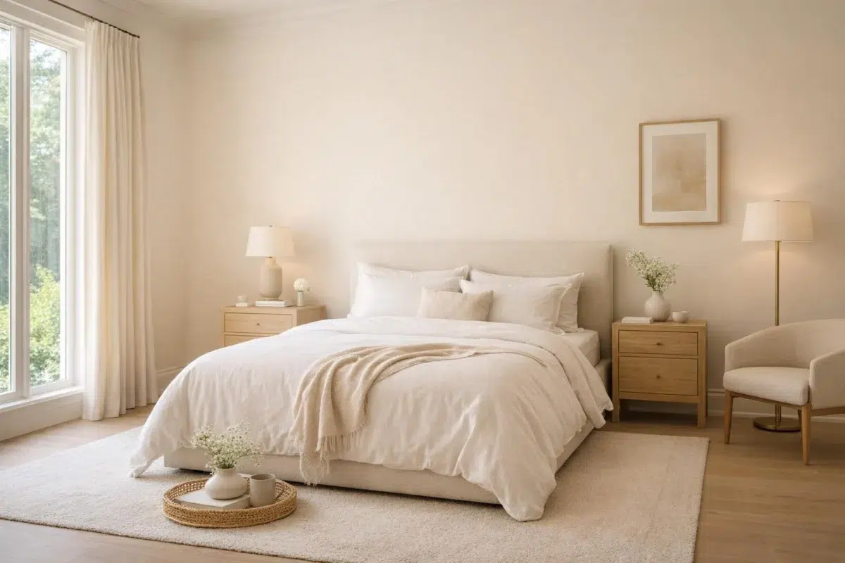
In a room designed around rest, softness and retreat, the most interesting quality of Dover White (6385) may be the way it responds to bed linen, timber, wool and upholstered textures. The beige, white hue classifications suggest the subtle directions the color may take as the room changes.

Bedroom walls painted Dover White create a calm retreat.
@mybudgetrecipes

Soft ceiling in Dover White expands bedroom proportions visually.
@gbd_paintingllc

Bedroom walls in Dover White provide a peaceful backdrop.
@gbd_paintingllc

Bedroom walls glow with Dover White's warm undertones.
@emilypelaezdesign
4 Kitchen Photos
In a hardworking room where color meets movement and strong surfaces, the most interesting quality of Dover White (6385) may be the way it responds to stone, timber, tile and metal finishes. The beige, white hue classifications suggest the subtle directions the color may take as the room changes.

Cabinet doors in Dover White offer timeless kitchen elegance.
@mybudgetrecipes

Kitchen walls in Dover White complement stainless steel appliances.
@gbd_paintingllc

Wall color Dover White brightens the kitchen workspace.
@gbd_paintingllc

Kitchen walls painted Dover White enhance the cooking area.
@gbd_paintingllc
4 Bathroom Photos
Dover White (6385) brings its white character into a compact setting where tile, fixtures and color sit close together. Its brighter saturation allows the hue to remain present rather than fading quietly into the background.

Bathroom vanity cabinet in Dover White pairs with marble counters.
@mybudgetrecipes

Bathroom walls in Dover White feel fresh and clean.
@white_pine_cottage

Master bath in Dover White provides a spa-like atmosphere.
@emilypelaezdesign

Vanity walls in Dover White brighten the bathroom daily.
@emilypelaezdesign
1 Home Office Photo
Dover White (6385) can change noticeably under daylight beside desk lamps and screen glow. Sample it beside the finishes that will remain in the room.

Home office walls in Dover White maximize natural light reflection.
@mybudgetrecipes
3 House Photos
Against roofing, masonry, timber, planting and trim, Dover White (6385) may feel quieter, sharper or more atmospheric than the digital swatch alone. Its LRV of 82.5 gives it a light-reflective character, though shadows and neighboring finishes can still draw out surprising depth.

House exterior in Dover White provides clean architectural definition.
@mybudgetrecipes

Exterior siding in Dover White suits traditional home designs.
@fivestarpaintingcab

Eaves painted Dover White highlight the home's exterior trim.
@farmhouseonwaters
1 Front Door Photo
Dover White (6385) brings its white character into a small architectural moment with an outsized first impression. Its brighter saturation allows the hue to remain present rather than fading quietly into the background.

Front door trim painted Dover White frames the entryway.
@mybudgetrecipes
1 Kitchen Cabinets Photo
The repetition of doors, drawers and shadow lines can draw different notes from Dover White (6385). The beige, white hue classifications suggest the subtle directions the color may take as the room changes.

Cabinet faces in Dover White brighten the kitchen workflow.
@white_pine_cottage
1 Dining Room Photo
The 1 dining room image turn a white swatch into something more spatial and expressive. Its brighter saturation allows the hue to remain present rather than fading quietly into the background.

Dining room walls in Dover White create an elegant setting.
@white_pine_cottage
2 Misc Photos
Against a changing mix of architectural details and personal finishes, Dover White (6385) may feel quieter, sharper or more atmospheric than the digital swatch alone. Its LRV of 82.5 gives it a light-reflective character, though shadows and neighboring finishes can still draw out surprising depth.

Children's room painted Dover White feels light and airy.
@emilypelaezdesign

Nursery walls in Dover White create a soothing environment.
@emilypelaezdesign
Expert Perspectives
Articles and features from across our network of home and design sites.
Coordinating Colors


Dover White reflects far more light (LRV 83 vs 54), opening up a space where Dakota Wheat encloses it.


At LRV 83 vs 13, Dover White is decisively the brighter choice.
Similar Colors


Their light reflectance is nearly identical (LRV 83 vs 83), so neither reads brighter in a room.


Their light reflectance is nearly identical (LRV 83 vs 81), so neither reads brighter in a room.


With LRVs of 83 and 83, the two reflect almost the same amount of light.


Roman Column reads slightly lighter (LRV 88 vs 83), a gap that shows most in low-lit rooms.


A 4-point LRV gap (83 vs 79) makes Dover White the marginally brighter of the two.


Their light reflectance is nearly identical (LRV 83 vs 81), so neither reads brighter in a room.


Westhighland White reads slightly lighter (LRV 86 vs 83), a gap that shows most in low-lit rooms.


Their light reflectance is nearly identical (LRV 83 vs 81), so neither reads brighter in a room.


A 4-point LRV gap (86 vs 83) makes Whitetail the marginally brighter of the two.


A 4-point LRV gap (87 vs 83) makes Paperwhite the marginally brighter of the two.
Complementary Colors


Dover White reflects far more light (LRV 83 vs 7), opening up a space where Sea Mariner encloses it.


Dover White reflects far more light (LRV 83 vs 69), opening up a space where Starry Night encloses it.


At LRV 83 vs 20, Dover White is decisively the brighter choice.


At LRV 83 vs 28, Dover White is decisively the brighter choice.


Dover White reflects far more light (LRV 83 vs 47), opening up a space where Lakeside encloses it.


Dover White reflects far more light (LRV 83 vs 3), opening up a space where After the Storm encloses it.

Their light reflectance is nearly identical (LRV 83 vs 83), so neither reads brighter in a room.
Lighter Colors
With LRVs of 83 and 83, the two reflect almost the same amount of light.
Their light reflectance is nearly identical (LRV 83 vs 81), so neither reads brighter in a room.
Westhighland White reads slightly lighter (LRV 86 vs 83), a gap that shows most in low-lit rooms.
Their light reflectance is nearly identical (LRV 83 vs 83), so neither reads brighter in a room.
Darker Colors


A 8-point LRV gap (83 vs 74) makes Dover White the marginally brighter of the two.
Their light reflectance is nearly identical (LRV 83 vs 81), so neither reads brighter in a room.


Dover White reads slightly lighter (LRV 83 vs 75), a gap that shows most in low-lit rooms.


At LRV 83 vs 51, Dover White is decisively the brighter choice.


A 10-point LRV gap (83 vs 72) makes Dover White the marginally brighter of the two.
Color Codes
Manufacturer description
A warm, sun-splashed white, this hue makes any room breezy and welcoming. Bring out its color by pairing it with a more saturated shade like Dakota Wheat.