
Agreeable Gray
We've categorized Agreeable Gray as a versatile and reflective Neutral because of its unique LRV profile. We have documented it across our network because it can provide a clean, timeless feel that works across various lighting conditions so effectively. Explore our collection of 155 room photos to see how it looks alongside coordinating accent choices.
Hex
#D1CBC1
LRV
60.39
Agreeable Gray's Color Strip
Agreeable Gray is the first shade on this 7-color strip, the lightest in this coordinated family. Strip 243 lines up the full value range so you can see exactly where this color lands among its closest relatives.


Agreeable Gray in Real Rooms
Agreeable Gray has a high LRV of 60.39 — it reflects a lot of light and will read pale and airy in most spaces. It's neutral in temperature and , making it adaptable across different lighting conditions and room orientations. Grouped in the Neutral family, the photos below show it applied in a living room, bedroom, kitchen, exterior, home office, bathroom, front door, house, kitchen cabinets, misc, dining room and mudroom.
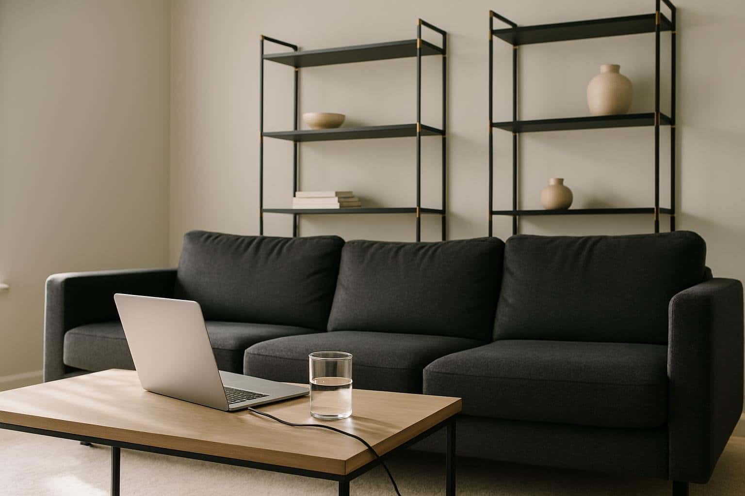
58 Living Room Photos
For open-concept living rooms, Agreeable Gray is a powerful tool for definition. It has enough presence to signal where the living area begins without creating a harsh visual break from the rest of the house. It defines the "zone" of relaxation through color psychology and sophisticated depth.
Living room walls in Agreeable Gray establish a warm, inviting base.
@mybudgetrecipes
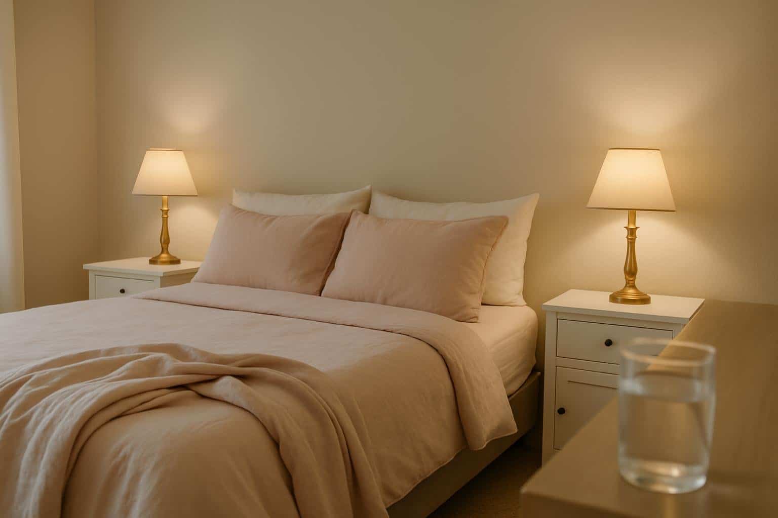
22 Bedroom Photos
The bedroom is where Agreeable Gray really earns its place as a sanctuary. Away from direct sunlight, the color settles into a rich, cocooning tone that actively promotes rest and psychological slowing. Pair it with crisp white bedding and warm-toned wood nightstands to keep the overall palette from feeling too heavy or closed-in.

Bedroom walls in Agreeable Gray create a restful, neutral sanctuary.
@mybudgetrecipes
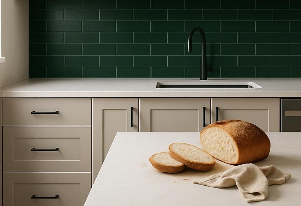
10 Kitchen Photos
Agreeable Gray in a kitchen reads differently from how it might anywhere else — the hard surfaces, task lighting, and constant activity give it more to work against, and it holds up beautifully. It doesn't compete with the colors of food or the texture of countertops; instead, it frames them with a professional finish.

Kitchen cabinets in Agreeable Gray offer timeless, versatile style.
@mybudgetrecipes
1 Exterior Photo

Exterior walls in Agreeable Gray provide sophisticated curb appeal.
@mybudgetrecipes
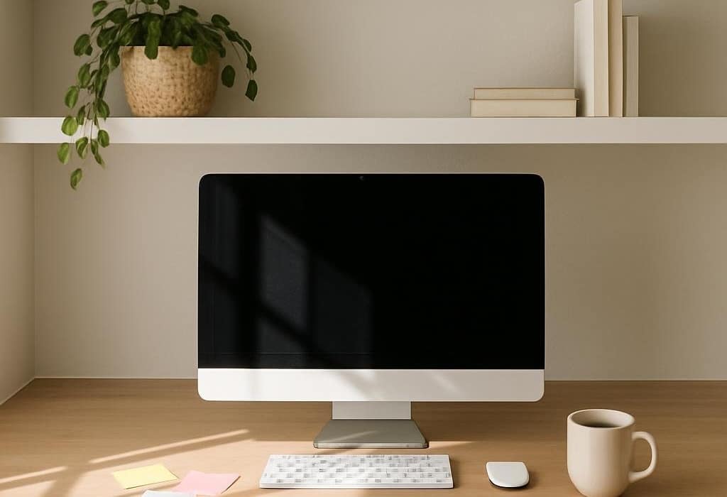
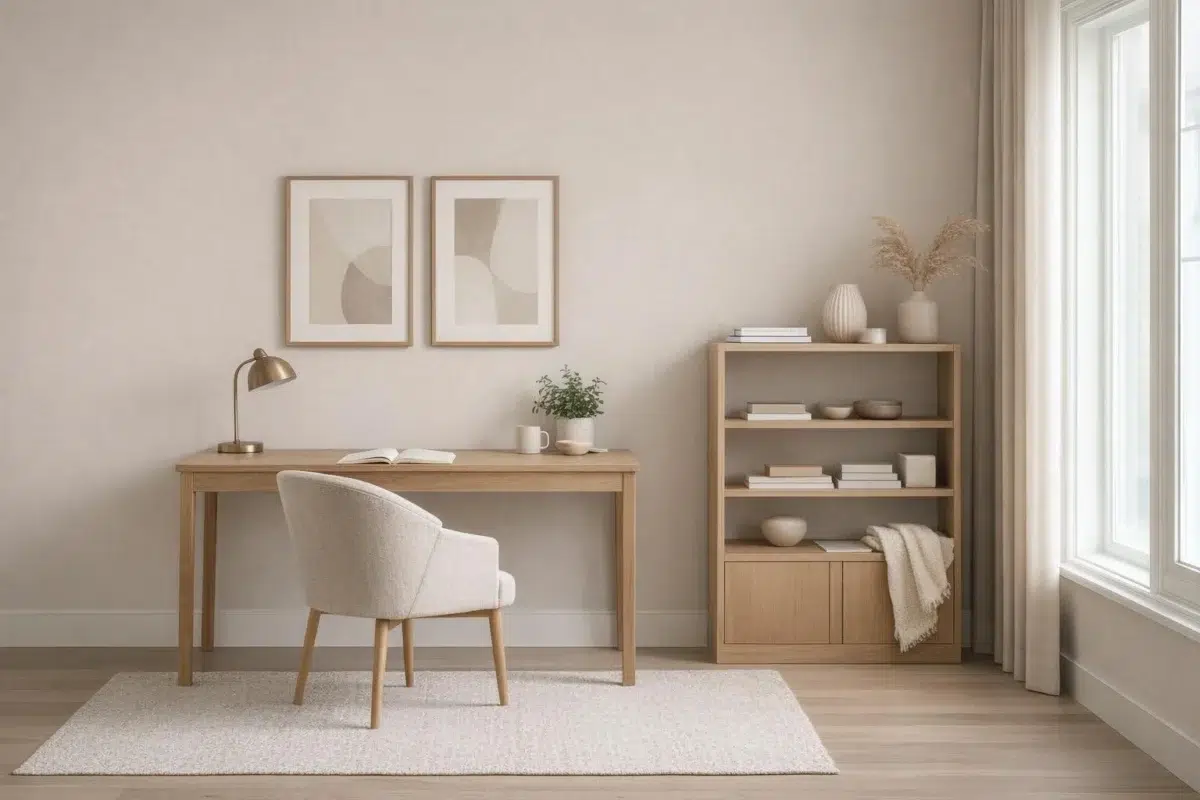
6 Home Office Photos
In a workspace, Agreeable Gray helps to reduce "visual noise," allowing your mind to focus on the task at hand. It provides a steady, non-distracting horizon line that is particularly helpful for those in creative or high-concentration fields.

Home office walls in Agreeable Gray support focused, productive work.
@mybudgetrecipes
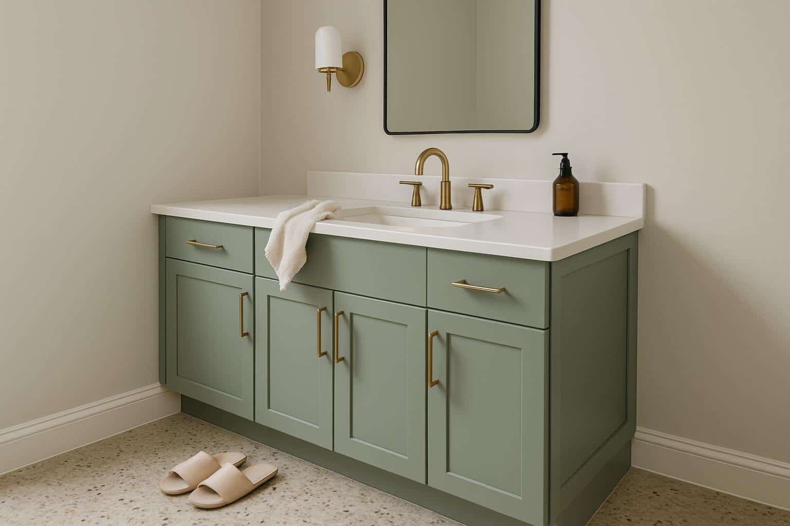
27 Bathroom Photos
In a powder room, Agreeable Gray can be used floor-to-ceiling to create a dramatic, high-impact experience for guests. Because these rooms are small and transitional, they can handle the full intensity of the color's personality without feeling overwhelming.

Bathroom walls in Agreeable Gray deliver modern, spa-like serenity.
@homeimprovementdude
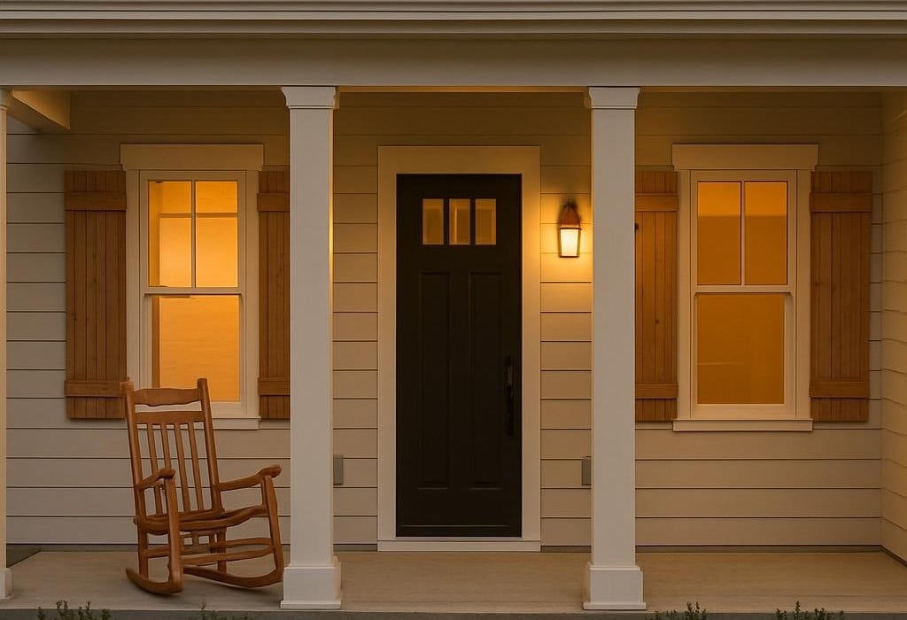
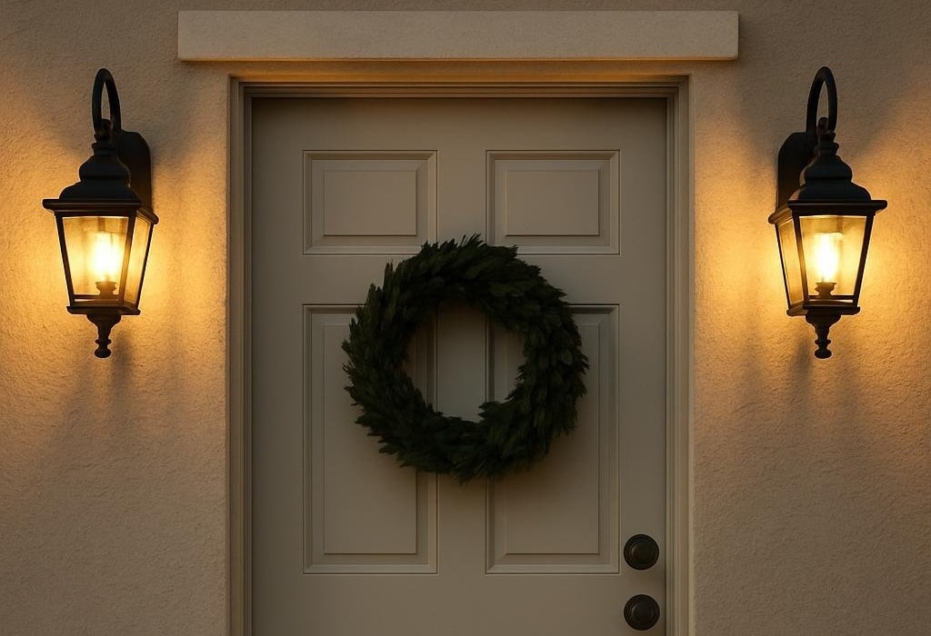
5 Front Door Photos
Agreeable Gray on a front door looks particularly stunning when framed by greenery or seasonal wreaths. The color provides a deep, matte background that makes the organic textures of a boxwood wreath or autumn garland really pop.

Front door painted in Agreeable Gray welcomes guests with understated elegance.
@homeimprovementdude

Classic front door in Agreeable Gray complements traditional architectural details.
@homeimprovementdude

Wooden front door trim frames the Agreeable Gray entry with warm contrast.
@homeimprovementdude

Stone surround frames the inviting Agreeable Gray front entrance beautifully.
@homeimprovementdude

Dramatic stone facade surrounds the Agreeable Gray front door entrance.
@homeimprovementdude
6 House Photos
On a traditional or historic home, Agreeable Gray acts as a restorative force. It brings out the dignity of the original craftsmanship while making the structure feel relevant to the 21st century. It's a "new classic" in every sense.

Farmhouse exterior siding in Agreeable Gray complements classic architectural charm.
@homeimprovementdude
6 Kitchen Cabinets Photos
The way Agreeable Gray interacts with under-cabinet lighting is transformative. It catches the glow and reflects a softer, more diffused light onto the countertops, making the workspace feel more inviting and less utilitarian.

Cabinet doors in Agreeable Gray blend seamlessly with backsplash in this kitchen.
@katylynndesign
9 Misc Photos
Note how Agreeable Gray is used as a "ceiling color" in some of these rooms. This "fifth wall" application is a bold designer move that can make a room feel infinitely more cozy and architecturally unique.

Vertical shiplap wall in Agreeable Gray creates textural interest and depth.
@passion_4_decor
4 Dining Room Photos
Dining rooms are often the best place to take a "color risk." By choosing Agreeable Gray, you're opting for a shade that is saturated and confident, yet still refined enough to act as a neutral backdrop for colorful table linens and floral arrangements.

Dining room walls painted Agreeable Gray enhance natural light from adjacent windows.
@thecolorconcierge

Wainscoting in Agreeable Gray adds architectural detail to this formal dining space.
@thegroenstead

Crown molding and walls in Agreeable Gray unify this sophisticated dining room.
@kristigerdesphotography

Ceiling and upper walls painted Agreeable Gray make rooms feel larger.
@iveyinspires
1 Mudroom Photo
Agreeable Gray in the mudroom earns its keep. It's a color that can handle the traffic — grounding enough to hide the daily chaos, and intentional enough to make the transition from outside feel considered and high-end.

Mudroom lockers and cubbies finished in Agreeable Gray organize entryway storage.
@mckernanmaterial
Expert Perspectives
In-depth articles and real-home features from across our network of home and design sites.
Agreeable Gray Living Room Ideas For A Cozy And Stylish Space
Choosing the right paint color can shape the entire mood of your living room. Agreeable Gray by Sherwin Williams has become a popular choice because it blends warmth and softness in a way that feels inviting without being overwhelming. You get a neutral backdrop that works with many styles, from cozy and relaxed to modern
Agreeable Gray Kitchen Ideas For A Warm And Stylish Space
Picking a kitchen color can get overwhelming—yeah, we’ve all been there. But Agreeable Gray? It really takes the stress out of things. This neutral base works with so many styles, from modern to classic, and it never feels boring or flat. You get a versatile color that blends with all sorts of materials and finishes.
Agreeable Gray House Ideas For A Warm And Welcoming Home
Picking a paint color for your home can get overwhelming, right? Some shades, though, just make things easier. Agreeable Gray by Sherwin Williams stands out because it brings both warmth and versatility, fitting into so many different styles. You can use this neutral tone to create a look that’s balanced, timeless, and easy to match
Agreeable Gray Home Office Ideas For A Cozy And Stylish Workspace
Finding the right paint color can really make or break a home office. Agreeable Gray gives you a balanced backdrop that works with many styles, from modern and minimalist to cozy and inviting. This soft tone sets up a workspace that feels professional but still comfortable. It’s amazing how much color can affect the mood
Agreeable Gray Front Door Ideas to Refresh Your Home’s Curb Appeal
Picking a front door color really sets the vibe for your place. Agreeable Gray strikes a nice middle ground—warm, stylish, not too showy, not too boring. It creates a welcoming entry that feels timeless and pairs well with tons of different accents. With a little creativity, you can make this neutral shade work for both
Agreeable Gray Bedroom Ideas For a Cozy and Stylish Retreat
Picking a paint color for your bedroom is tough, right? But honestly, Agreeable Gray gives you a warm and neutral backdrop that fits so many styles, from cozy and relaxed to modern and sleek. It sets a calm mood without coming off as boring. Bedrooms of any size seem to work with it. As you
Agreeable Gray Bathroom Ideas For A Calm And Stylish Space
Looking for a bathroom that feels calm but still has style? Agreeable Gray gives you a flexible base to start with. This soft, neutral shade plays well with a lot of design choices, so you can make your space modern, cozy, or honestly, something in between. Agreeable Gray sets up the perfect backdrop for bold
Agreeable Gray by Sherwin Williams SW 7029: The Perfect Neutral Paint for Every Room
Agreeable Gray SW 7029 stands as one of Sherwin Williams' most popular neutral paint colors, offering a perfect balance between warm and cool tones. This versatile greige shade combines the softness of gray with beige undertones, making it an excellent choice for both modern and traditional spaces. Looking to create a cozy yet sophisticated atmosphere
Coordinating Colors


At LRV 74 vs 60, Incredible White is decisively the brighter choice.


Extra White reflects far more light (LRV 86 vs 60), opening up a space where Agreeable Gray encloses it.


At LRV 60 vs 28, Agreeable Gray is decisively the brighter choice.
Trim Color
At LRV 74 vs 60, Incredible White is decisively the brighter choice.
Similar Colors


With LRVs of 62 and 60, the two reflect almost the same amount of light.

With LRVs of 60 and 58, the two reflect almost the same amount of light.


Their light reflectance is nearly identical (LRV 62 vs 60), so neither reads brighter in a room.


With LRVs of 61 and 60, the two reflect almost the same amount of light.


Their light reflectance is nearly identical (LRV 61 vs 60), so neither reads brighter in a room.


A 3-point LRV gap (60 vs 57) makes Agreeable Gray the marginally brighter of the two.


With LRVs of 60 and 58, the two reflect almost the same amount of light.


With LRVs of 60 and 59, the two reflect almost the same amount of light.


With LRVs of 61 and 60, the two reflect almost the same amount of light.


Agreeable Gray reads slightly lighter (LRV 60 vs 57), a gap that shows most in low-lit rooms.
Complementary Colors


Agreeable Gray reflects far more light (LRV 60 vs 11), opening up a space where Rain Cloud encloses it.


Agreeable Gray reflects far more light (LRV 60 vs 7), opening up a space where Sea Mariner encloses it.


Starry Night reads slightly lighter (LRV 69 vs 60), a gap that shows most in low-lit rooms.


At LRV 60 vs 20, Agreeable Gray is decisively the brighter choice.


At LRV 60 vs 28, Agreeable Gray is decisively the brighter choice.


Agreeable Gray reflects far more light (LRV 60 vs 47), opening up a space where Lakeside encloses it.


Agreeable Gray reflects far more light (LRV 60 vs 3), opening up a space where After the Storm encloses it.
Lighter Colors


Snowfall reflects far more light (LRV 73 vs 60), opening up a space where Agreeable Gray encloses it.


Ghosted reflects far more light (LRV 75 vs 60), opening up a space where Agreeable Gray encloses it.

At LRV 83 vs 60, Natural White is decisively the brighter choice.
With LRVs of 61 and 60, the two reflect almost the same amount of light.


At LRV 73 vs 60, Lunar Lite is decisively the brighter choice.
Darker Colors


Agreeable Gray reflects far more light (LRV 60 vs 45), opening up a space where Whisper encloses it.


A 7-point LRV gap (60 vs 53) makes Agreeable Gray the marginally brighter of the two.


At LRV 60 vs 39, Agreeable Gray is decisively the brighter choice.


Agreeable Gray reflects far more light (LRV 60 vs 47), opening up a space where Analytical Gray encloses it.


A 8-point LRV gap (60 vs 53) makes Agreeable Gray the marginally brighter of the two.