
Repose Gray
Often used for its versatile and reflective qualities, Repose Gray remains a staple for Sherwin-Williams designers. It is widely considered one of the best colors in its class to provide a clean, timeless feel that works across various lighting conditions. We've gathered 55 real-home scenarios to help you visualize this color alongside our expert data.
Hex
#CCC9C0
LRV
58.22
Repose Gray's Color Strip
Repose Gray is the first shade on this 7-color strip, the lightest in this coordinated family. Strip 244 puts these related shades in sequence, making it simple to find the tone that suits your room.


Repose Gray in Real Rooms
Repose Gray has a high LRV of 58.22 — it reflects a lot of light and will read pale and airy in most spaces. It's neutral in temperature and , making it adaptable across different lighting conditions and room orientations. Grouped in the Neutral family, the photos below show it applied in a bedroom, living room, bathroom, kitchen cabinets, house and misc.
9 Bedroom Photos
In the context of a primary suite, Repose Gray suggests a boutique-hotel level of refinement. It creates a seamless flow between the sleeping area and the dressing room, providing a steadying influence that makes the morning routine feel more organized and serene.
Bedroom walls painted in Repose Gray establish a calm, restful environment.
@laurengravesco
9 Living Room Photos
When applied to living room walls, Repose Gray creates a sense of "visual quiet." It eliminates the erratic shadows found in busier spaces, instead providing a steady, rhythmic tone that ties together disparate furniture styles. It's the common thread that makes a room full of heirlooms and modern pieces feel like a cohesive collection.

Living room walls in Repose Gray allow furnishings and artwork to stand out.
@sunsetsatwestover
6 Bathroom Photos
The interaction between Repose Gray and steam or humidity creates a beautiful, diffused atmosphere in a bathroom. It's a color that feels "alive," shifting slightly in character as the environment changes during a hot shower or a long soak.

Bathroom walls in Repose Gray create a spa-like retreat.
@thepaynehome
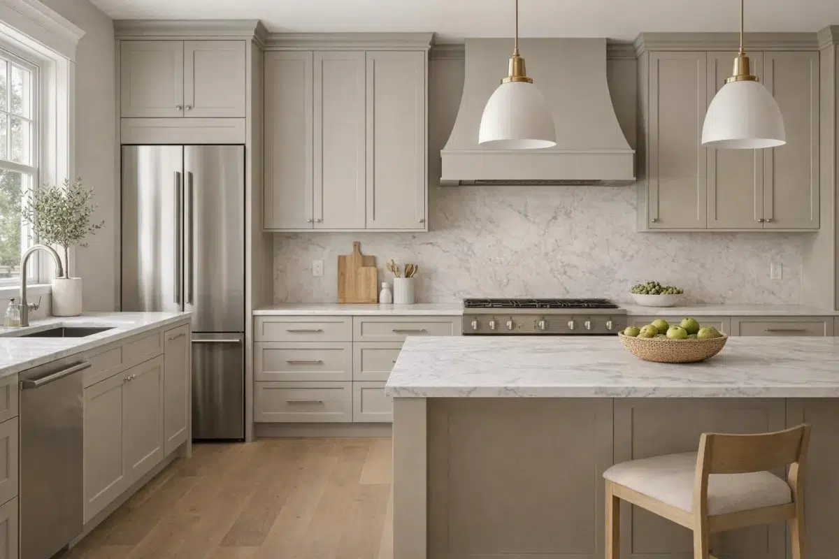
7 Kitchen Cabinets Photos
Repose Gray cabinets paired with a matching backsplash create a "monolith" look that is incredibly popular in contemporary design. It's a bold, seamless approach that makes the kitchen feel integrated into the home's overall architecture.

Kitchen cabinets finished in Repose Gray pair well with marble and wood.
@tjhconstruction
6 House Photos
The way Repose Gray interacts with exterior lighting—like sconces or path lights—is dramatic. At night, the house takes on a protective, fortress-like quality that feels incredibly secure and welcoming to those returning home.

Home exterior painted in Repose Gray offers understated elegance.
@kchomereport
18 Misc Photos
Note how Repose Gray is used as a "ceiling color" in some of these rooms. This "fifth wall" application is a bold designer move that can make a room feel infinitely more cozy and architecturally unique.

Hallway walls transition gracefully in calming Repose Gray along the corridor.
@heidi_jensen_interiors
Expert Perspectives
In-depth articles and real-home features from across our network of home and design sites.
Coordinating Colors


At LRV 73 vs 58, Eider White is decisively the brighter choice.


At LRV 58 vs 32, Repose Gray is decisively the brighter choice.


At LRV 58 vs 26, Repose Gray is decisively the brighter choice.
Trim Color
At LRV 73 vs 58, Eider White is decisively the brighter choice.
Similar Colors

With LRVs of 58 and 58, the two reflect almost the same amount of light.


Their light reflectance is nearly identical (LRV 60 vs 58), so neither reads brighter in a room.


Their light reflectance is nearly identical (LRV 58 vs 58), so neither reads brighter in a room.


With LRVs of 60 and 58, the two reflect almost the same amount of light.


Gossamer Veil reads slightly lighter (LRV 62 vs 58), a gap that shows most in low-lit rooms.


With LRVs of 60 and 58, the two reflect almost the same amount of light.


With LRVs of 60 and 58, the two reflect almost the same amount of light.


With LRVs of 59 and 58, the two reflect almost the same amount of light.


With LRVs of 61 and 58, the two reflect almost the same amount of light.


On The Rocks reads slightly lighter (LRV 62 vs 58), a gap that shows most in low-lit rooms.
Complementary Colors


Repose Gray reflects far more light (LRV 58 vs 7), opening up a space where Sea Mariner encloses it.


Starry Night reads slightly lighter (LRV 69 vs 58), a gap that shows most in low-lit rooms.


At LRV 58 vs 20, Repose Gray is decisively the brighter choice.


At LRV 58 vs 28, Repose Gray is decisively the brighter choice.


Repose Gray reflects far more light (LRV 58 vs 3), opening up a space where After the Storm encloses it.

At LRV 83 vs 58, Lavender Wisp is decisively the brighter choice.


Repose Gray reflects far more light (LRV 58 vs 6), opening up a space where Charcoal Blue encloses it.
Lighter Colors


A 3-point LRV gap (62 vs 58) makes Big Chill the marginally brighter of the two.

A 4-point LRV gap (62 vs 58) makes Touch of Grey the marginally brighter of the two.


A 11-point LRV gap (69 vs 58) makes First Star the marginally brighter of the two.


A 5-point LRV gap (63 vs 58) makes Guild Grey the marginally brighter of the two.
On The Rocks reads slightly lighter (LRV 62 vs 58), a gap that shows most in low-lit rooms.
Darker Colors


At LRV 58 vs 41, Repose Gray is decisively the brighter choice.


At LRV 58 vs 31, Repose Gray is decisively the brighter choice.


Repose Gray reflects far more light (LRV 58 vs 41), opening up a space where Gateway Gray encloses it.


At LRV 58 vs 32, Repose Gray is decisively the brighter choice.

At LRV 58 vs 45, Repose Gray is decisively the brighter choice.