
Appleblossom
Appleblossom is a Red paint color from Sherwin-Williams, but its character reaches beyond a single label. Its warm classification can bring a gentle glow to the color, particularly beside natural wood and softer whites. Treat the digital swatch as an opening note, then watch a physical sample from morning light through evening lamps.
Hex
#DAB5B4LRV
51.25
Appleblossom in Rooms
Follow Appleblossom from one space to another and watch how light, scale and surrounding materials reshape its character. 10 generated visualizations explore how the color might shape a finished room.
1 Home Office Photo
The transition between focused work and the rest of the home can draw different notes from Appleblossom (0076). The pink, red hue classifications suggest the subtle directions the color may take as the room changes.
Sherwin-Williams Appleblossom in a minimalist home office
@mybudgetrecipes
1 Bathroom Photo
Against tile, stone, glass, timber and metal fixtures, Appleblossom (0076) may feel quieter, sharper or more atmospheric than the digital swatch alone. An LRV of 51.3 lets the color hold its identity across both brighter and more shaded parts of the room.

Appleblossom — japandi bathroom
@mybudgetrecipes
1 Dining Room Photo
1 dining room image place Appleblossom (0076) in a gathering space that can move from daylight to ceremony. An LRV of 51.3 lets the color hold its identity across both brighter and more shaded parts of the room.

Appleblossom paint in a contemporary dining room
@mybudgetrecipes
1 Bedroom Photo
Appleblossom (0076) can change noticeably under gentle morning light and low evening lamps. Sample it beside the finishes that will remain in the room.

A traditional bedroom painted in Appleblossom
@mybudgetrecipes
1 Front Door Photo
Appleblossom (0076) offers a starting mood rather than a finished formula: Its warm classification can feel inviting beside tactile, natural materials. Test it under direct sun, porch shade and evening exterior light.

rustic modern front door featuring Appleblossom by Sherwin-Williams
@mybudgetrecipes
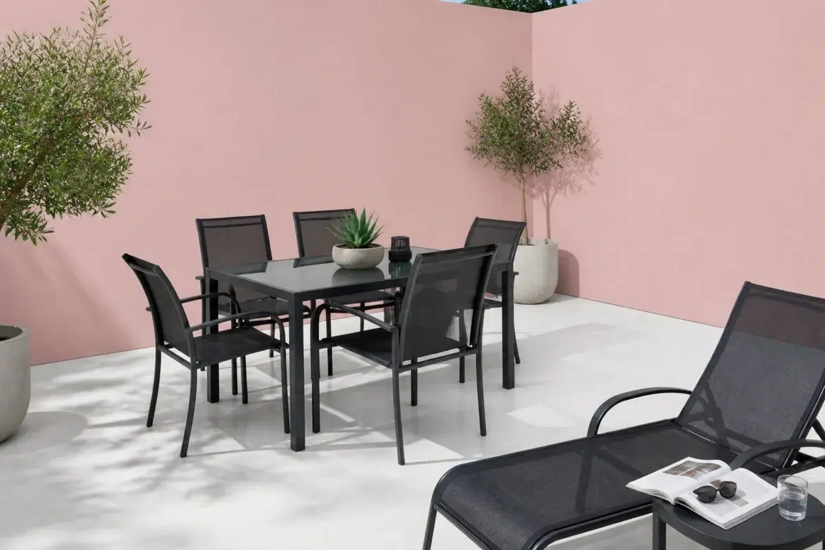
1 Patio Photo
Appleblossom (0076) can change noticeably under direct sun, reflected daylight and deep exterior shade. Sample it beside the finishes that will remain in the room.

contemporary patio featuring Appleblossom by Sherwin-Williams
@mybudgetrecipes
1 Living Room Photo
Appleblossom (0076) offers a starting mood rather than a finished formula: Its warm classification can feel inviting beside tactile, natural materials. Test it under the movement from window light to lamplight.

A mid century living room painted in Appleblossom
@mybudgetrecipes
1 Kitchen Photo
Appleblossom (0076) brings its red character into a hardworking room where color meets movement and strong surfaces. Its muted saturation softens the color’s edges, making texture and shadow part of the composition.

Appleblossom — contemporary kitchen
@mybudgetrecipes
1 House Photo
Appleblossom (0076) moves through 1 house image without becoming a fixed prescription for the room. Its warm classification can feel inviting beside tactile, natural materials.

Appleblossom color — eclectic house inspiration
@mybudgetrecipes
1 Mudroom Photo
Against flooring, storage, timber, baskets and hardware, Appleblossom (0076) may feel quieter, sharper or more atmospheric than the digital swatch alone. An LRV of 51.3 lets the color hold its identity across both brighter and more shaded parts of the room.

Appleblossom — cottagecore mudroom
@mybudgetrecipes
Expert Perspectives
Articles and features from across our network of home and design sites.
Coordinating Colors


At LRV 88 vs 51, Roman Column is decisively the brighter choice.

At LRV 51 vs 31, Appleblossom is decisively the brighter choice.
Similar Colors


Their light reflectance is nearly identical (LRV 52 vs 51), so neither reads brighter in a room.

Lotus Flower reads slightly lighter (LRV 57 vs 51), a gap that shows most in low-lit rooms.


With LRVs of 53 and 51, the two reflect almost the same amount of light.


Fading Rose reads slightly lighter (LRV 55 vs 51), a gap that shows most in low-lit rooms.


Their light reflectance is nearly identical (LRV 51 vs 51), so neither reads brighter in a room.


Bella Pink reflects far more light (LRV 63 vs 51), opening up a space where Appleblossom encloses it.


A 4-point LRV gap (55 vs 51) makes Rachel Pink the marginally brighter of the two.


Gaiety reads slightly lighter (LRV 59 vs 51), a gap that shows most in low-lit rooms.


Appleblossom reads slightly lighter (LRV 51 vs 46), a gap that shows most in low-lit rooms.

A 10-point LRV gap (61 vs 51) makes Loveable the marginally brighter of the two.
Complementary Colors


At LRV 73 vs 51, Mountain Air is decisively the brighter choice.


Their light reflectance is nearly identical (LRV 53 vs 51), so neither reads brighter in a room.


With LRVs of 53 and 51, the two reflect almost the same amount of light.


Appleblossom reflects far more light (LRV 51 vs 16), opening up a space where Riverway encloses it.


Glass Bead reflects far more light (LRV 77 vs 51), opening up a space where Appleblossom encloses it.


At LRV 51 vs 29, Appleblossom is decisively the brighter choice.


At LRV 51 vs 6, Appleblossom is decisively the brighter choice.
Lighter Colors
Their light reflectance is nearly identical (LRV 52 vs 51), so neither reads brighter in a room.

At LRV 76 vs 51, Possibly Pink is decisively the brighter choice.

Verbena reflects far more light (LRV 77 vs 51), opening up a space where Appleblossom encloses it.


Diminutive Pink reflects far more light (LRV 76 vs 51), opening up a space where Appleblossom encloses it.
Darker Colors


Appleblossom reflects far more light (LRV 51 vs 28), opening up a space where Coral Rose encloses it.


At LRV 51 vs 35, Appleblossom is decisively the brighter choice.


Appleblossom reflects far more light (LRV 51 vs 26), opening up a space where Coral Clay encloses it.
Color Codes
Manufacturer description
Soft as the delicate petals of spring blooms, this muted red carries warm undertones that whisper of romance and gentle femininity. Perfect for bedrooms or powder rooms, it pairs beautifully with cream trim and weathered wood accents for a cottage-inspired haven.
Attributed to Sherwin-Williams catalog data.