
Bella Pink
Bella Pink begins as a red color on paper, then shifts with every surface, shadow and neighboring material. It appears in Living Well, placing it within several distinct decorating stories rather than a single fixed look. Treat the digital swatch as an opening note, then watch a physical sample from morning light through evening lamps.
Hex
#F1C6C4LRV
63.32
Bella Pink's Color Strip
Bella Pink is the first shade on this 7-color strip, the lightest in this coordinated family. Browsing strip 107 alongside this color helps you gauge whether to go lighter, darker, or stay right here.


Bella Pink in Rooms
Follow Bella Pink from one space to another and watch how light, scale and surrounding materials reshape its character. 10 generated visualizations explore how the color might shape a finished room.
1 Front Door Photo
Its place within Living Well hints at the range of palettes it can inhabit. In this setting, let direct sun, porch shade and evening exterior light and hardware, glazing, masonry, timber and surrounding trim guide the final sample decision.
modern luxury front door featuring Bella Pink by Sherwin-Williams
@mybudgetrecipes
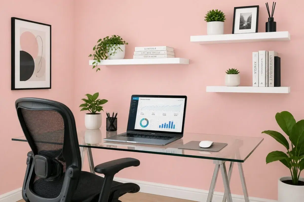
1 Home Office Photo
Against wood, paper, shelving and upholstered seating, Bella Pink (6596) may feel quieter, sharper or more atmospheric than the digital swatch alone. An LRV of 63.3 lets the color hold its identity across both brighter and more shaded parts of the room.

Sherwin-Williams Bella Pink in a contemporary home office
@mybudgetrecipes
1 Bedroom Photo
The 1 bedroom image turn a red swatch into something more spatial and expressive. Its brighter saturation allows the hue to remain present rather than fading quietly into the background.

A industrial bedroom painted in Bella Pink
@mybudgetrecipes
1 Bathroom Photo
Bella Pink (6596) brings its red character into a compact setting where tile, fixtures and color sit close together. Its brighter saturation allows the hue to remain present rather than fading quietly into the background.

Bella Pink — coastal bathroom
@mybudgetrecipes
1 Dining Room Photo
Bella Pink (6596) moves through 1 dining room image without becoming a fixed prescription for the room. Its warm classification can feel inviting beside tactile, natural materials.

Bella Pink paint in a art deco dining room
@mybudgetrecipes
1 Living Room Photo
Bella Pink (6596) can change noticeably under the movement from window light to lamplight. Sample it beside the finishes that will remain in the room.

A elegant living room painted in Bella Pink
@mybudgetrecipes
1 Mudroom Photo
1 mudroom image trace Bella Pink (6596) through the daily movement of arrivals, departures and changing weather. Its place within Living Well hints at the range of palettes it can inhabit.

Bella Pink paint in a industrial mudroom
@mybudgetrecipes
1 Patio Photo
Its place within Living Well hints at the range of palettes it can inhabit. In this setting, let direct sun, reflected daylight and deep exterior shade and stone, timber, metal, textiles and greenery guide the final sample decision.

rustic modern patio featuring Bella Pink by Sherwin-Williams
@mybudgetrecipes
1 Kitchen Photo
Against stone, timber, tile and metal finishes, Bella Pink (6596) may feel quieter, sharper or more atmospheric than the digital swatch alone. An LRV of 63.3 lets the color hold its identity across both brighter and more shaded parts of the room.

Bella Pink — modern luxury kitchen
@mybudgetrecipes
1 House Photo
1 house image place Bella Pink (6596) in an exterior viewed across distance, weather and the changing sky. An LRV of 63.3 lets the color hold its identity across both brighter and more shaded parts of the room.

Bella Pink color — traditional house inspiration
@mybudgetrecipes
Expert Perspectives
Articles and features from across our network of home and design sites.
Coordinating Colors


Intimate White reflects far more light (LRV 77 vs 63), opening up a space where Bella Pink encloses it.


At LRV 63 vs 28, Bella Pink is decisively the brighter choice.


Bella Pink reflects far more light (LRV 63 vs 20), opening up a space where Studio Blue Green encloses it.
Trim Color
Intimate White reflects far more light (LRV 77 vs 63), opening up a space where Bella Pink encloses it.
Similar Colors

Bella Pink reads slightly lighter (LRV 63 vs 57), a gap that shows most in low-lit rooms.

Their light reflectance is nearly identical (LRV 65 vs 63), so neither reads brighter in a room.


Bella Pink reads slightly lighter (LRV 63 vs 59), a gap that shows most in low-lit rooms.


Their light reflectance is nearly identical (LRV 66 vs 63), so neither reads brighter in a room.

Their light reflectance is nearly identical (LRV 63 vs 61), so neither reads brighter in a room.


Bella Pink reads slightly lighter (LRV 63 vs 53), a gap that shows most in low-lit rooms.


With LRVs of 66 and 63, the two reflect almost the same amount of light.


Bella Pink reads slightly lighter (LRV 63 vs 58), a gap that shows most in low-lit rooms.


A 11-point LRV gap (63 vs 52) makes Bella Pink the marginally brighter of the two.

With LRVs of 66 and 63, the two reflect almost the same amount of light.
Complementary Colors


Carefree reflects far more light (LRV 79 vs 63), opening up a space where Bella Pink encloses it.


Bella Pink reflects far more light (LRV 63 vs 4), opening up a space where Cascades encloses it.


A 9-point LRV gap (63 vs 55) makes Bella Pink the marginally brighter of the two.


Bella Pink reflects far more light (LRV 63 vs 38), opening up a space where Aquitaine encloses it.


Bella Pink reflects far more light (LRV 63 vs 47), opening up a space where French Moire encloses it.


At LRV 63 vs 25, Bella Pink is decisively the brighter choice.


Bella Pink reflects far more light (LRV 63 vs 5), opening up a space where Westhaven encloses it.
Lighter Colors

Young At Heart reflects far more light (LRV 80 vs 63), opening up a space where Bella Pink encloses it.
Their light reflectance is nearly identical (LRV 66 vs 63), so neither reads brighter in a room.


At LRV 79 vs 63, Laurel Pink is decisively the brighter choice.
Darker Colors


At LRV 63 vs 29, Bella Pink is decisively the brighter choice.


Bella Pink reads slightly lighter (LRV 63 vs 54), a gap that shows most in low-lit rooms.
Bella Pink reads slightly lighter (LRV 63 vs 59), a gap that shows most in low-lit rooms.
Color Codes
Manufacturer description
This cheerful, saturated pink radiates warmth and optimism with its red undertones, evoking the joy of blooming garden paths and sunset-painted skies. Perfect for nurseries, powder rooms, or any space craving a bright, welcoming pop of color that feels both playful and refined.