
Aquatint
Aquatint begins as a blue color on paper, then shifts with every surface, shadow and neighboring material. Its cool classification gives it a crisper edge that may become clearer beside warm timber, cream or brass. Move between the room imagery, color measurements and coordinating shades to build a fuller sense of how it might live in your space.
Hex
#B8E7DELRV
72.66
Aquatint in Rooms
Follow Aquatint from one space to another and watch how light, scale and surrounding materials reshape its character. 10 generated visualizations explore how the color might shape a finished room.
1 Kitchen Photo
Aquatint (6936) brings its blue character into a hardworking room where color meets movement and strong surfaces. Its cool classification can bring a composed, clean tension to warmer finishes.
Aquatint — scandinavian kitchen
@mybudgetrecipes
1 House Photo
Viewed across 1 house image in an exterior viewed across distance, weather and the changing sky, Aquatint (6936) reveals how much color depends on scale, surface and shadow. Its LRV of 72.7 gives it a light-reflective character, though shadows and neighboring finishes can still draw out surprising depth.

Aquatint color — coastal house inspiration
@mybudgetrecipes
1 Living Room Photo
Aquatint (6936) brings its blue character into a space shaped by conversation, quiet evenings and changing daylight. Its cool classification can bring a composed, clean tension to warmer finishes.

A scandinavian living room painted in Aquatint
@mybudgetrecipes
1 Front Door Photo
Against hardware, glazing, masonry, timber and surrounding trim, Aquatint (6936) may feel quieter, sharper or more atmospheric than the digital swatch alone. Its LRV of 72.7 gives it a light-reflective character, though shadows and neighboring finishes can still draw out surprising depth.

scandinavian front door featuring Aquatint by Sherwin-Williams
@mybudgetrecipes
1 Bathroom Photo
Across 1 bathroom image, Aquatint (6936) meets window light, mirrors and focused task lighting. Its cool classification can bring a composed, clean tension to warmer finishes.

Aquatint — vintage bathroom
@mybudgetrecipes
1 Bedroom Photo
Across 1 bedroom image, Aquatint (6936) meets gentle morning light and low evening lamps. Its cool classification can bring a composed, clean tension to warmer finishes.

A minimalist bedroom painted in Aquatint
@mybudgetrecipes
1 Dining Room Photo
Across 1 dining room image, Aquatint (6936) meets natural light, candles and pendant lighting. Its cool classification can bring a composed, clean tension to warmer finishes.

Aquatint paint in a moody dining room
@mybudgetrecipes
1 Home Office Photo
1 home office image trace Aquatint (6936) through the transition between focused work and the rest of the home. The blue hue classifications suggest the subtle directions the color may take as the room changes.

Sherwin-Williams Aquatint in a contemporary home office
@mybudgetrecipes
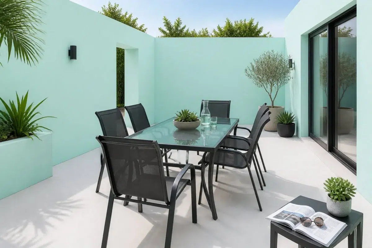
1 Patio Photo
Against stone, timber, metal, textiles and greenery, Aquatint (6936) may feel quieter, sharper or more atmospheric than the digital swatch alone. Its LRV of 72.7 gives it a light-reflective character, though shadows and neighboring finishes can still draw out surprising depth.

Aquatint — contemporary patio
@mybudgetrecipes
1 Mudroom Photo
Against flooring, storage, timber, baskets and hardware, Aquatint (6936) may feel quieter, sharper or more atmospheric than the digital swatch alone. Its LRV of 72.7 gives it a light-reflective character, though shadows and neighboring finishes can still draw out surprising depth.

Aquatint color — small mudroom inspiration
@mybudgetrecipes
Expert Perspectives
Articles and features from across our network of home and design sites.
Coordinating Colors


Aquatint reflects far more light (LRV 73 vs 54), opening up a space where Gold Vessel encloses it.
Similar Colors


Aquatint reads slightly lighter (LRV 73 vs 66), a gap that shows most in low-lit rooms.
Complementary Colors

Whimsical White reads slightly lighter (LRV 79 vs 73), a gap that shows most in low-lit rooms.


At LRV 73 vs 46, Aquatint is decisively the brighter choice.

At LRV 73 vs 24, Aquatint is decisively the brighter choice.

Aquatint reflects far more light (LRV 73 vs 17), opening up a space where Plum Dandy encloses it.


Aquatint reads slightly lighter (LRV 73 vs 64), a gap that shows most in low-lit rooms.


Lighter Colors
Color Codes
Manufacturer description
This ethereal pale blue-green evokes the luminous quality of shallow tropical waters kissed by sunlight, with cool undertones that refresh without overwhelming. Perfect for bathrooms, bedrooms, or any sanctuary where you seek a serene, spa-like tranquility.