
Blue Sky
There is more to Sherwin-Williams Blue Sky (0063) than the swatch alone: its depth, undertones and setting all shape the final impression. Its blue classifications hint at the directions it may take as daylight, lamps and neighboring colors move around it. Because screens flatten both light and texture, sample the paint beside the finishes that will ultimately surround it.
Hex
#ABD1C9LRV
58.47
Blue Sky in Rooms
Follow Blue Sky from one space to another and watch how light, scale and surrounding materials reshape its character. 10 generated visualizations explore how the color might shape a finished room.
1 Front Door Photo
Blue Sky (0063) moves through 1 front door image without becoming a fixed prescription for the room. Its cool classification can bring a composed, clean tension to warmer finishes.
traditional front door featuring Blue Sky by Sherwin-Williams
@mybudgetrecipes
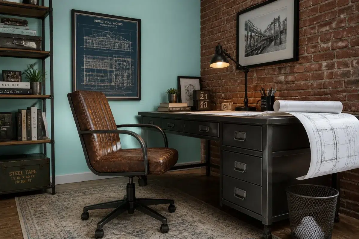
1 Home Office Photo
1 generated visualization explores how the color might shape the finished space. Together they show Blue Sky (0063) as inspiration rather than a promise of an identical result.

Sherwin-Williams Blue Sky in a industrial home office
@mybudgetrecipes
1 Dining Room Photo
Blue Sky (0063) can change noticeably under natural light, candles and pendant lighting. Sample it beside the finishes that will remain in the room.

Blue Sky paint in a parisian dining room
@mybudgetrecipes
1 Bedroom Photo
Against bed linen, timber, wool and upholstered textures, Blue Sky (0063) may feel quieter, sharper or more atmospheric than the digital swatch alone. An LRV of 58.5 lets the color hold its identity across both brighter and more shaded parts of the room.

A boho bedroom painted in Blue Sky
@mybudgetrecipes
1 Bathroom Photo
The 1 bathroom image turn a green swatch into something more spatial and expressive. Its brighter saturation allows the hue to remain present rather than fading quietly into the background.

Blue Sky — modern luxury bathroom
@mybudgetrecipes
1 Kitchen Photo
The blue hue classifications suggest the subtle directions the color may take as the room changes. In this setting, let daylight, task lighting and evening pendants and stone, timber, tile and metal finishes guide the final sample decision.

Blue Sky — vintage kitchen
@mybudgetrecipes
1 Patio Photo
Blue Sky (0063) moves through 1 patio image without becoming a fixed prescription for the room. Its cool classification can bring a composed, clean tension to warmer finishes.

boho patio featuring Blue Sky by Sherwin-Williams
@mybudgetrecipes
1 Living Room Photo
The room’s shift from daytime energy to evening calm can draw different notes from Blue Sky (0063). The blue hue classifications suggest the subtle directions the color may take as the room changes.

A cozy living room painted in Blue Sky
@mybudgetrecipes
1 House Photo
Against roofing, masonry, timber, planting and trim, Blue Sky (0063) may feel quieter, sharper or more atmospheric than the digital swatch alone. An LRV of 58.5 lets the color hold its identity across both brighter and more shaded parts of the room.

Blue Sky color — coastal house inspiration
@mybudgetrecipes
1 Mudroom Photo
1 generated visualization explores how the color might shape the finished space. Together they show Blue Sky (0063) as inspiration rather than a promise of an identical result.

Blue Sky paint in a rustic modern mudroom
@mybudgetrecipes
Expert Perspectives
Articles and features from across our network of home and design sites.
Coordinating Colors


Dover White reflects far more light (LRV 83 vs 58), opening up a space where Blue Sky encloses it.


Canvas Tan reads slightly lighter (LRV 64 vs 58), a gap that shows most in low-lit rooms.
Similar Colors


A 8-point LRV gap (66 vs 58) makes Meander Blue the marginally brighter of the two.


Complementary Colors

At LRV 79 vs 58, Whimsical White is decisively the brighter choice.


Blue Sky reflects far more light (LRV 58 vs 46), opening up a space where Chaise Mauve encloses it.

Blue Sky reflects far more light (LRV 58 vs 24), opening up a space where Ruby Violet encloses it.

At LRV 58 vs 17, Blue Sky is decisively the brighter choice.


A 6-point LRV gap (64 vs 58) makes Wallflower the marginally brighter of the two.


Lighter Colors
A 8-point LRV gap (66 vs 58) makes Meander Blue the marginally brighter of the two.


Crystal Clear reflects far more light (LRV 81 vs 58), opening up a space where Blue Sky encloses it.


At LRV 80 vs 58, Buoyant Blue is decisively the brighter choice.

At LRV 79 vs 58, Retiring Blue is decisively the brighter choice.
Darker Colors


At LRV 58 vs 41, Blue Sky is decisively the brighter choice.


A 10-point LRV gap (58 vs 49) makes Blue Sky the marginally brighter of the two.


Blue Sky reads slightly lighter (LRV 58 vs 49), a gap that shows most in low-lit rooms.
Color Codes
Manufacturer description
This historic Jazz Age color is a vibrant, cool, blue with a playful green undertone, fostering an energizing atmosphere in any space.
Attributed to Sherwin-Williams catalog data.