
Black Swan
Sherwin-Williams Black Swan (6279) carries the measured structure of its color data and the less predictable beauty of paint in a finished space. Its neutral temperature leaves room for surrounding materials and light to pull the color warmer or cooler. Treat the digital swatch as an opening note, then watch a physical sample from morning light through evening lamps.
Hex
#3A373ELRV
3.98
Black Swan's Color Strip
Black Swan is the seventh shade on this 7-color strip, the deepest shade in this coordinated family. As part of strip 252, these colors are curated to work together — helpful when you're deciding how light or deep to go.


Black Swan in Rooms
Follow Black Swan from one space to another and watch how light, scale and surrounding materials reshape its character. 10 generated visualizations explore how the color might shape a finished room.
1 Bedroom Photo
1 bedroom image trace Black Swan (6279) through the slower pace of morning and night. Its place within 2017 Noir and 2018 Connectivity hints at the range of palettes it can inhabit.
A minimalist bedroom painted in Black Swan
@mybudgetrecipes
1 Front Door Photo
1 generated visualization explores how the color might shape the finished space. Together they show Black Swan (6279) as inspiration rather than a promise of an identical result.

mediterranean front door featuring Black Swan by Sherwin-Williams
@mybudgetrecipes
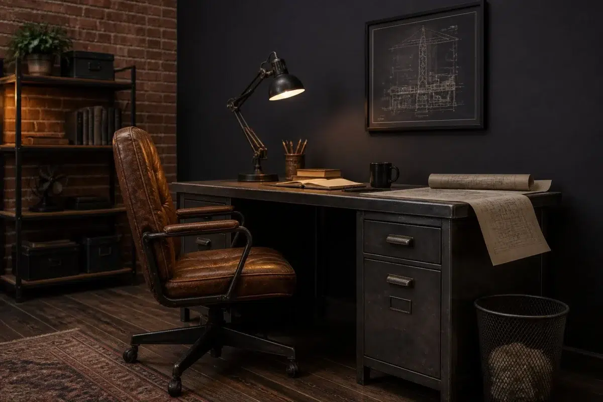
1 Home Office Photo
Across 1 home office image, Black Swan (6279) meets daylight beside desk lamps and screen glow. Its neutral temperature gives the surrounding palette unusual influence over the final mood.

Sherwin-Williams Black Swan in a industrial home office
@mybudgetrecipes
1 Bathroom Photo
Black Swan (6279) offers a starting mood rather than a finished formula: Its neutral temperature gives the surrounding palette unusual influence over the final mood. Test it under window light, mirrors and focused task lighting.

Black Swan — industrial bathroom
@mybudgetrecipes
1 Dining Room Photo
The room’s change from everyday meals to evening occasions can draw different notes from Black Swan (6279). The grey hue classifications suggest the subtle directions the color may take as the room changes.

Black Swan paint in a minimalist dining room
@mybudgetrecipes
1 Mudroom Photo
Viewed across 1 mudroom image in a practical threshold where the outdoors enters the home, Black Swan (6279) reveals how much color depends on scale, surface and shadow. With an LRV of 4.0, it carries enough visual weight to make light, trim and texture feel especially deliberate.

Black Swan paint in a earthy mudroom
@mybudgetrecipes
1 Living Room Photo
1 living room image place Black Swan (6279) in a space shaped by conversation, quiet evenings and changing daylight. With an LRV of 4.0, it carries enough visual weight to make light, trim and texture feel especially deliberate.

A industrial living room painted in Black Swan
@mybudgetrecipes
1 Kitchen Photo
Black Swan (6279) can change noticeably under daylight, task lighting and evening pendants. Sample it beside the finishes that will remain in the room.

Black Swan — classy kitchen
@mybudgetrecipes
1 House Photo
1 house image trace Black Swan (6279) through the façade’s movement through sun, shade and season. Its place within 2017 Noir and 2018 Connectivity hints at the range of palettes it can inhabit.

Black Swan color — rustic modern house inspiration
@mybudgetrecipes
1 Patio Photo
In an outdoor room surrounded by sky, planting and open light, the most interesting quality of Black Swan (6279) may be the way it responds to stone, timber, metal, textiles and greenery. The grey hue classifications suggest the subtle directions the color may take as the room changes.

coastal patio featuring Black Swan by Sherwin-Williams
@mybudgetrecipes
Expert Perspectives
Articles and features from across our network of home and design sites.
Coordinating Colors


Original White reflects far more light (LRV 74 vs 4), opening up a space where Black Swan encloses it.


Creamy reflects far more light (LRV 81 vs 4), opening up a space where Black Swan encloses it.


Dried Edamame reflects far more light (LRV 36 vs 4), opening up a space where Black Swan encloses it.
Trim Color
Original White reflects far more light (LRV 74 vs 4), opening up a space where Black Swan encloses it.
Similar Colors


With LRVs of 4 and 4, the two reflect almost the same amount of light.


Their light reflectance is nearly identical (LRV 4 vs 3), so neither reads brighter in a room.


With LRVs of 4 and 4, the two reflect almost the same amount of light.


With LRVs of 5 and 4, the two reflect almost the same amount of light.

Their light reflectance is nearly identical (LRV 4 vs 4), so neither reads brighter in a room.


With LRVs of 4 and 3, the two reflect almost the same amount of light.


Their light reflectance is nearly identical (LRV 4 vs 3), so neither reads brighter in a room.


Their light reflectance is nearly identical (LRV 5 vs 4), so neither reads brighter in a room.


With LRVs of 4 and 3, the two reflect almost the same amount of light.


Their light reflectance is nearly identical (LRV 4 vs 4), so neither reads brighter in a room.
Complementary Colors


Rookwood Dark Green reads slightly lighter (LRV 10 vs 4), a gap that shows most in low-lit rooms.


At LRV 73 vs 4, Opaline is decisively the brighter choice.

Pine Frost reflects far more light (LRV 65 vs 4), opening up a space where Black Swan encloses it.


A 5-point LRV gap (9 vs 4) makes Vogue Green the marginally brighter of the two.


Filmy Green reflects far more light (LRV 64 vs 4), opening up a space where Black Swan encloses it.

Leaflet reflects far more light (LRV 30 vs 4), opening up a space where Black Swan encloses it.


Frostwork reflects far more light (LRV 62 vs 4), opening up a space where Black Swan encloses it.
Lighter Colors


A 7-point LRV gap (11 vs 4) makes Cloak Gray the marginally brighter of the two.


Perle Noir reads slightly lighter (LRV 8 vs 4), a gap that shows most in low-lit rooms.


A 6-point LRV gap (10 vs 4) makes Midnight the marginally brighter of the two.


With LRVs of 6 and 4, the two reflect almost the same amount of light.

Ripe Berry reads slightly lighter (LRV 10 vs 4), a gap that shows most in low-lit rooms.
Darker Colors
Their light reflectance is nearly identical (LRV 4 vs 3), so neither reads brighter in a room.
Color Codes
Manufacturer description
This nearly black neutral exudes an air of quiet elegance and theatrical drama with its muted, understated depth. Perfect for creating an intimate gallery wall or a sophisticated accent in bedrooms and studies, it pairs beautifully with warm metallics and soft cream trim.