
Creamy
With a focus on bright and airy tones, Creamy (7012) is a standout White in our database. It was selected for this featured gallery for its ability to maximize natural light while maintaining a clean, neutral backdrop. See it applied across 100 real world scenarios and find professional pairing data below.
Hex
#EFE8DB
LRV
81.19
Creamy's Color Strip
Creamy is the third shade on this 7-color strip, sitting between Dover White and Aged White. The strip spans from Whitetail at the lightest end to Patience at the deepest. As part of strip 261, these colors are curated to work together — helpful when you're deciding how light or deep to go.


Creamy in Real Rooms
Creamy has a high LRV of 81.19 — it reflects a lot of light and will read pale and airy in most spaces. It's neutral in temperature and , making it adaptable across different lighting conditions and room orientations. Grouped in the White family, the photos below show it applied in a living room, bedroom, kitchen, bathroom, home office, house, front door, dining room, misc and kitchen cabinets.
24 Living Room Photos
Creamy anchors the living room with a quiet, architectural confidence. Its depth shifts subtly through the day — cooler in the crisp morning light and significantly warmer by lamplight in the evening — making it a natural fit for a space meant for both high-energy gathering and silent unwinding. To maximize the effect, layer in natural white oak, heavy linen, and soft metallics to let the color truly breathe.
Living room walls in Creamy create a serene, light-filled atmosphere.
@mybudgetrecipes
15 Bedroom Photos
Creamy creates a bedroom that feels deliberately calm rather than accidentally plain. The color absorbs the first rays of morning light without bouncing them back harshly, which means waking up in this environment feels gentle and gradual. Keep the window treatments simple and let the walls do the heavy lifting.

Bedroom walls wrapped in Creamy establish a restful, cohesive backdrop.
@mybudgetrecipes
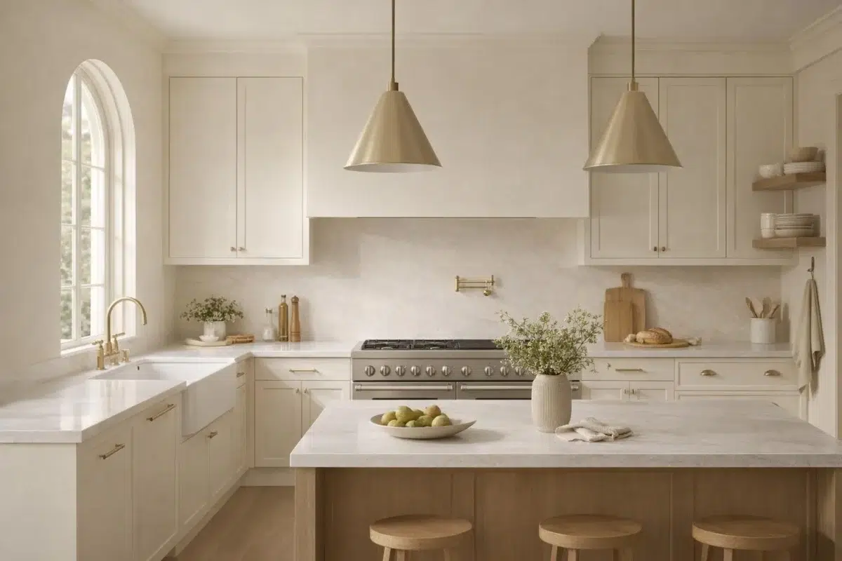
3 Kitchen Photos
The challenge with kitchen color is longevity: it needs to look right at 7am under bright task lights and at dinner with the pendants dimmed low. Creamy manages to bridge all three lighting scenarios with ease, which is a rarer quality in a paint pigment than it sounds.

Kitchen cabinets painted Creamy brighten the cooking space with soft warmth.
@mybudgetrecipes

Kitchen cabinets painted in Creamy create a warm, inviting cooking space.
@michellezawackirealestate

Cream-colored walls brighten this kitchen with soft, natural light.
@thegorillabrothers
6 Bathroom Photos
Creamy is the perfect "clean" color for a bathroom that still wants to feel cozy. It lacks the clinical coldness of a pure white but retains a sense of hygiene and order that is essential for a space dedicated to self-care and grooming.

Bathroom walls in Creamy enhance the room's clean, spa-like quality.
@mybudgetrecipes
1 Home Office Photo
To create a "library" feel in your home office, use Creamy on both the walls and the built-in shelving. This monochromatic approach creates a sophisticated, academic atmosphere that makes the room feel like a true destination for thought.

Desk and shelving in Creamy keep the home office calm and focused.
@mybudgetrecipes
21 House Photos
Creamy is particularly effective on modern-style homes with flat planes and large windows. The color emphasizes the geometry of the house, using shadows and light to create a dynamic, ever-changing facade throughout the day.

Exterior trim painted Creamy softens the home's overall architectural lines.
@mybudgetrecipes
1 Front Door Photo
The front door is a great place to experiment with higher sheen levels. Creamy in a high-gloss finish creates a mirror-like surface that looks incredibly expensive and traditional, echoing the grand entryways of London or New York.

The front door frames itself in crisp Creamy against neutral siding.
@mybudgetrecipes
3 Dining Room Photos
Using Creamy in the dining room allows you to go bold with your lighting fixtures. An oversized chandelier or a modern sculptural pendant will look even more dramatic against the rich, steady background of this particular shade.

Dining room walls in Creamy allow artwork and furnishings to take center stage.
@cottage.inthe.cotton

Wainscoting detailed in Creamy brings classic elegance to the dining space.
@cottage.inthe.cotton

Crown molding painted Creamy ties the dining room's color scheme together gracefully.
@cottage.inthe.cotton
9 Misc Photos
Note how Creamy is used as a "ceiling color" in some of these rooms. This "fifth wall" application is a bold designer move that can make a room feel infinitely more cozy and architecturally unique.

A hallway lined with Creamy walls feels bright and welcoming.
@travarsbuilthomes
17 Kitchen Cabinets Photos
Choosing Creamy for cabinets allows you to be more adventurous with your tile and stone choices. Because the cabinetry is so well-grounded, it can balance out a heavily veined marble or a colorful geometric backsplash without the room feeling "busy."

Cabinet doors finished in Creamy brighten this kitchen workspace.
@red.nest.designs
Expert Perspectives
In-depth articles and real-home features from across our network of home and design sites.
Coordinating Colors


At LRV 81 vs 34, Creamy is decisively the brighter choice.

Similar Colors


With LRVs of 81 and 79, the two reflect almost the same amount of light.


With LRVs of 83 and 81, the two reflect almost the same amount of light.


Their light reflectance is nearly identical (LRV 83 vs 81), so neither reads brighter in a room.


Their light reflectance is nearly identical (LRV 83 vs 81), so neither reads brighter in a room.


A 5-point LRV gap (81 vs 77) makes Creamy the marginally brighter of the two.


A 5-point LRV gap (86 vs 81) makes Westhighland White the marginally brighter of the two.


Complementary Colors


At LRV 81 vs 7, Creamy is decisively the brighter choice.


At LRV 81 vs 69, Creamy is decisively the brighter choice.


Creamy reflects far more light (LRV 81 vs 20), opening up a space where Soulful Blue encloses it.


Creamy reflects far more light (LRV 81 vs 28), opening up a space where Dusty Heather encloses it.


At LRV 81 vs 3, Creamy is decisively the brighter choice.

With LRVs of 83 and 81, the two reflect almost the same amount of light.