
Bramble Bush
At first glance, Bramble Bush belongs to the beige family; in a room, light and context can make it far more elusive. Its beige and pink classifications hint at the directions it may take as daylight, lamps and neighboring colors move around it. Its related shades below reveal where the color harmonizes—and where contrast brings it fully to life.
Hex
#503629LRV
4.50
Bramble Bush in Rooms
Follow Bramble Bush from one space to another and watch how light, scale and surrounding materials reshape its character. 10 generated visualizations explore how the color might shape a finished room.
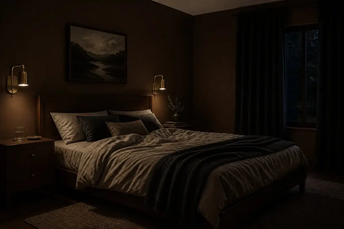
1 Bedroom Photo
1 bedroom image place Bramble Bush (2923) in a room designed around rest, softness and retreat. With an LRV of 4.5, it carries enough visual weight to make light, trim and texture feel especially deliberate.
A moody bedroom painted in Bramble Bush
@mybudgetrecipes
1 Home Office Photo
Bramble Bush (2923) offers a starting mood rather than a finished formula: Its warm classification can feel inviting beside tactile, natural materials. Test it under daylight beside desk lamps and screen glow.

Sherwin-Williams Bramble Bush in a industrial home office
@mybudgetrecipes
1 Front Door Photo
Against hardware, glazing, masonry, timber and surrounding trim, Bramble Bush (2923) may feel quieter, sharper or more atmospheric than the digital swatch alone. With an LRV of 4.5, it carries enough visual weight to make light, trim and texture feel especially deliberate.

minimalist front door featuring Bramble Bush by Sherwin-Williams
@mybudgetrecipes
1 Bathroom Photo
Viewed across 1 bathroom image in a compact setting where tile, fixtures and color sit close together, Bramble Bush (2923) reveals how much color depends on scale, surface and shadow. With an LRV of 4.5, it carries enough visual weight to make light, trim and texture feel especially deliberate.

Bramble Bush — vintage bathroom
@mybudgetrecipes
1 Dining Room Photo
The beige, pink hue classifications suggest the subtle directions the color may take as the room changes. In this setting, let natural light, candles and pendant lighting and timber, table linen, glass and artwork guide the final sample decision.

Bramble Bush paint in a parisian dining room
@mybudgetrecipes
1 Living Room Photo
The 1 living room image turn a beige swatch into something more spatial and expressive. Its warm classification can feel inviting beside tactile, natural materials.

A cozy living room painted in Bramble Bush
@mybudgetrecipes
1 Patio Photo
Viewed across 1 patio image in an outdoor room surrounded by sky, planting and open light, Bramble Bush (2923) reveals how much color depends on scale, surface and shadow. With an LRV of 4.5, it carries enough visual weight to make light, trim and texture feel especially deliberate.

wabi-sabi patio featuring Bramble Bush by Sherwin-Williams
@mybudgetrecipes
1 House Photo
The beige, pink hue classifications suggest the subtle directions the color may take as the room changes. In this setting, let full daylight, cloud cover and long evening shadows and roofing, masonry, timber, planting and trim guide the final sample decision.

Bramble Bush color — rustic modern house inspiration
@mybudgetrecipes
1 Kitchen Photo
Bramble Bush (2923) can change noticeably under daylight, task lighting and evening pendants. Sample it beside the finishes that will remain in the room.

Bramble Bush — classy kitchen
@mybudgetrecipes
1 Mudroom Photo
Across 1 mudroom image, Bramble Bush (2923) meets doorway light and the softer illumination of an internal passage. Its warm classification can feel inviting beside tactile, natural materials.

Bramble Bush paint in a rustic modern mudroom
@mybudgetrecipes
Expert Perspectives
Articles and features from across our network of home and design sites.
Coordinating Colors


Panda White reflects far more light (LRV 77 vs 5), opening up a space where Bramble Bush encloses it.


Vast Sky reflects far more light (LRV 55 vs 5), opening up a space where Bramble Bush encloses it.
Similar Colors


With LRVs of 5 and 4, the two reflect almost the same amount of light.

Their light reflectance is nearly identical (LRV 5 vs 5), so neither reads brighter in a room.

With LRVs of 5 and 5, the two reflect almost the same amount of light.

With LRVs of 5 and 3, the two reflect almost the same amount of light.

With LRVs of 6 and 5, the two reflect almost the same amount of light.


With LRVs of 7 and 5, the two reflect almost the same amount of light.


With LRVs of 5 and 5, the two reflect almost the same amount of light.


With LRVs of 7 and 5, the two reflect almost the same amount of light.


With LRVs of 5 and 5, the two reflect almost the same amount of light.
Complementary Colors


Niebla Azul reflects far more light (LRV 53 vs 5), opening up a space where Bramble Bush encloses it.


At LRV 53 vs 5, Silver Lake is decisively the brighter choice.


A 11-point LRV gap (16 vs 5) makes Riverway the marginally brighter of the two.


At LRV 77 vs 5, Glass Bead is decisively the brighter choice.


Morning at Sea reflects far more light (LRV 29 vs 5), opening up a space where Bramble Bush encloses it.


With LRVs of 6 and 5, the two reflect almost the same amount of light.


Debonair reflects far more light (LRV 34 vs 5), opening up a space where Bramble Bush encloses it.
Lighter Colors


Brevity Brown reads slightly lighter (LRV 10 vs 5), a gap that shows most in low-lit rooms.


A 5-point LRV gap (10 vs 5) makes Rookwood Medium Brown the marginally brighter of the two.


Grounded reads slightly lighter (LRV 12 vs 5), a gap that shows most in low-lit rooms.

A 9-point LRV gap (14 vs 5) makes Rookwood Brown the marginally brighter of the two.


A 8-point LRV gap (12 vs 5) makes Burnished Brandy the marginally brighter of the two.
Darker Colors
With LRVs of 5 and 4, the two reflect almost the same amount of light.
With LRVs of 5 and 3, the two reflect almost the same amount of light.
Color Codes
Manufacturer description
Step into the shadowed depths of an overgrown woodland sanctuary with this rich, dark brown warmed by subtle earthy undertones. Perfect for creating an intimate, enveloping atmosphere in libraries, dens, or bedrooms that call for moody sophistication.