
Brevity Brown
At first glance, Brevity Brown belongs to the red family; in a room, light and context can make it far more elusive. A muted saturation softens the hue, giving it a quieter quality that can sit comfortably among layered neutrals. Its related shades below reveal where the color harmonizes—and where contrast brings it fully to life.
Hex
#715243LRV
9.95
Brevity Brown's Color Strip
Brevity Brown is the sixth shade on this 7-color strip, sitting between Mocha and French Roast. The strip spans from Reticence at the lightest end to French Roast at the deepest. Strip 196 lines up the full value range so you can see exactly where this color lands among its closest relatives.


Brevity Brown in Rooms
Follow Brevity Brown from one space to another and watch how light, scale and surrounding materials reshape its character. 10 generated visualizations explore how the color might shape a finished room.
1 Dining Room Photo
Brevity Brown (6068) offers a starting mood rather than a finished formula: Its warm classification can feel inviting beside tactile, natural materials. Test it under natural light, candles and pendant lighting.
Brevity Brown paint in a minimalist dining room
@mybudgetrecipes
1 Bathroom Photo
1 bathroom image trace Brevity Brown (6068) through the contrast between bright mornings and quieter evening light. The beige, pink hue classifications suggest the subtle directions the color may take as the room changes.

Brevity Brown — minimalist bathroom
@mybudgetrecipes
1 Home Office Photo
These 1 home office image show how Brevity Brown (6068) can sit beside wood, paper, shelving and upholstered seating. The beige, pink hue classifications suggest the subtle directions the color may take as the room changes.

Sherwin-Williams Brevity Brown in a mid century home office
@mybudgetrecipes
1 Front Door Photo
Brevity Brown (6068) offers a starting mood rather than a finished formula: Its warm classification can feel inviting beside tactile, natural materials. Test it under direct sun, porch shade and evening exterior light.

scandinavian front door featuring Brevity Brown by Sherwin-Williams
@mybudgetrecipes
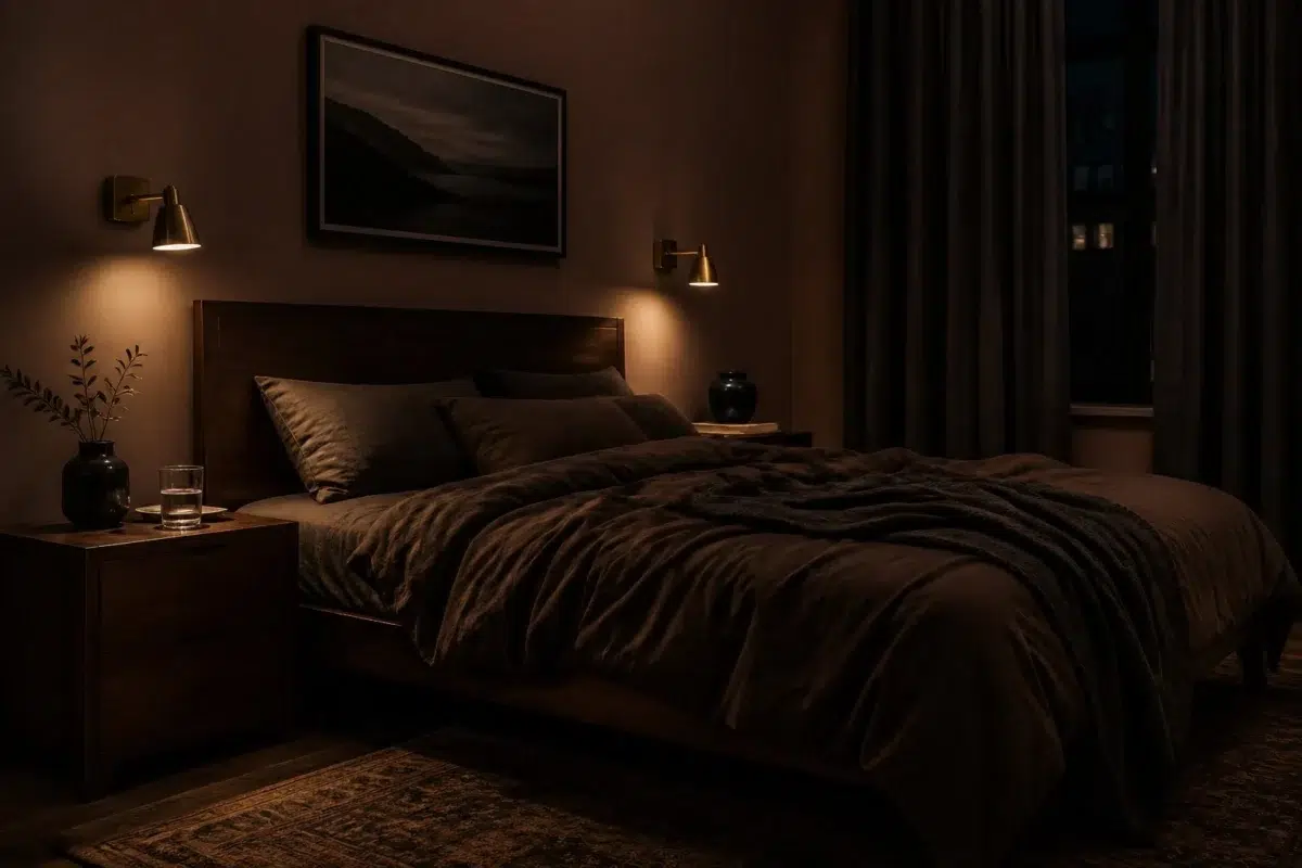
1 Bedroom Photo
Against bed linen, timber, wool and upholstered textures, Brevity Brown (6068) may feel quieter, sharper or more atmospheric than the digital swatch alone. With an LRV of 9.9, it carries enough visual weight to make light, trim and texture feel especially deliberate.

A moody bedroom painted in Brevity Brown
@mybudgetrecipes
1 House Photo
Brevity Brown (6068) brings its red character into an exterior viewed across distance, weather and the changing sky. Its muted saturation softens the color’s edges, making texture and shadow part of the composition.

Brevity Brown color — mediterranean house inspiration
@mybudgetrecipes
1 Mudroom Photo
In a practical threshold where the outdoors enters the home, the most interesting quality of Brevity Brown (6068) may be the way it responds to flooring, storage, timber, baskets and hardware. The beige, pink hue classifications suggest the subtle directions the color may take as the room changes.

Brevity Brown paint in a cottagecore mudroom
@mybudgetrecipes
1 Living Room Photo
Viewed across 1 living room image in a space shaped by conversation, quiet evenings and changing daylight, Brevity Brown (6068) reveals how much color depends on scale, surface and shadow. With an LRV of 9.9, it carries enough visual weight to make light, trim and texture feel especially deliberate.

A elegant living room painted in Brevity Brown
@mybudgetrecipes
1 Kitchen Photo
Brevity Brown (6068) brings its red character into a hardworking room where color meets movement and strong surfaces. Its muted saturation softens the color’s edges, making texture and shadow part of the composition.

Brevity Brown — contemporary kitchen
@mybudgetrecipes
1 Patio Photo
1 patio image place Brevity Brown (6068) in an outdoor room surrounded by sky, planting and open light. With an LRV of 9.9, it carries enough visual weight to make light, trim and texture feel especially deliberate.

coastal patio featuring Brevity Brown by Sherwin-Williams
@mybudgetrecipes
Expert Perspectives
Articles and features from across our network of home and design sites.
Coordinating Colors


At LRV 73 vs 10, Nice White is decisively the brighter choice.


At LRV 60 vs 10, Softer Tan is decisively the brighter choice.


Foxy reads slightly lighter (LRV 17 vs 10), a gap that shows most in low-lit rooms.
Trim Color
At LRV 73 vs 10, Nice White is decisively the brighter choice.
Similar Colors


Their light reflectance is nearly identical (LRV 10 vs 10), so neither reads brighter in a room.

Their light reflectance is nearly identical (LRV 10 vs 9), so neither reads brighter in a room.


With LRVs of 12 and 10, the two reflect almost the same amount of light.


With LRVs of 10 and 10, the two reflect almost the same amount of light.


With LRVs of 10 and 7, the two reflect almost the same amount of light.


With LRVs of 10 and 7, the two reflect almost the same amount of light.

Their light reflectance is nearly identical (LRV 10 vs 10), so neither reads brighter in a room.

Their light reflectance is nearly identical (LRV 10 vs 10), so neither reads brighter in a room.

Their light reflectance is nearly identical (LRV 10 vs 8), so neither reads brighter in a room.
Complementary Colors


Niebla Azul reflects far more light (LRV 53 vs 10), opening up a space where Brevity Brown encloses it.


At LRV 53 vs 10, Silver Lake is decisively the brighter choice.


A 6-point LRV gap (16 vs 10) makes Riverway the marginally brighter of the two.


At LRV 77 vs 10, Glass Bead is decisively the brighter choice.


Morning at Sea reflects far more light (LRV 29 vs 10), opening up a space where Brevity Brown encloses it.


Brevity Brown reads slightly lighter (LRV 10 vs 6), a gap that shows most in low-lit rooms.


Debonair reflects far more light (LRV 34 vs 10), opening up a space where Brevity Brown encloses it.
Lighter Colors

A 9-point LRV gap (19 vs 10) makes Nuthatch the marginally brighter of the two.

A 12-point LRV gap (22 vs 10) makes Moroccan Brown the marginally brighter of the two.


Reddened Earth reads slightly lighter (LRV 19 vs 10), a gap that shows most in low-lit rooms.


Their light reflectance is nearly identical (LRV 13 vs 10), so neither reads brighter in a room.

A 6-point LRV gap (15 vs 10) makes Tanbark the marginally brighter of the two.
Darker Colors

Brevity Brown reads slightly lighter (LRV 10 vs 2), a gap that shows most in low-lit rooms.
With LRVs of 10 and 7, the two reflect almost the same amount of light.
Their light reflectance is nearly identical (LRV 10 vs 10), so neither reads brighter in a room.

A 5-point LRV gap (10 vs 5) makes Brevity Brown the marginally brighter of the two.
Their light reflectance is nearly identical (LRV 10 vs 9), so neither reads brighter in a room.
Color Codes
Manufacturer description
Let this deep brown with red undertone bring warmth and comfort to a well-lit family room or office accent wall. Complement with off-white trim like Nice White.