
Brick Paver
There is more to Sherwin-Williams Brick Paver (7599) than the swatch alone: its depth, undertones and setting all shape the final impression. Its pink and red classifications hint at the directions it may take as daylight, lamps and neighboring colors move around it. 1 sourced room photo offers a closer look at the color in lived-in settings.
Hex
#93402FLRV
10.10
Brick Paver's Color Strip
Brick Paver is the seventh shade on this 7-color strip, the deepest shade in this coordinated family. Strip 119 puts these related shades in sequence, making it simple to find the tone that suits your room.


Brick Paver in Rooms
Follow Brick Paver from one space to another and watch how light, scale and surrounding materials reshape its character. 1 sourced room photo offers a closer look at the color in lived-in settings.
1 Front Door Photo
Across 1 front door image, Brick Paver (7599) meets direct sun, porch shade and evening exterior light. Its warm classification can feel inviting beside tactile, natural materials.
Front door in warm Brick Paver establishes an earthy, inviting entry.
@higginspaintingpgh
Coordinating Colors
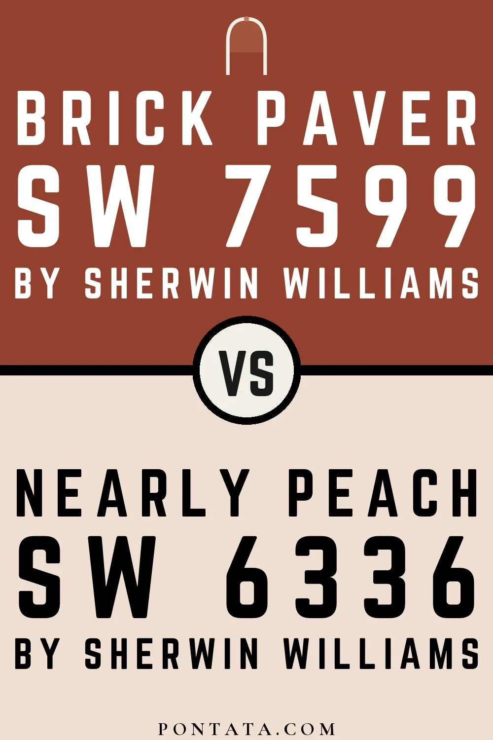

At LRV 75 vs 10, Nearly Peach is decisively the brighter choice.

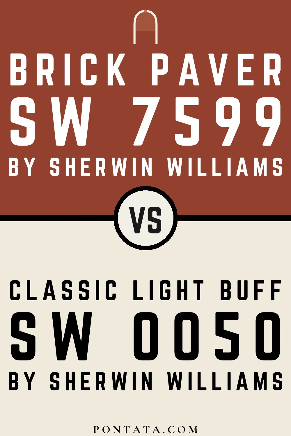
At LRV 83 vs 10, Classic Light Buff is decisively the brighter choice.
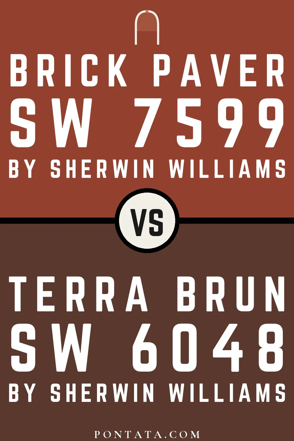
Brick Paver reads slightly lighter (LRV 10 vs 5), a gap that shows most in low-lit rooms.
Trim Color
At LRV 75 vs 10, Nearly Peach is decisively the brighter choice.
Similar Colors


Their light reflectance is nearly identical (LRV 10 vs 10), so neither reads brighter in a room.

With LRVs of 10 and 9, the two reflect almost the same amount of light.


Their light reflectance is nearly identical (LRV 10 vs 10), so neither reads brighter in a room.


Their light reflectance is nearly identical (LRV 11 vs 10), so neither reads brighter in a room.


Their light reflectance is nearly identical (LRV 12 vs 10), so neither reads brighter in a room.


Their light reflectance is nearly identical (LRV 12 vs 10), so neither reads brighter in a room.


With LRVs of 10 and 8, the two reflect almost the same amount of light.


Their light reflectance is nearly identical (LRV 12 vs 10), so neither reads brighter in a room.


With LRVs of 11 and 10, the two reflect almost the same amount of light.


Their light reflectance is nearly identical (LRV 10 vs 9), so neither reads brighter in a room.
Complementary Colors

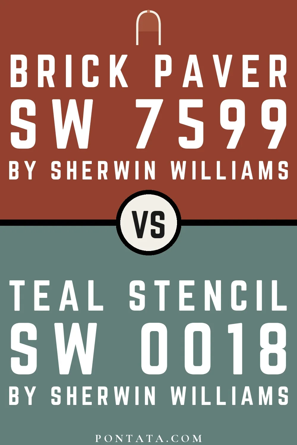
A 9-point LRV gap (19 vs 10) makes Teal Stencil the marginally brighter of the two.

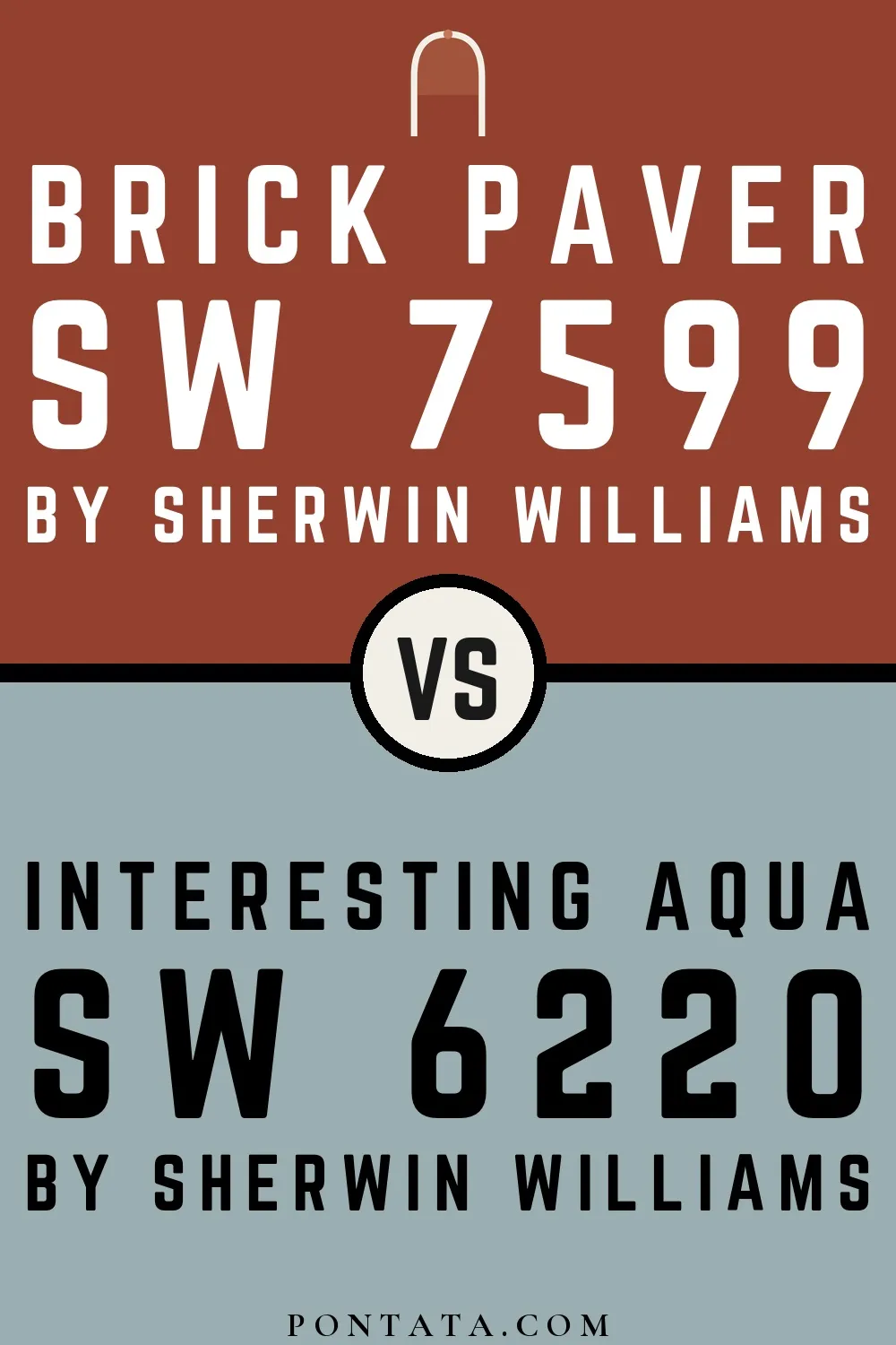
At LRV 41 vs 10, Interesting Aqua is decisively the brighter choice.


Aqua-Sphere reflects far more light (LRV 41 vs 10), opening up a space where Brick Paver encloses it.

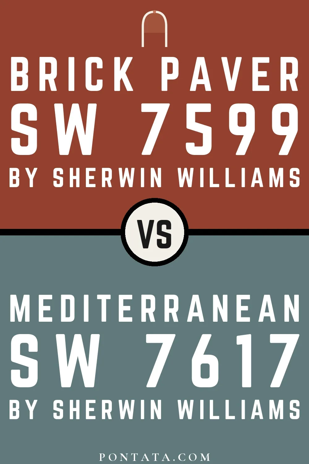
A 7-point LRV gap (18 vs 10) makes Mediterranean the marginally brighter of the two.

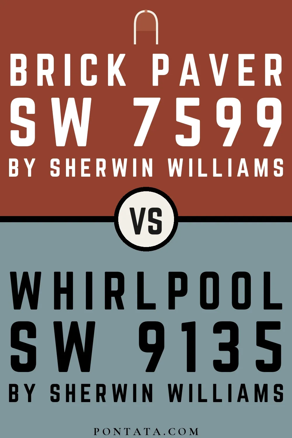
Whirlpool reflects far more light (LRV 29 vs 10), opening up a space where Brick Paver encloses it.

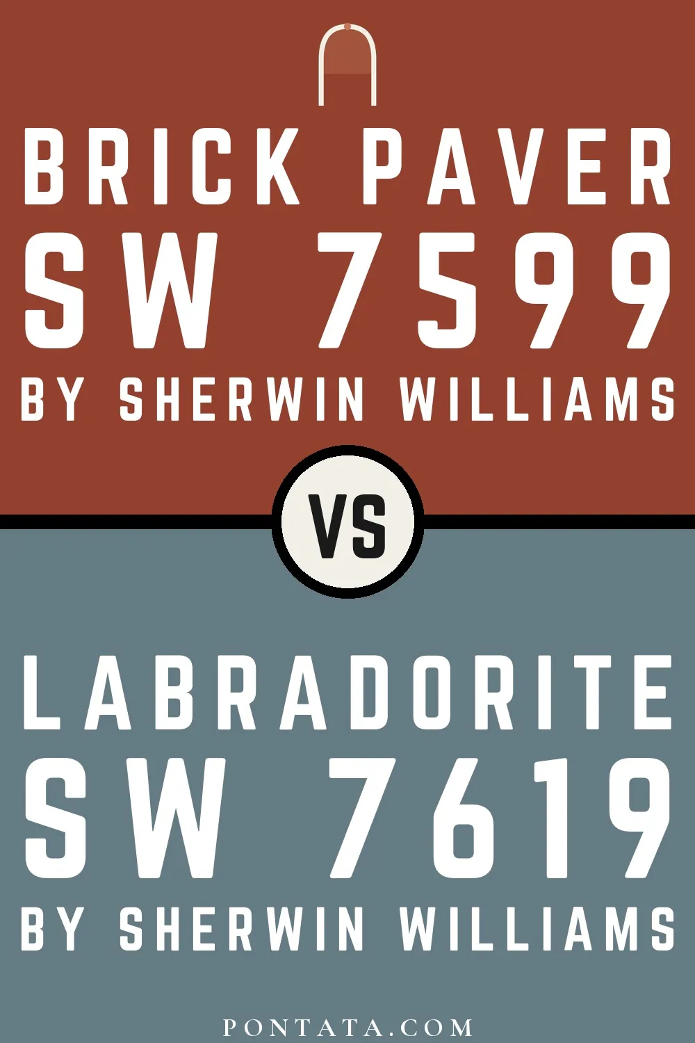
A 8-point LRV gap (19 vs 10) makes Labradorite the marginally brighter of the two.

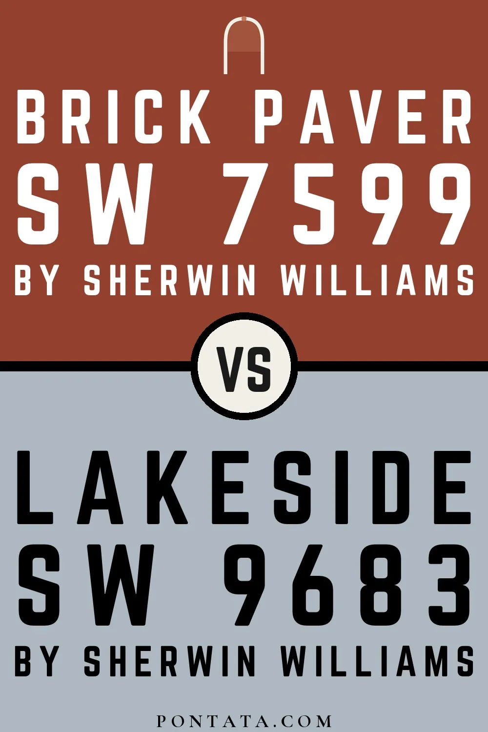
Lakeside reflects far more light (LRV 47 vs 10), opening up a space where Brick Paver encloses it.
Lighter Colors

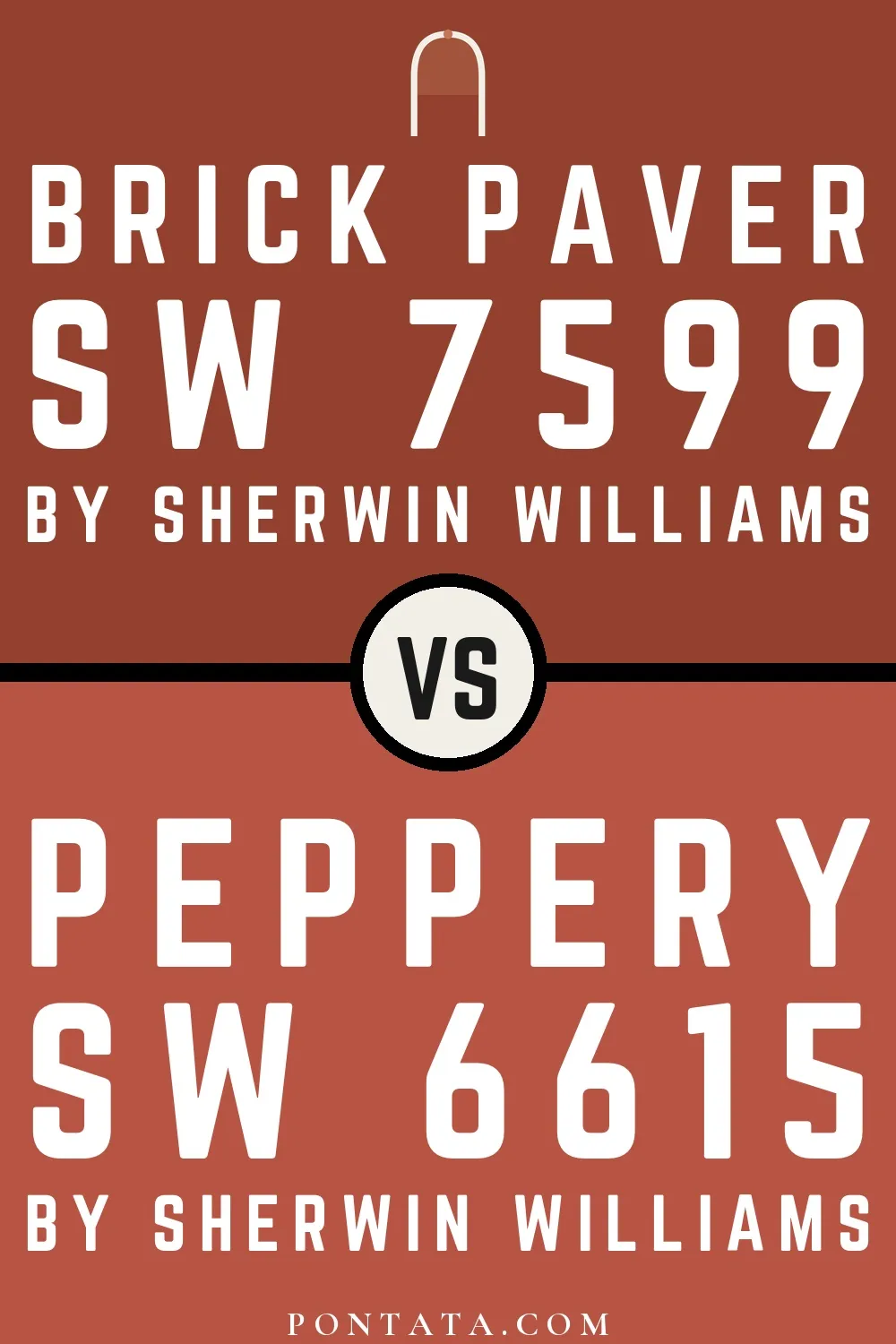
A 7-point LRV gap (17 vs 10) makes Peppery the marginally brighter of the two.
Their light reflectance is nearly identical (LRV 10 vs 9), so neither reads brighter in a room.
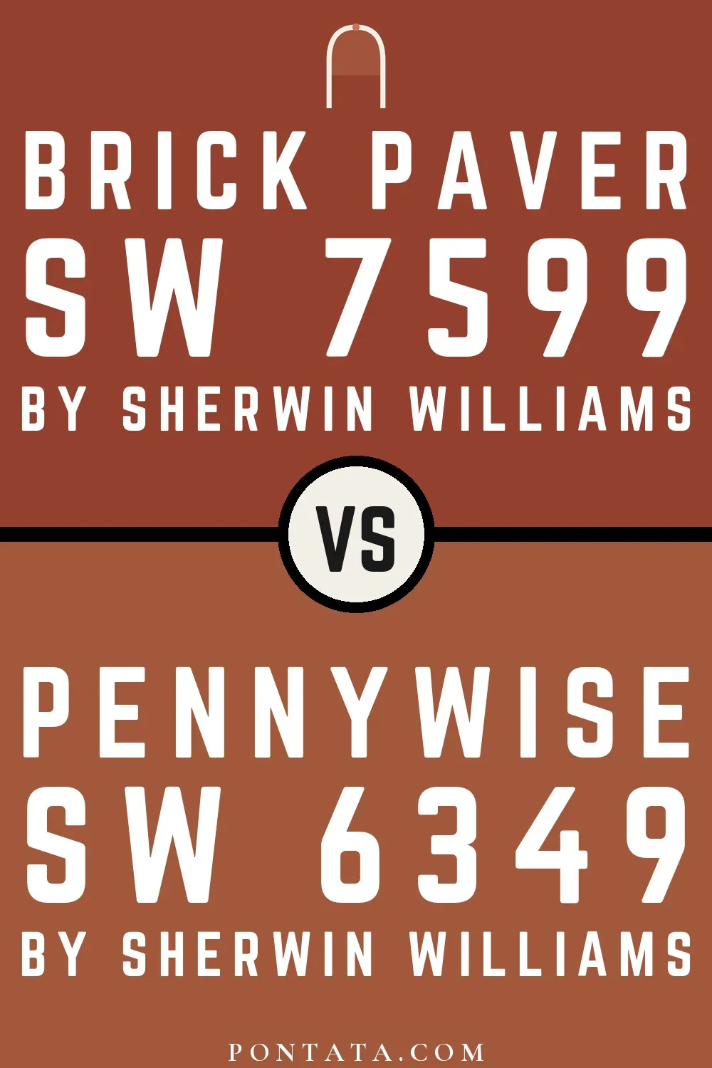
Pennywise reads slightly lighter (LRV 15 vs 10), a gap that shows most in low-lit rooms.

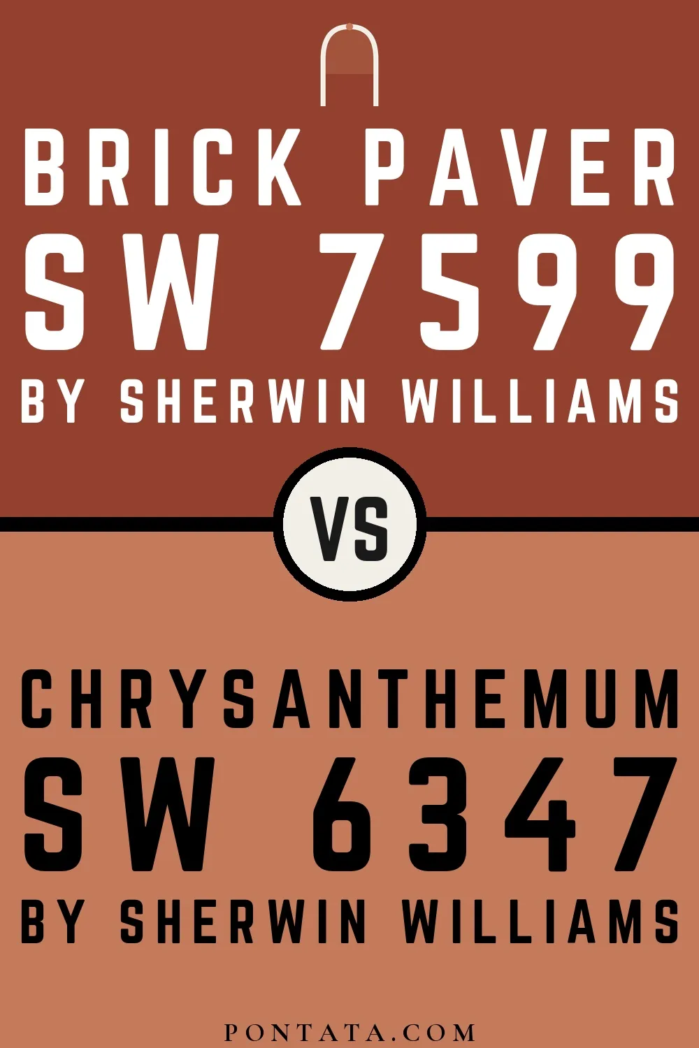
Chrysanthemum reflects far more light (LRV 27 vs 10), opening up a space where Brick Paver encloses it.

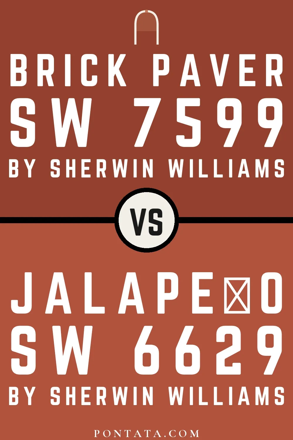
Jalapeño reads slightly lighter (LRV 16 vs 10), a gap that shows most in low-lit rooms.
Darker Colors


Brick Paver reads slightly lighter (LRV 10 vs 7), a gap that shows most in low-lit rooms.
With LRVs of 10 and 8, the two reflect almost the same amount of light.
With LRVs of 10 and 9, the two reflect almost the same amount of light.
Their light reflectance is nearly identical (LRV 10 vs 10), so neither reads brighter in a room.
Color Codes
Manufacturer description
Step onto sun-baked terra cotta with this deep, saturated orange that glows with the warmth of clay-fired earth and aged brick. Perfect for creating an intimate, grounded atmosphere in dining rooms or accent walls, it pairs beautifully with warm neutrals and cream trim.