
Broccoflower
Sherwin-Williams Broccoflower (9039) carries the measured structure of its color data and the less predictable beauty of paint in a finished space. Its midtone saturation balances color with restraint, so the hue can register without overwhelming nearby finishes. Treat the digital swatch as an opening note, then watch a physical sample from morning light through evening lamps.
Hex
#8FA277LRV
33.00
Broccoflower's Color Strip
Broccoflower is the fourth shade on this 7-color strip, sitting between Haven and Dill. The strip spans from Gratifying Green at the lightest end to Courtyard at the deepest. Strip 156 makes it easy to compare shades side by side and find the right depth for your space.


Broccoflower in Rooms
Follow Broccoflower from one space to another and watch how light, scale and surrounding materials reshape its character. 10 generated visualizations explore how the color might shape a finished room.
1 Front Door Photo
Broccoflower (9039) brings its green character into a small architectural moment with an outsized first impression. Its midtone saturation keeps the color expressive without letting it dominate every surface around it.
classy front door featuring Broccoflower by Sherwin-Williams
@mybudgetrecipes
1 Bathroom Photo
Broccoflower (9039) moves through 1 bathroom image without becoming a fixed prescription for the room. Its neutral temperature gives the surrounding palette unusual influence over the final mood.

Broccoflower — traditional bathroom
@mybudgetrecipes
1 Dining Room Photo
In a gathering space that can move from daylight to ceremony, the most interesting quality of Broccoflower (9039) may be the way it responds to timber, table linen, glass and artwork. The green, yellow hue classifications suggest the subtle directions the color may take as the room changes.

Broccoflower paint in a traditional dining room
@mybudgetrecipes
1 Bedroom Photo
1 generated visualization explores how the color might shape the finished space. Together they show Broccoflower (9039) as inspiration rather than a promise of an identical result.

A traditional bedroom painted in Broccoflower
@mybudgetrecipes
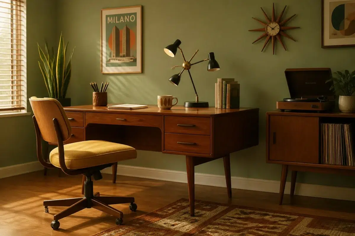
1 Home Office Photo
1 generated visualization explores how the color might shape the finished space. Together they show Broccoflower (9039) as inspiration rather than a promise of an identical result.

Sherwin-Williams Broccoflower in a mid century home office
@mybudgetrecipes
1 Mudroom Photo
Broccoflower (9039) moves through 1 mudroom image without becoming a fixed prescription for the room. Its neutral temperature gives the surrounding palette unusual influence over the final mood.

Broccoflower paint in a coastal mudroom
@mybudgetrecipes
1 Kitchen Photo
Against stone, timber, tile and metal finishes, Broccoflower (9039) may feel quieter, sharper or more atmospheric than the digital swatch alone. An LRV of 33 lets the color hold its identity across both brighter and more shaded parts of the room.

Broccoflower — vintage kitchen
@mybudgetrecipes
1 Patio Photo
Viewed across 1 patio image in an outdoor room surrounded by sky, planting and open light, Broccoflower (9039) reveals how much color depends on scale, surface and shadow. An LRV of 33 lets the color hold its identity across both brighter and more shaded parts of the room.

coastal patio featuring Broccoflower by Sherwin-Williams
@mybudgetrecipes
1 House Photo
These 1 house image show how Broccoflower (9039) can sit beside roofing, masonry, timber, planting and trim. The green, yellow hue classifications suggest the subtle directions the color may take as the room changes.

Broccoflower color — rustic modern house inspiration
@mybudgetrecipes
1 Living Room Photo
The green, yellow hue classifications suggest the subtle directions the color may take as the room changes. In this setting, let the movement from window light to lamplight and upholstery, timber, art and metal accents guide the final sample decision.

Broccoflower — hollywood regency living room
@mybudgetrecipes
Expert Perspectives
Articles and features from across our network of home and design sites.
Coordinating Colors


At LRV 79 vs 33, Spinach White is decisively the brighter choice.


At LRV 83 vs 33, Dover White is decisively the brighter choice.


Flan reflects far more light (LRV 69 vs 33), opening up a space where Broccoflower encloses it.
Trim Color
At LRV 79 vs 33, Spinach White is decisively the brighter choice.
Similar Colors


Their light reflectance is nearly identical (LRV 36 vs 33), so neither reads brighter in a room.


Their light reflectance is nearly identical (LRV 33 vs 32), so neither reads brighter in a room.


Their light reflectance is nearly identical (LRV 34 vs 33), so neither reads brighter in a room.


Their light reflectance is nearly identical (LRV 34 vs 33), so neither reads brighter in a room.


With LRVs of 33 and 33, the two reflect almost the same amount of light.

Broccoflower reads slightly lighter (LRV 33 vs 30), a gap that shows most in low-lit rooms.


A 9-point LRV gap (42 vs 33) makes Haven the marginally brighter of the two.


Mesclun Green reads slightly lighter (LRV 42 vs 33), a gap that shows most in low-lit rooms.


Nurture Green reads slightly lighter (LRV 40 vs 33), a gap that shows most in low-lit rooms.


A 7-point LRV gap (33 vs 26) makes Broccoflower the marginally brighter of the two.
Complementary Colors

Broccoflower reflects far more light (LRV 33 vs 16), opening up a space where Wood Violet encloses it.


Broccoflower reads slightly lighter (LRV 33 vs 28), a gap that shows most in low-lit rooms.

Broccoflower reflects far more light (LRV 33 vs 12), opening up a space where Purple Passage encloses it.


A 6-point LRV gap (39 vs 33) makes Obi Lilac the marginally brighter of the two.

At LRV 33 vs 11, Broccoflower is decisively the brighter choice.


At LRV 72 vs 33, Elation is decisively the brighter choice.


At LRV 71 vs 33, Inspired Lilac is decisively the brighter choice.
Lighter Colors
A 9-point LRV gap (42 vs 33) makes Haven the marginally brighter of the two.

At LRV 58 vs 33, Valleyview is decisively the brighter choice.


At LRV 60 vs 33, Bonsai Tint is decisively the brighter choice.

At LRV 48 vs 33, Seawashed Glass is decisively the brighter choice.
Darker Colors


Broccoflower reads slightly lighter (LRV 33 vs 24), a gap that shows most in low-lit rooms.


Broccoflower reflects far more light (LRV 33 vs 15), opening up a space where Greenfield encloses it.
Their light reflectance is nearly identical (LRV 33 vs 32), so neither reads brighter in a room.
Color Codes
Manufacturer description
This sophisticated muted green captures the essence of a garden at dusk, where cool gray undertones ground its natural earthiness in serene contemplation. Perfect for creating a balanced, restful atmosphere in bedrooms or studies, it pairs beautifully with warm creams and soft charcoals.