
Caraïbe
Sherwin-Williams Caraïbe (9090) carries the measured structure of its color data and the less predictable beauty of paint in a finished space. A muted saturation softens the hue, giving it a quieter quality that can sit comfortably among layered neutrals. Treat the digital swatch as an opening note, then watch a physical sample from morning light through evening lamps.
Hex
#785F4CLRV
12.79
Caraïbe's Color Strip
Caraïbe is the sixth shade on this 7-color strip, sitting between Llama Wool and Half-Caff. The strip spans from Touch of Sand at the lightest end to Half-Caff at the deepest. Strip 199 makes it easy to compare shades side by side and find the right depth for your space.


Caraïbe in Rooms
Follow Caraïbe from one space to another and watch how light, scale and surrounding materials reshape its character. 10 generated visualizations explore how the color might shape a finished room.
1 Front Door Photo
Caraïbe (9090) moves through 1 front door image without becoming a fixed prescription for the room. Its warm classification can feel inviting beside tactile, natural materials.
stylish front door featuring Caraïbe by Sherwin-Williams
@mybudgetrecipes
1 Bedroom Photo
Across 1 bedroom image, Caraïbe (9090) meets gentle morning light and low evening lamps. Its warm classification can feel inviting beside tactile, natural materials.

A modern luxury bedroom painted in Caraïbe
@mybudgetrecipes
1 Bathroom Photo
In a compact setting where tile, fixtures and color sit close together, the most interesting quality of Caraïbe (9090) may be the way it responds to tile, stone, glass, timber and metal fixtures. The beige, greige hue classifications suggest the subtle directions the color may take as the room changes.

Caraïbe — minimalist bathroom
@mybudgetrecipes
1 Home Office Photo
The 1 home office image turn a orange swatch into something more spatial and expressive. Its muted saturation softens the color’s edges, making texture and shadow part of the composition.

Sherwin-Williams Caraïbe in a minimalist home office
@mybudgetrecipes
1 Dining Room Photo
The 1 dining room image turn a orange swatch into something more spatial and expressive. Its muted saturation softens the color’s edges, making texture and shadow part of the composition.

Caraïbe paint in a moody dining room
@mybudgetrecipes
1 Mudroom Photo
The beige, greige hue classifications suggest the subtle directions the color may take as the room changes. In this setting, let doorway light and the softer illumination of an internal passage and flooring, storage, timber, baskets and hardware guide the final sample decision.

Caraïbe paint in a coastal mudroom
@mybudgetrecipes
1 House Photo
1 house image trace Caraïbe (9090) through the façade’s movement through sun, shade and season. The beige, greige hue classifications suggest the subtle directions the color may take as the room changes.

Caraïbe color — rustic modern house inspiration
@mybudgetrecipes
1 Living Room Photo
The beige, greige hue classifications suggest the subtle directions the color may take as the room changes. In this setting, let the movement from window light to lamplight and upholstery, timber, art and metal accents guide the final sample decision.

A scandinavian living room painted in Caraïbe
@mybudgetrecipes
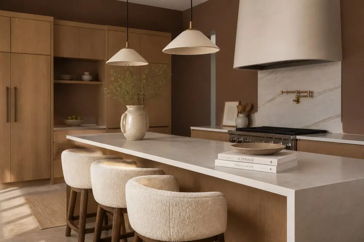
1 Kitchen Photo
Caraïbe (9090) moves through 1 kitchen image without becoming a fixed prescription for the room. Its warm classification can feel inviting beside tactile, natural materials.

Caraïbe — organic modern kitchen
@mybudgetrecipes
1 Patio Photo
Against stone, timber, metal, textiles and greenery, Caraïbe (9090) may feel quieter, sharper or more atmospheric than the digital swatch alone. With an LRV of 12.8, it carries enough visual weight to make light, trim and texture feel especially deliberate.

wabi-sabi patio featuring Caraïbe by Sherwin-Williams
@mybudgetrecipes
Expert Perspectives
Articles and features from across our network of home and design sites.
Coordinating Colors


At LRV 73 vs 13, Modest White is decisively the brighter choice.


Antique White reflects far more light (LRV 72 vs 13), opening up a space where Caraïbe encloses it.

Whole Wheat reflects far more light (LRV 48 vs 13), opening up a space where Caraïbe encloses it.
Trim Color
At LRV 73 vs 13, Modest White is decisively the brighter choice.
Similar Colors


With LRVs of 14 and 13, the two reflect almost the same amount of light.


Their light reflectance is nearly identical (LRV 14 vs 13), so neither reads brighter in a room.


With LRVs of 13 and 12, the two reflect almost the same amount of light.


With LRVs of 13 and 11, the two reflect almost the same amount of light.


With LRVs of 13 and 13, the two reflect almost the same amount of light.


With LRVs of 13 and 12, the two reflect almost the same amount of light.


Caraïbe reads slightly lighter (LRV 13 vs 10), a gap that shows most in low-lit rooms.
Color Codes
Manufacturer description
Picture warm tropical breezes and sun-baked clay in this deep, muted orange with earthy undertones that evoke the rustic charm of Caribbean architecture. Perfect for creating intimate, welcoming spaces like dining rooms or libraries, it pairs beautifully with warm creams and natural wood tones.
Attributed to Sherwin-Williams catalog data.