
Ceiling Bright White
There is more to Sherwin-Williams Ceiling Bright White (7007) than the swatch alone: its depth, undertones and setting all shape the final impression. Its green and white classifications hint at the directions it may take as daylight, lamps and neighboring colors move around it. Because screens flatten both light and texture, sample the paint beside the finishes that will ultimately surround it.
Hex
#E9EBE7LRV
82.53
Ceiling Bright White's Color Strip
Ceiling Bright White is the second shade on this 7-color strip, sitting between Extra White and Ice Cube. The strip spans from Extra White at the lightest end to Site White at the deepest. Strip 257 lines up the full value range so you can see exactly where this color lands among its closest relatives.


Ceiling Bright White in Rooms
Follow Ceiling Bright White from one space to another and watch how light, scale and surrounding materials reshape its character. 10 generated visualizations explore how the color might shape a finished room.
1 Bedroom Photo
1 bedroom image trace Ceiling Bright White (7007) through the slower pace of morning and night. Its place within Finest Whites and Living Well - Reflect hints at the range of palettes it can inhabit.
A minimalist bedroom painted in Ceiling Bright White
@mybudgetrecipes
1 Home Office Photo
1 home office image place Ceiling Bright White (7007) in a focused room balancing work, concentration and comfort. Its LRV of 82.5 gives it a light-reflective character, though shadows and neighboring finishes can still draw out surprising depth.

Sherwin-Williams Ceiling Bright White in a minimalist home office
@mybudgetrecipes
1 Dining Room Photo
1 dining room image trace Ceiling Bright White (7007) through the room’s change from everyday meals to evening occasions. Its place within Finest Whites and Living Well - Reflect hints at the range of palettes it can inhabit.

Ceiling Bright White paint in a contemporary dining room
@mybudgetrecipes
1 Front Door Photo
Ceiling Bright White (7007) can change noticeably under direct sun, porch shade and evening exterior light. Sample it beside the finishes that will remain in the room.

minimalist front door featuring Ceiling Bright White by Sherwin-Williams
@mybudgetrecipes
1 Bathroom Photo
1 bathroom image place Ceiling Bright White (7007) in a compact setting where tile, fixtures and color sit close together. Its LRV of 82.5 gives it a light-reflective character, though shadows and neighboring finishes can still draw out surprising depth.

Ceiling Bright White — modern luxury bathroom
@mybudgetrecipes
1 Mudroom Photo
In a practical threshold where the outdoors enters the home, the most interesting quality of Ceiling Bright White (7007) may be the way it responds to flooring, storage, timber, baskets and hardware. The green, white hue classifications suggest the subtle directions the color may take as the room changes.

Ceiling Bright White paint in a earthy mudroom
@mybudgetrecipes
1 Patio Photo
Its place within Finest Whites and Living Well - Reflect hints at the range of palettes it can inhabit. In this setting, let direct sun, reflected daylight and deep exterior shade and stone, timber, metal, textiles and greenery guide the final sample decision.

industrial patio featuring Ceiling Bright White by Sherwin-Williams
@mybudgetrecipes
1 Living Room Photo
1 living room image trace Ceiling Bright White (7007) through the room’s shift from daytime energy to evening calm. Its place within Finest Whites and Living Well - Reflect hints at the range of palettes it can inhabit.

Ceiling Bright White paint in a hollywood regency living room
@mybudgetrecipes
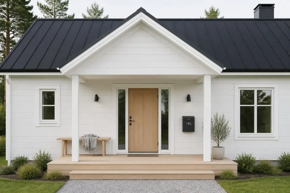
1 House Photo
These 1 house image show how Ceiling Bright White (7007) can sit beside roofing, masonry, timber, planting and trim. The green, white hue classifications suggest the subtle directions the color may take as the room changes.

Ceiling Bright White — scandinavian house
@mybudgetrecipes
1 Kitchen Photo
Ceiling Bright White (7007) offers a starting mood rather than a finished formula: Its neutral temperature gives the surrounding palette unusual influence over the final mood. Test it under daylight, task lighting and evening pendants.

A scandinavian kitchen painted in Ceiling Bright White
@mybudgetrecipes
Expert Perspectives
Articles and features from across our network of home and design sites.
Coordinating Colors


At LRV 83 vs 40, Ceiling Bright White is decisively the brighter choice.


Ceiling Bright White reflects far more light (LRV 83 vs 22), opening up a space where Blustery Sky encloses it.
Similar Colors


Their light reflectance is nearly identical (LRV 83 vs 82), so neither reads brighter in a room.


With LRVs of 83 and 83, the two reflect almost the same amount of light.

Their light reflectance is nearly identical (LRV 83 vs 83), so neither reads brighter in a room.


Extra White reads slightly lighter (LRV 86 vs 83), a gap that shows most in low-lit rooms.


With LRVs of 83 and 81, the two reflect almost the same amount of light.

Snowbelt reads slightly lighter (LRV 87 vs 83), a gap that shows most in low-lit rooms.

With LRVs of 84 and 83, the two reflect almost the same amount of light.

With LRVs of 84 and 83, the two reflect almost the same amount of light.


With LRVs of 84 and 83, the two reflect almost the same amount of light.


Their light reflectance is nearly identical (LRV 83 vs 82), so neither reads brighter in a room.
Complementary Colors

At LRV 83 vs 16, Ceiling Bright White is decisively the brighter choice.


At LRV 83 vs 28, Ceiling Bright White is decisively the brighter choice.

At LRV 83 vs 12, Ceiling Bright White is decisively the brighter choice.


Ceiling Bright White reflects far more light (LRV 83 vs 39), opening up a space where Obi Lilac encloses it.

Ceiling Bright White reflects far more light (LRV 83 vs 11), opening up a space where Plummy encloses it.


Ceiling Bright White reads slightly lighter (LRV 83 vs 72), a gap that shows most in low-lit rooms.


Ceiling Bright White reads slightly lighter (LRV 83 vs 71), a gap that shows most in low-lit rooms.
Lighter Colors
Snowbelt reads slightly lighter (LRV 87 vs 83), a gap that shows most in low-lit rooms.
Darker Colors


Ceiling Bright White reflects far more light (LRV 83 vs 51), opening up a space where Hazel Gaze encloses it.

At LRV 83 vs 65, Ceiling Bright White is decisively the brighter choice.


Ceiling Bright White reflects far more light (LRV 83 vs 46), opening up a space where Magnetic Gray encloses it.


Ceiling Bright White reflects far more light (LRV 83 vs 59), opening up a space where Silver Strand encloses it.


Ceiling Bright White reflects far more light (LRV 83 vs 63), opening up a space where Sea Salt encloses it.
Color Codes
Manufacturer description
Forecast is bright, clear skies and a calm mood with this radiant white and its clean, blue undertone. Pairs well with cool gray blues like Blustery Sky.
Attributed to Sherwin-Williams catalog data.