
Sea Salt
At first glance, Sea Salt belongs to the green family; in a room, light and context can make it far more elusive. An LRV of 63.3 places it through the middle of the scale, where color and depth can remain visible as the light changes. Its related shades below reveal where the color harmonizes—and where contrast brings it fully to life.
Hex
#CDD2CALRV
63.34
Sea Salt's Color Strip
Sea Salt is the first shade on this 7-color strip, the lightest in this coordinated family. Strip 217 lines up the full value range so you can see exactly where this color lands among its closest relatives.


Sea Salt in Rooms
Follow Sea Salt from one space to another and watch how light, scale and surrounding materials reshape its character. 84 sourced room photos sit alongside 7 generated visualizations.
11 Living Room Photos
Viewed across 11 living room images in a space shaped by conversation, quiet evenings and changing daylight, Sea Salt (6204) reveals how much color depends on scale, surface and shadow. An LRV of 63.3 lets the color hold its identity across both brighter and more shaded parts of the room.
Living room walls in Sea Salt create a fresh, airy atmosphere.
@mybudgetrecipes
14 Bedroom Photos
These 14 bedroom images show how Sea Salt (6204) can sit beside bed linen, timber, wool and upholstered textures. The green, grey hue classifications suggest the subtle directions the color may take as the room changes.

Bedroom painted Sea Salt offers a serene, naturally calming retreat.
@mybudgetrecipes
9 Kitchen Photos
Sea Salt (6204) brings its green character into a hardworking room where color meets movement and strong surfaces. Its muted saturation softens the color’s edges, making texture and shadow part of the composition.

Kitchen cabinets in Sea Salt blend soft color with modern style.
@mybudgetrecipes
15 Bathroom Photos
Against tile, stone, glass, timber and metal fixtures, Sea Salt (6204) may feel quieter, sharper or more atmospheric than the digital swatch alone. An LRV of 63.3 lets the color hold its identity across both brighter and more shaded parts of the room.

Bathroom walls in Sea Salt provide a restful, refreshing backdrop.
@mybudgetrecipes
6 Home Office Photos
6 home office images place Sea Salt (6204) in a focused room balancing work, concentration and comfort. An LRV of 63.3 lets the color hold its identity across both brighter and more shaded parts of the room.

Home office painted Sea Salt enhances focus with cool-toned serenity.
@mybudgetrecipes
10 House Photos
These 10 house images show how Sea Salt (6204) can sit beside roofing, masonry, timber, planting and trim. The green, grey hue classifications suggest the subtle directions the color may take as the room changes.

Exterior painted Sea Salt presents a timeless, elegant appearance.
@mybudgetrecipes
9 Front Door Photos
The 9 front door images turn a green swatch into something more spatial and expressive. Its muted saturation softens the color’s edges, making texture and shadow part of the composition.

Front door in Sea Salt coordinates beautifully with traditional details.
@mybudgetrecipes
10 Misc Photos
10 sourced room photos give the gallery a lived-in point of reference. Together they show Sea Salt (6204) as inspiration rather than a promise of an identical result.

Neutral Sea Salt paint transforms any wall with subtle depth.
@leslie_quilts
1 Dining Room Photo
1 dining room image place Sea Salt (6204) in a gathering space that can move from daylight to ceremony. An LRV of 63.3 lets the color hold its identity across both brighter and more shaded parts of the room.

Dining room walls in Sea Salt create an inviting gathering space.
@theroadbacktonew
5 Kitchen Cabinets Photos
Its place within Living Well - Recharge and Top 50 Colors hints at the range of palettes it can inhabit. In this setting, let light moving across doors, rails and recessed panels and countertops, hardware, splashbacks and flooring guide the final sample decision.

Kitchen cabinetry painted in Sea Salt brightens the entire cooking space.
@chandlerfarmstead

Cabinet doors in Sea Salt provide a timeless, versatile kitchen look.
@chandlerfarmstead

Upper cabinets in Sea Salt create an airy, open kitchen feel.
@denisecuddesigns

Kitchen island painted in Sea Salt anchors the room perfectly.
@mansiondemullen

Cabinet hardware gleams against Sea Salt painted kitchen cabinetry.
@across_the_creek_farmhouse
1 Mudroom Photo
1 sourced room photo gives the gallery a lived-in point of reference. Together they show Sea Salt (6204) as inspiration rather than a promise of an identical result.

Mudroom shelving painted in Sea Salt keeps the space organized.
@waddellbuild
Expert Perspectives
Articles and features from across our network of home and design sites.
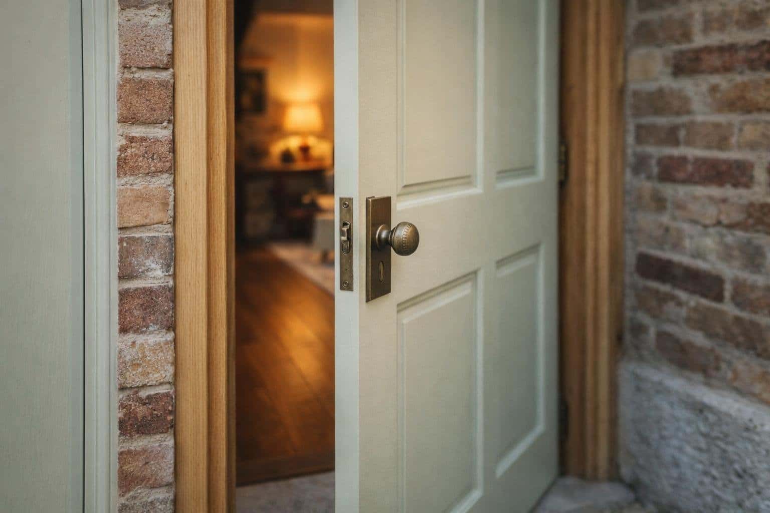
5 Front Door Styles That Prove Sea Salt by Sherwin‑Williams Stands Out
Your front door sets expectations before anyone steps inside. Color does more work than most details. Sea Salt by Sherwin‑Williams blends soft green, blue, and gray tones that shift with light. This makes it a strong choice when you want personality without visual noise. Sea Salt makes a clear statement across classic, modern, vintage, minimalist,
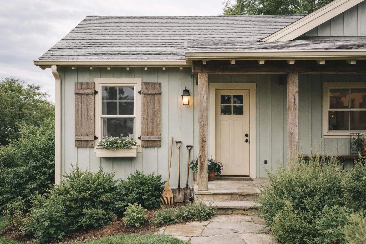
5 House Exterior Styles That Shine in Sea Salt by Sherwin‑Williams
You want an exterior color that feels calm, current, and flexible across design styles. Sherwin‑Williams Sea Salt delivers a soft blue‑green with gray undertones that adapts well to light, materials, and architectural detail. IIt creates a balanced look that feels fresh without looking trendy. Sea Salt looks its best on modern luxury homes, cozy cottage‑style
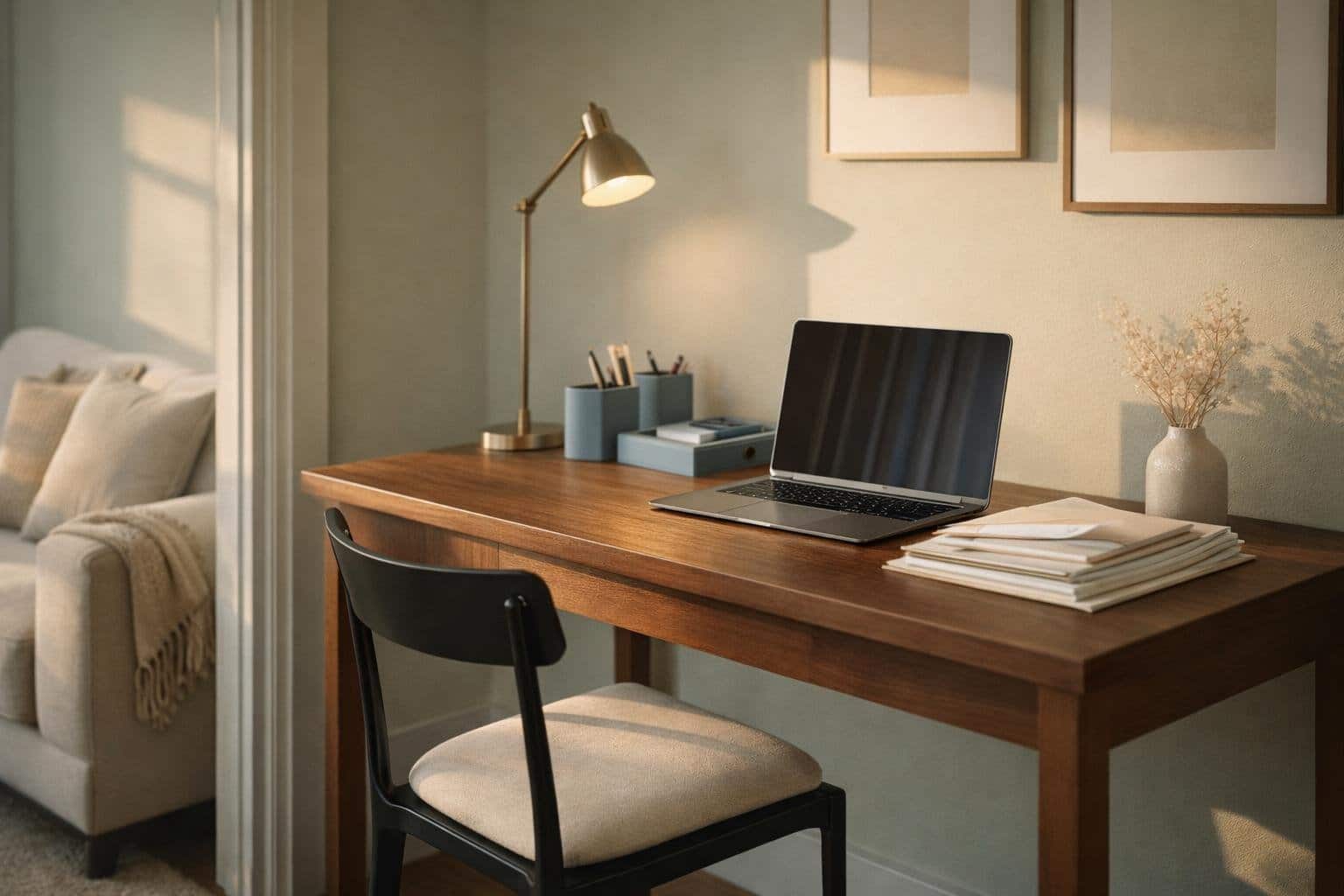
5 Home Office Styles That Work Beautifully with Sea Salt – Top Looks
Choosing the right home office color shapes how you focus, think, and feel throughout the day. Sea Salt by Sherwin‑Williams offers a soft green‑blue tone with subtle gray that adapts to light and surroundings, making it especially effective in workspaces where balance matters. Sea Salt works beautifully with polished, cozy, minimalist, eclectic, and serene home
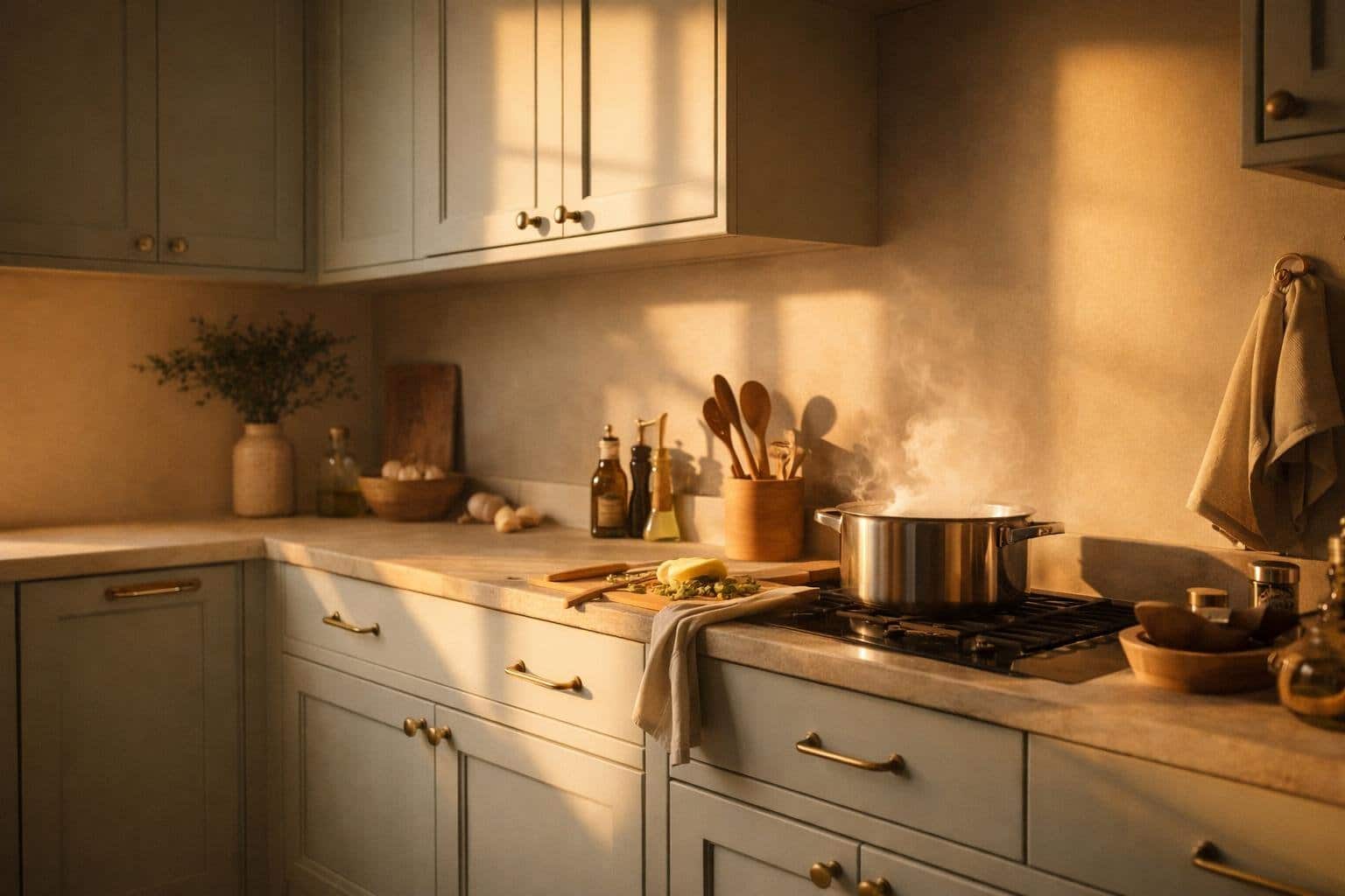
5 Kitchen Cabinet Styles That Elevate Sea Salt by Sherwin‑Williams
Sea Salt by Sherwin‑Williams brings a soft green‑blue tone with subtle gray undertones that shifts with light and surroundings. In a kitchen, that flexibility means your cabinet style matters as much as the color itself. The right pairing can sharpen the look, warm it up, or give it a more refined presence. You elevate Sea
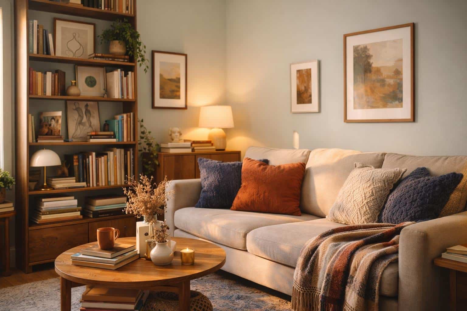
5 Living Room Styles That Come Alive in Sea Salt by Sherwin‑Williams
Sea Salt by Sherwin‑Williams shifts with light, furniture, and mood. This makes it a strong choice for living rooms that need flexibility. You can use it to create warmth, depth, or calm without locking the space into a single style. Sea Salt brings five living room styles to life by adapting to lighting, textures, and
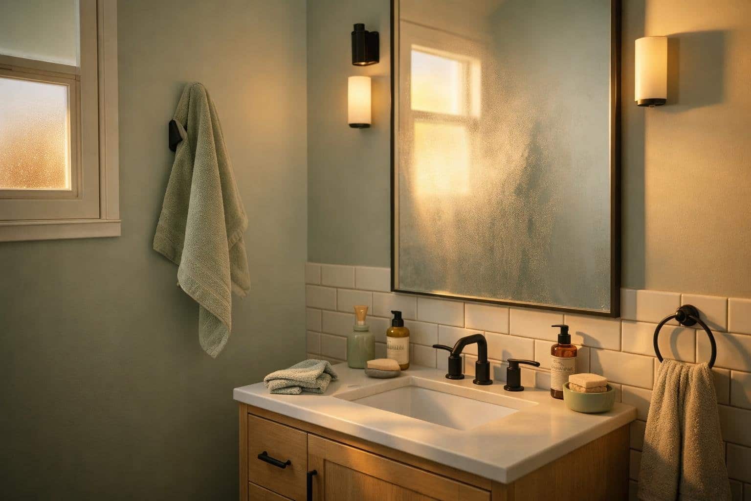
5 Ways Sea Salt by Sherwin-Williams Transforms the Bathroom
A bathroom sets the tone for how you start and end each day, and color plays a central role in that experience. Sea Salt by Sherwin-Williams shifts between soft blue, green, and gray, adapting to light and time of day. You get a space that feels calm without looking flat or cold. Sea Salt transforms
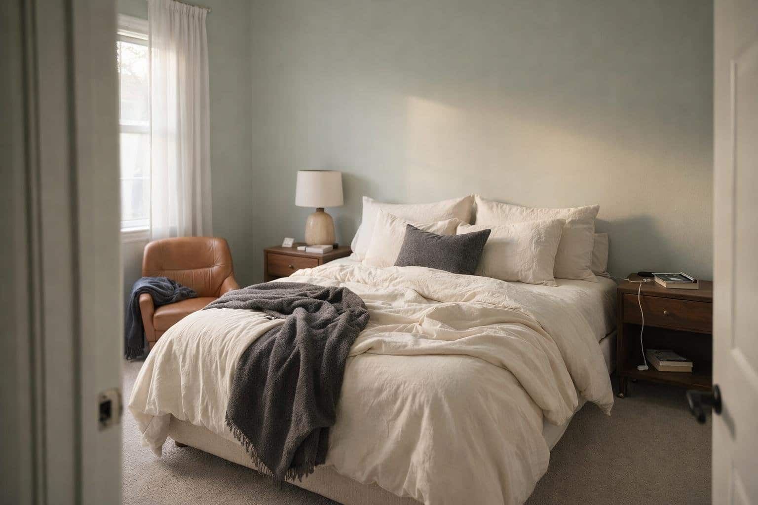
5 Bedroom Moods That Shine in Sea Salt by Sherwin‑Williams: Design Inspiration
Sea Salt by Sherwin‑Williams shifts between soft green, muted blue, and gentle gray. This gives you flexibility to shape the mood of your bedroom without changing the paint. Light, textiles, and furnishings guide how the color reads, from warm and welcoming to calm and minimal. That range makes it a strong foundation for bedrooms that
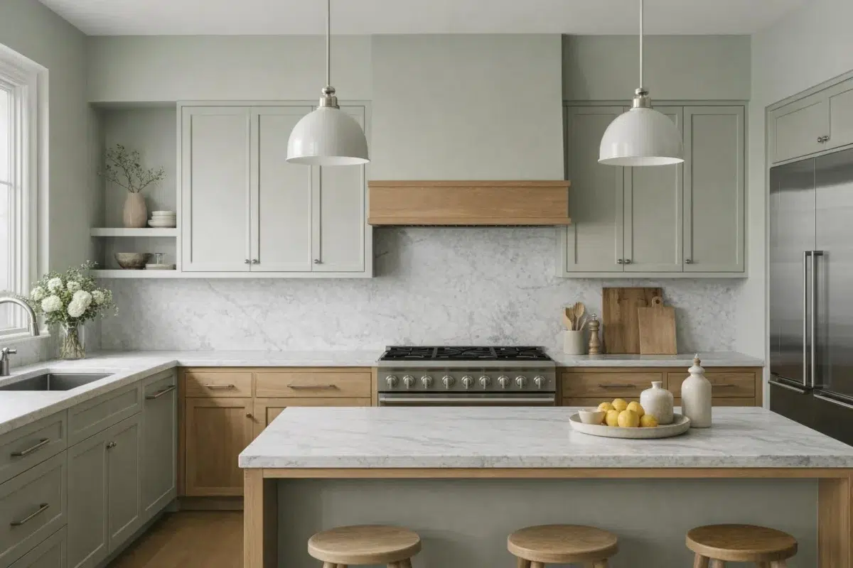
Sea Salt by Sherwin Williams SW 6204: A Refreshing Coastal Hue for Your Home
Looking for a paint color that brings the beach into your home? Sea Salt SW 6204 by Sherwin-Williams might be exactly what you need. This cool, muted green with blue undertones creates a tranquil atmosphere that makes every space feel like a relaxing beach day. It's a versatile shade that sits at the crossroads of
Coordinating Colors


At LRV 77 vs 63, Spare White is decisively the brighter choice.


A 9-point LRV gap (72 vs 63) makes Fleur De Sel the marginally brighter of the two.


At LRV 63 vs 30, Sea Salt is decisively the brighter choice.
Trim Color
At LRV 77 vs 63, Spare White is decisively the brighter choice.
Similar Colors


Their light reflectance is nearly identical (LRV 65 vs 63), so neither reads brighter in a room.


With LRVs of 63 and 61, the two reflect almost the same amount of light.


Sea Salt reads slightly lighter (LRV 63 vs 59), a gap that shows most in low-lit rooms.


With LRVs of 64 and 63, the two reflect almost the same amount of light.


Their light reflectance is nearly identical (LRV 64 vs 63), so neither reads brighter in a room.


Complementary Colors

At LRV 63 vs 16, Sea Salt is decisively the brighter choice.


At LRV 63 vs 28, Sea Salt is decisively the brighter choice.


Feathery Lilac reflects far more light (LRV 81 vs 63), opening up a space where Sea Salt encloses it.

At LRV 63 vs 21, Sea Salt is decisively the brighter choice.
Lighter Colors


Ceiling Bright White reflects far more light (LRV 83 vs 63), opening up a space where Sea Salt encloses it.
Their light reflectance is nearly identical (LRV 65 vs 63), so neither reads brighter in a room.

Serendipity reflects far more light (LRV 84 vs 63), opening up a space where Sea Salt encloses it.
Darker Colors


At LRV 63 vs 32, Sea Salt is decisively the brighter choice.


At LRV 63 vs 38, Sea Salt is decisively the brighter choice.


At LRV 63 vs 44, Sea Salt is decisively the brighter choice.


Sea Salt reflects far more light (LRV 63 vs 51), opening up a space where Hazel Gaze encloses it.
Color Codes
Manufacturer description
This cool, muted green with blue undertones makes every day feel like a relaxing beach day. Set it off nicely with white trim.