
Charcoal Blue
There is more to Sherwin-Williams Charcoal Blue (2739) than the swatch alone: its depth, undertones and setting all shape the final impression. Its blue and grey classifications hint at the directions it may take as daylight, lamps and neighboring colors move around it. Its related shades below reveal where the color harmonizes—and where contrast brings it fully to life.
Hex
#3D4450LRV
5.71
Charcoal Blue's Color Strip
Charcoal Blue is the fourth shade on this 7-color strip, sitting between In the Navy and Mineral Gray. The strip spans from Dress Blues at the lightest end to Anchors Aweigh at the deepest. Strip 253 lines up the full value range so you can see exactly where this color lands among its closest relatives.


Charcoal Blue in Rooms
Follow Charcoal Blue from one space to another and watch how light, scale and surrounding materials reshape its character. 30 sourced room photos sit alongside 7 generated visualizations.
1 Bathroom Photo
Viewed across 1 bathroom image in a compact setting where tile, fixtures and color sit close together, Charcoal Blue (2739) reveals how much color depends on scale, surface and shadow. With an LRV of 5.7, it carries enough visual weight to make light, trim and texture feel especially deliberate.
Bathroom walls in Charcoal Blue provide sophisticated contrast and visual depth.
@mybudgetrecipes
4 Bedroom Photos
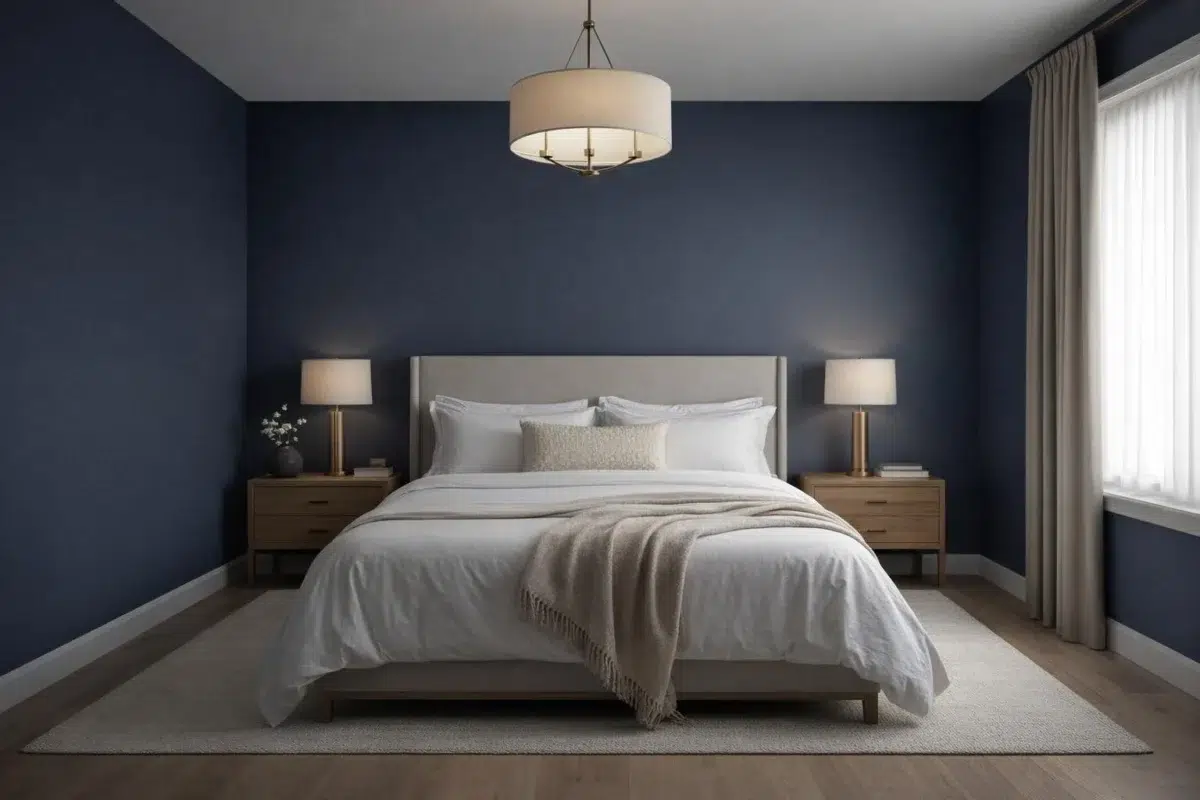
Against bed linen, timber, wool and upholstered textures, Charcoal Blue (2739) may feel quieter, sharper or more atmospheric than the digital swatch alone. With an LRV of 5.7, it carries enough visual weight to make light, trim and texture feel especially deliberate.

Bedroom walls painted Charcoal Blue establish a moody, restful sleeping environment.
@mybudgetrecipes

Charcoal Blue walls in the bedroom establish a serene yet sophisticated sleeping retreat.
@homeimprovewhit

An accent wall in Charcoal Blue anchors this serene bedroom with sophisticated depth.
@elysian_design_staging

Soft bedding complements the moody Charcoal Blue wall behind the headboard.
@elysian_design_staging
3 Front Door Photos
3 front door images place Charcoal Blue (2739) in a small architectural moment with an outsized first impression. With an LRV of 5.7, it carries enough visual weight to make light, trim and texture feel especially deliberate.

A front door in Charcoal Blue makes a bold architectural statement.
@mybudgetrecipes

A bold Charcoal Blue front door commands attention on this white cottage.
@houseofbluehues

Charcoal Blue paint on the entry door provides striking curb appeal.
@uglyducklinghomes
2 Home Office Photos
The 2 home office images turn a blue swatch into something more spatial and expressive. Its muted saturation softens the color’s edges, making texture and shadow part of the composition.

Home office walls in Charcoal Blue foster focus and professional calm.
@mybudgetrecipes

Desk wall in this home office glows with deep Charcoal Blue tones.
@rachaelroyaldesign
6 House Photos
6 house images place Charcoal Blue (2739) in an exterior viewed across distance, weather and the changing sky. With an LRV of 5.7, it carries enough visual weight to make light, trim and texture feel especially deliberate.

Exterior painted in Charcoal Blue presents striking curb appeal and visual distinction.
@mybudgetrecipes
3 Kitchen Photos
Across 3 kitchen images, Charcoal Blue (2739) meets daylight, task lighting and evening pendants. Its cool classification can bring a composed, clean tension to warmer finishes.

Kitchen cabinetry in Charcoal Blue grounds the space with dramatic sophistication.
@mybudgetrecipes

Charcoal Blue cabinetry frames white countertops in this modern kitchen layout.
@villagehomestores

Charcoal Blue walls complement warm wood tones in this inviting kitchen.
@boyerbrotherspaintingllc
9 Living Room Photos
9 living room images trace Charcoal Blue (2739) through the room’s shift from daytime energy to evening calm. Its place within 2019 Aficionado hints at the range of palettes it can inhabit.

Living room walls in Charcoal Blue create an intimate, inviting gathering space.
@mybudgetrecipes
3 Kitchen Cabinets Photos
The 3 kitchen cabinets images turn a blue swatch into something more spatial and expressive. Its muted saturation softens the color’s edges, making texture and shadow part of the composition.

Lower kitchen cabinets painted in Charcoal Blue create striking contrast with white uppers.
@arrowpointdesign

Shaker-style kitchen cabinets in Charcoal Blue provide timeless elegance and storage.
@villagehomestores

Deep Charcoal Blue cabinet doors ground this kitchen with dramatic visual weight.
@villagehomestores
6 Misc Photos
In an assortment of spaces that reveals the color outside a single design formula, the most interesting quality of Charcoal Blue (2739) may be the way it responds to a changing mix of architectural details and personal finishes. The blue, grey hue classifications suggest the subtle directions the color may take as the room changes.

A dresser refinished in Charcoal Blue becomes a striking focal point piece.
@cubedhomes
Expert Perspectives
Articles and features from across our network of home and design sites.
Coordinating Colors


At LRV 81 vs 6, Creamy is decisively the brighter choice.


Gossamer Veil reflects far more light (LRV 62 vs 6), opening up a space where Charcoal Blue encloses it.


Moonlit Orchid reflects far more light (LRV 29 vs 6), opening up a space where Charcoal Blue encloses it.
Trim Color
At LRV 81 vs 6, Creamy is decisively the brighter choice.
Similar Colors


With LRVs of 7 and 6, the two reflect almost the same amount of light.

With LRVs of 6 and 4, the two reflect almost the same amount of light.


With LRVs of 6 and 4, the two reflect almost the same amount of light.


Their light reflectance is nearly identical (LRV 6 vs 6), so neither reads brighter in a room.


Their light reflectance is nearly identical (LRV 7 vs 6), so neither reads brighter in a room.


Their light reflectance is nearly identical (LRV 6 vs 6), so neither reads brighter in a room.


With LRVs of 6 and 3, the two reflect almost the same amount of light.


With LRVs of 6 and 4, the two reflect almost the same amount of light.


With LRVs of 8 and 6, the two reflect almost the same amount of light.


With LRVs of 6 and 6, the two reflect almost the same amount of light.
Complementary Colors


Truly Taupe reflects far more light (LRV 35 vs 6), opening up a space where Charcoal Blue encloses it.


Heavenly White reflects far more light (LRV 81 vs 6), opening up a space where Charcoal Blue encloses it.

At LRV 74 vs 6, Original White is decisively the brighter choice.

At LRV 35 vs 6, Palisade is decisively the brighter choice.


A 7-point LRV gap (13 vs 6) makes Griffin the marginally brighter of the two.


At LRV 20 vs 6, Warm Stone is decisively the brighter choice.


Mercurial reflects far more light (LRV 61 vs 6), opening up a space where Charcoal Blue encloses it.
Lighter Colors


Gibraltar reads slightly lighter (LRV 14 vs 6), a gap that shows most in low-lit rooms.


Mineral Gray reads slightly lighter (LRV 9 vs 6), a gap that shows most in low-lit rooms.
With LRVs of 7 and 6, the two reflect almost the same amount of light.

A 7-point LRV gap (13 vs 6) makes Mesmerize the marginally brighter of the two.
Darker Colors


With LRVs of 6 and 3, the two reflect almost the same amount of light.
Color Codes
Manufacturer description
Indulge your dramatic side with this dark, almost black shade of navy. Makes an elegant backdrop for wood, leather and metallic furnishings.