
Chartreuse
At first glance, Chartreuse belongs to the green family; in a room, light and context can make it far more elusive. Its beige and yellow classifications hint at the directions it may take as daylight, lamps and neighboring colors move around it. Its related shades below reveal where the color harmonizes—and where contrast brings it fully to life.
Hex
#E1D286LRV
63.82
Chartreuse in Rooms
Follow Chartreuse from one space to another and watch how light, scale and surrounding materials reshape its character. 10 generated visualizations explore how the color might shape a finished room.
1 Home Office Photo
The transition between focused work and the rest of the home can draw different notes from Chartreuse (0073). The beige, yellow hue classifications suggest the subtle directions the color may take as the room changes.
Sherwin-Williams Chartreuse in a mid century home office
@mybudgetrecipes
1 Front Door Photo
Across 1 front door image, Chartreuse (0073) meets direct sun, porch shade and evening exterior light. Its warm classification can feel inviting beside tactile, natural materials.

classy front door featuring Chartreuse by Sherwin-Williams
@mybudgetrecipes
1 Dining Room Photo
Chartreuse (0073) offers a starting mood rather than a finished formula: Its warm classification can feel inviting beside tactile, natural materials. Test it under natural light, candles and pendant lighting.

Chartreuse paint in a traditional dining room
@mybudgetrecipes
1 Bathroom Photo
These 1 bathroom image show how Chartreuse (0073) can sit beside tile, stone, glass, timber and metal fixtures. The beige, yellow hue classifications suggest the subtle directions the color may take as the room changes.

Chartreuse — vintage bathroom
@mybudgetrecipes
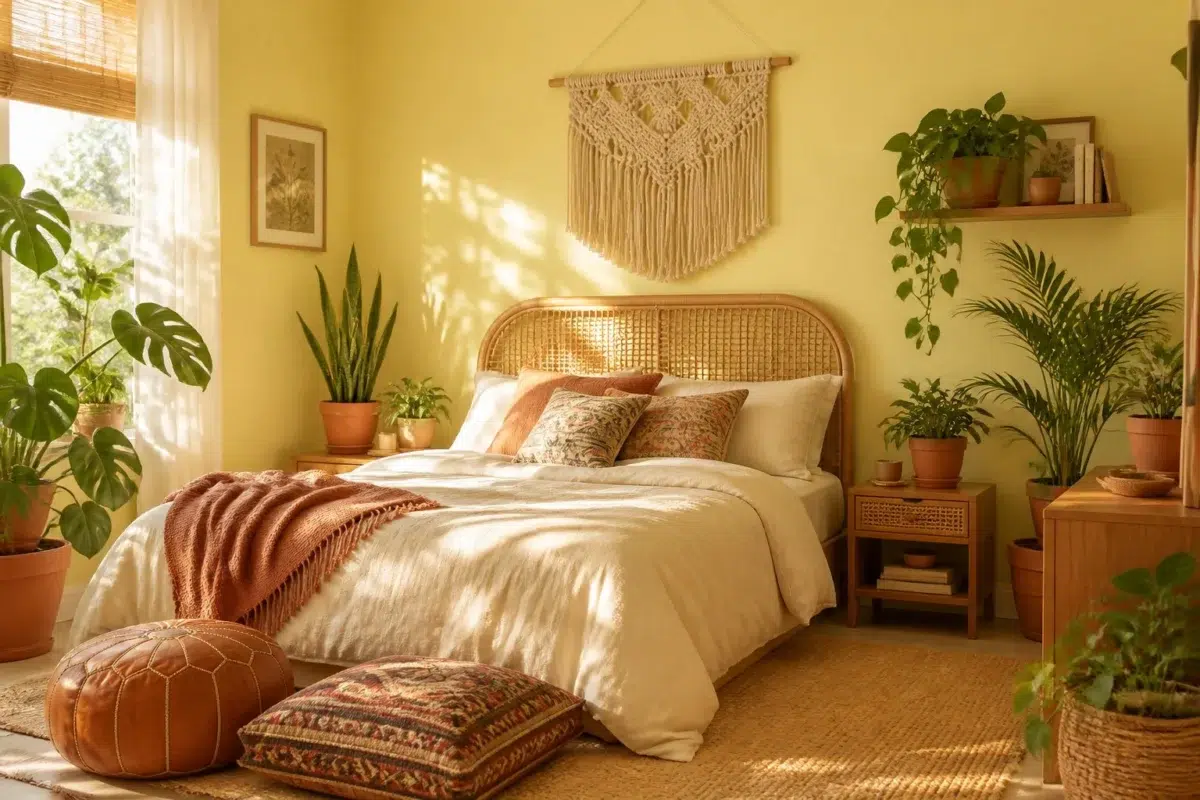
1 Bedroom Photo
Chartreuse (0073) brings its green character into a room designed around rest, softness and retreat. Its midtone saturation keeps the color expressive without letting it dominate every surface around it.

A boho bedroom painted in Chartreuse
@mybudgetrecipes
1 Patio Photo
Chartreuse (0073) can change noticeably under direct sun, reflected daylight and deep exterior shade. Sample it beside the finishes that will remain in the room.

mediterranean patio featuring Chartreuse by Sherwin-Williams
@mybudgetrecipes
1 Kitchen Photo
1 generated visualization explores how the color might shape the finished space. Together they show Chartreuse (0073) as inspiration rather than a promise of an identical result.

Chartreuse — industrial kitchen
@mybudgetrecipes
1 House Photo
Against roofing, masonry, timber, planting and trim, Chartreuse (0073) may feel quieter, sharper or more atmospheric than the digital swatch alone. An LRV of 63.8 lets the color hold its identity across both brighter and more shaded parts of the room.

Chartreuse color — mediterranean house inspiration
@mybudgetrecipes
1 Mudroom Photo
Chartreuse (0073) offers a starting mood rather than a finished formula: Its warm classification can feel inviting beside tactile, natural materials. Test it under doorway light and the softer illumination of an internal passage.

Chartreuse paint in a earthy mudroom
@mybudgetrecipes
1 Living Room Photo
The beige, yellow hue classifications suggest the subtle directions the color may take as the room changes. In this setting, let the movement from window light to lamplight and upholstery, timber, art and metal accents guide the final sample decision.

A mid century living room painted in Chartreuse
@mybudgetrecipes
Expert Perspectives
Articles and features from across our network of home and design sites.
Coordinating Colors


At LRV 64 vs 47, Chartreuse is decisively the brighter choice.


At LRV 64 vs 32, Chartreuse is decisively the brighter choice.
Similar Colors


Their light reflectance is nearly identical (LRV 67 vs 64), so neither reads brighter in a room.

Lively Yellow reads slightly lighter (LRV 68 vs 64), a gap that shows most in low-lit rooms.


With LRVs of 66 and 64, the two reflect almost the same amount of light.

A 4-point LRV gap (64 vs 60) makes Chartreuse the marginally brighter of the two.


Fun Yellow reflects far more light (LRV 78 vs 64), opening up a space where Chartreuse encloses it.


With LRVs of 65 and 64, the two reflect almost the same amount of light.


A 8-point LRV gap (64 vs 56) makes Chartreuse the marginally brighter of the two.

A 6-point LRV gap (70 vs 64) makes Solaria the marginally brighter of the two.

Midday reads slightly lighter (LRV 70 vs 64), a gap that shows most in low-lit rooms.
Complementary Colors

At LRV 64 vs 5, Chartreuse is decisively the brighter choice.

A 8-point LRV gap (72 vs 64) makes Wishful Blue the marginally brighter of the two.


At LRV 64 vs 13, Chartreuse is decisively the brighter choice.


At LRV 64 vs 8, Chartreuse is decisively the brighter choice.


Chartreuse reflects far more light (LRV 64 vs 18), opening up a space where Gentian encloses it.

At LRV 64 vs 6, Chartreuse is decisively the brighter choice.

Violet Vignette reads slightly lighter (LRV 74 vs 64), a gap that shows most in low-lit rooms.
Lighter Colors


Springtime reflects far more light (LRV 77 vs 64), opening up a space where Chartreuse encloses it.

At LRV 83 vs 64, Narcissus is decisively the brighter choice.
Their light reflectance is nearly identical (LRV 67 vs 64), so neither reads brighter in a room.

Moonraker reflects far more light (LRV 76 vs 64), opening up a space where Chartreuse encloses it.
Lively Yellow reads slightly lighter (LRV 68 vs 64), a gap that shows most in low-lit rooms.
Darker Colors
A 8-point LRV gap (64 vs 56) makes Chartreuse the marginally brighter of the two.


A 8-point LRV gap (64 vs 56) makes Chartreuse the marginally brighter of the two.


Chartreuse reflects far more light (LRV 64 vs 50), opening up a space where Limón Fresco encloses it.


Chartreuse reflects far more light (LRV 64 vs 47), opening up a space where Humorous Green encloses it.


Chartreuse reflects far more light (LRV 64 vs 41), opening up a space where Kingdom Gold encloses it.
Color Codes
Manufacturer description
This luminous yellow-green glows with the vibrant energy of new spring growth and captures the essence of light filtering through fresh foliage. Perfect for creative spaces, kitchens, or accent walls, its warm undertones bring an invigorating yet balanced cheerfulness that never feels jarring.
Attributed to Sherwin-Williams catalog data.