
Chateau Brown
At first glance, Chateau Brown belongs to the neutral family; in a room, light and context can make it far more elusive. Its grey classifications hint at the directions it may take as daylight, lamps and neighboring colors move around it. Because screens flatten both light and texture, sample the paint beside the finishes that will ultimately surround it.
Hex
#5B4B44LRV
7.61
Chateau Brown's Color Strip
Chateau Brown is the seventh shade on this 7-color strip, the deepest shade in this coordinated family. Strip 242 lines up the full value range so you can see exactly where this color lands among its closest relatives.


Chateau Brown in Rooms
Follow Chateau Brown from one space to another and watch how light, scale and surrounding materials reshape its character. 10 generated visualizations explore how the color might shape a finished room.
1 Home Office Photo
Against wood, paper, shelving and upholstered seating, Chateau Brown (7510) may feel quieter, sharper or more atmospheric than the digital swatch alone. With an LRV of 7.6, it carries enough visual weight to make light, trim and texture feel especially deliberate.
Sherwin-Williams Chateau Brown in a mid century home office
@mybudgetrecipes
1 Front Door Photo
The threshold between the street and the interior can draw different notes from Chateau Brown (7510). The grey hue classifications suggest the subtle directions the color may take as the room changes.

modern luxury front door featuring Chateau Brown by Sherwin-Williams
@mybudgetrecipes
1 Bathroom Photo
Chateau Brown (7510) offers a starting mood rather than a finished formula: Its warm classification can feel inviting beside tactile, natural materials. Test it under window light, mirrors and focused task lighting.

Chateau Brown — coastal bathroom
@mybudgetrecipes
1 Dining Room Photo
These 1 dining room image show how Chateau Brown (7510) can sit beside timber, table linen, glass and artwork. The grey hue classifications suggest the subtle directions the color may take as the room changes.

Chateau Brown paint in a traditional dining room
@mybudgetrecipes
1 Bedroom Photo
Chateau Brown (7510) moves through 1 bedroom image without becoming a fixed prescription for the room. Its warm classification can feel inviting beside tactile, natural materials.

A cozy bedroom painted in Chateau Brown
@mybudgetrecipes
1 Living Room Photo
Its place within Precious Baby and Warm Neutrals hints at the range of palettes it can inhabit. In this setting, let the movement from window light to lamplight and upholstery, timber, art and metal accents guide the final sample decision.

A mid century living room painted in Chateau Brown
@mybudgetrecipes
1 Kitchen Photo
Chateau Brown (7510) can change noticeably under daylight, task lighting and evening pendants. Sample it beside the finishes that will remain in the room.

Chateau Brown — scandinavian kitchen
@mybudgetrecipes
1 Patio Photo
In an outdoor room surrounded by sky, planting and open light, the most interesting quality of Chateau Brown (7510) may be the way it responds to stone, timber, metal, textiles and greenery. The grey hue classifications suggest the subtle directions the color may take as the room changes.

rustic modern patio featuring Chateau Brown by Sherwin-Williams
@mybudgetrecipes
1 Mudroom Photo
Viewed across 1 mudroom image in a practical threshold where the outdoors enters the home, Chateau Brown (7510) reveals how much color depends on scale, surface and shadow. With an LRV of 7.6, it carries enough visual weight to make light, trim and texture feel especially deliberate.

Chateau Brown paint in a tiny mudroom
@mybudgetrecipes
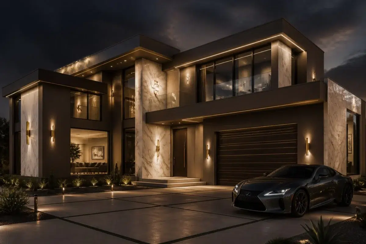
1 House Photo
Chateau Brown (7510) can change noticeably under full daylight, cloud cover and long evening shadows. Sample it beside the finishes that will remain in the room.

Chateau Brown — modern luxury house
@mybudgetrecipes
Expert Perspectives
Articles and features from across our network of home and design sites.
Coordinating Colors


Heron Plume reflects far more light (LRV 75 vs 8), opening up a space where Chateau Brown encloses it.


At LRV 67 vs 8, Patience is decisively the brighter choice.


At LRV 23 vs 8, Privilege Green is decisively the brighter choice.
Trim Color
Heron Plume reflects far more light (LRV 75 vs 8), opening up a space where Chateau Brown encloses it.
Similar Colors


With LRVs of 8 and 8, the two reflect almost the same amount of light.

Their light reflectance is nearly identical (LRV 8 vs 8), so neither reads brighter in a room.

With LRVs of 8 and 6, the two reflect almost the same amount of light.


With LRVs of 8 and 8, the two reflect almost the same amount of light.

Their light reflectance is nearly identical (LRV 8 vs 7), so neither reads brighter in a room.

Their light reflectance is nearly identical (LRV 9 vs 8), so neither reads brighter in a room.

With LRVs of 8 and 8, the two reflect almost the same amount of light.

With LRVs of 8 and 7, the two reflect almost the same amount of light.


With LRVs of 8 and 7, the two reflect almost the same amount of light.


Their light reflectance is nearly identical (LRV 8 vs 7), so neither reads brighter in a room.
Complementary Colors


Niebla Azul reflects far more light (LRV 53 vs 8), opening up a space where Chateau Brown encloses it.


At LRV 53 vs 8, Silver Lake is decisively the brighter choice.


A 8-point LRV gap (16 vs 8) makes Riverway the marginally brighter of the two.


At LRV 77 vs 8, Glass Bead is decisively the brighter choice.


Morning at Sea reflects far more light (LRV 29 vs 8), opening up a space where Chateau Brown encloses it.


With LRVs of 8 and 6, the two reflect almost the same amount of light.


Debonair reflects far more light (LRV 34 vs 8), opening up a space where Chateau Brown encloses it.
Lighter Colors


Poised Taupe reflects far more light (LRV 22 vs 8), opening up a space where Chateau Brown encloses it.


Manor House reads slightly lighter (LRV 11 vs 8), a gap that shows most in low-lit rooms.


A 7-point LRV gap (14 vs 8) makes Nutshell the marginally brighter of the two.


A 7-point LRV gap (15 vs 8) makes Garret Gray the marginally brighter of the two.

Timeless Taupe reflects far more light (LRV 24 vs 8), opening up a space where Chateau Brown encloses it.
Darker Colors


With LRVs of 8 and 5, the two reflect almost the same amount of light.
With LRVs of 8 and 6, the two reflect almost the same amount of light.


Chateau Brown reads slightly lighter (LRV 8 vs 4), a gap that shows most in low-lit rooms.


Their light reflectance is nearly identical (LRV 8 vs 5), so neither reads brighter in a room.
Color Codes
Manufacturer description
Sink into the intimate warmth of a candlelit European library with this deep, richly grounded brown accented by subtle golden undertones. This sophisticated neutral transforms bedrooms, studies, and accent walls into havens of quiet elegance and timeless refinement.